| July 8, 2020

U.S. Internet Speeds Increase 15.8% on Mobile and 19.6% on Fixed Broadband

The Q2 2020 Speedtest® United States Market Report by Ookla® is based on Speedtest Intelligence® data from over 1.6 million unique mobile user devices and 18.9 million fixed broadband devices performing more than 85.1 million consumer-initiated tests on Speedtest apps in the U.S. during the period.

Data from Speedtest Intelligence reveals median download speed over mobile in the U.S. increased 15.8% between Q2 2019 and Q2 2020 to 29.00 Mbps. The median upload speed for mobile was 5.74 Mbps, down 15.2% from Q2 2019.

Median download speed over fixed broadband increased 19.6% during the last year to 86.04 Mbps in Q2 2020, and median upload speed increased 1.5% to 11.86 Mbps in Q2 2020.

We saw a decline in mobile and fixed broadband download speeds in early March as consumer behavior shifted in response to the pandemic. Speeds have since rebounded on both mobile and fixed broadband. Read our week-by-week view of COVID-19’s impact on internet performance.

AT&T is fastest and most consistent

US_Report_Fastest_Mobile_Provider_June_2020

With a Speed Score of 41.23, AT&T was the fastest operator in competitive geographies in the U.S. during Q2 2020. AT&T also had the highest Consistency Score with 79.7% of Speedtest® results meeting or exceeding speed thresholds of 5 Mbps for download and 1 Mbps for upload.

To learn more about how operators performed for 4G Availability and latency, read the full report.

Mobile operators doubled down on 5G

All major U.S. operators were focused on implementing 5G over the past year.
AT&T continued to roll out its millimeter wave “5G+” network in parts of major cities. In addition, AT&T repurposed its 850 MHz low-band spectrum, previously used for 3G service, in parts of 30 states to offer improved 5G coverage.

Verizon launched new 5G markets and expanded its millimeter wave “Ultra Wideband” 5G footprint in parts of 35 cities. Verizon recently completed Dynamic Spectrum Sharing (DSS) field trials, and is expected to start leveraging its sub-6GHz spectrum for 5G by the end of the year.

In June 2019, T-Mobile launched their millimeter wave 5G in parts of six markets, followed by the nationwide rollout of 5G in the 600 MHz band to cover more than 200 million users. With the successful completion of the Sprint merger, T-Mobile accelerated the rollout of 5G in the 2.5 GHz band, which became commercially available in Philadelphia and New York City.

For specific information about how flagship phones performed and how speeds compare by manufacturer, read the full report.

Verizon has the fastest fixed broadband

US_Fastest_Fixed_Providers_June_2020
With a Speed Score of 117.14, Verizon had the fastest fixed broadband in the U.S. during Q2 2020. Verizon also had the lowest median latency at 9 ms. Spectrum provided the most consistent internet experience with a Consistency Score of 84.4%.

D.C. fastest for mobile, New Jersey for fixed

Analyzing performance at the state level, the District of Columbia showed the fastest median download speed on mobile during Q2 2020, while New Jersey showed the fastest median download speed over fixed broadband during the same period.

Pittsburgh, Pennsylvania was the fastest city in the U.S. for mobile during Q2 2020 while Kansas City, Missouri was the fastest city for fixed broadband.

Read our full report for full rankings in all fifty states and the 100 most populous cities in the country. We also include data on providers’ performance in states and major cities.

Ookla retains ownership of this article including all of the intellectual property rights, data, content graphs and analysis. This article may not be quoted, reproduced, distributed or published for any commercial purpose without prior consent. Members of the press and others using the findings in this article for non-commercial purposes are welcome to publicly share and link to report information with attribution to Ookla.

| December 5, 2018

Best Metros for Remote Workers: Where Fast Internet Meets Affordable Homes

“Work from anywhere with an internet connection” is a common refrain in today’s growing tech economy. If you want both a fast internet connection and an affordable home, use this list to discover the location of your new remote “office.”

Looking at Speedtest data from the 100 largest Metropolitan Statistical Areas (MSAs) in the U.S. during September 2018, we ranked each by their Speed Score over fixed broadband. Speed Score is a weighted measure of mean download and upload speeds that also considers performance at the lowest and highest tiers.

We then partnered with Zillow to compare our rankings to their data on median home value. Cities that ranked comparatively high for Speed Score and low for median home value made our list. The results present some interesting opportunities for digital nomads looking for a new home base.

Map-Legend-Speed-Score-3

Chattanooga takes the number one spot with a blend of fast internet speeds and affordable housing stock that make working from home (WFH) easy and appealing. Shreveport is number two and Kansas City places third. Five of the top ten metros were located in the Southeast and three in the Southwest. The western U.S. was notably absent from the top ten.

More affordable and fast cities if you plan to work from home

If you didn’t find your new best life on the map above, here is the full list of 25 places remote workers should consider. Each has the fast internet speeds that will keep you connected and the affordable home values that could help you reimagine your budget.

25 Best Cities for Remote Workers
Where fast internet meets affordable real estate

Based on September 2018 data from Speedtest and Zillow

WFH Rank MSA Name Speed Score Gigabit? Median Home Value
1 Chattanooga, TN-GA 151.23 Y $141,700
2 Shreveport, LA 107.66 N $103,300
3 Kansas City, MO-KS 128.76 Y $195,900
4 El Paso, TX 90.47 N $120,800
5 Pittsburgh, PA 102.14 Y $146,200
6 San Antonio, TX 119.97 Y $201,400
7 Oklahoma City, OK 95.13 Y $144,200
8 Jacksonville, FL 113.16 Y $210,200
9 Piedmont Triad, NC 89.50 Y $137,000
10 Charlotte-Gastonia, NC 115.59 Y $221,100
11 York, PA 103.04 Y $180,100
12 Wilmington, DE-NJ-MD 110.73 Y $219,800
13 Harrisburg, PA 100.22 Y $172,300
14 Raleigh-Durham, NC 128.91 Y $263,400
15 Houston, TX 104.94 Y $206,900
16 Syracuse, NY 82.75 N $128,800
17 Philadelphia, PA 110.86 Y $238,400
18 Baton Rouge, LA 90.86 Y $162,400
19 Davenport-Rock Island-Moline, IA/IL 83.85 Y $129,800
20 Wichita, KS 87.14 Y $143,600
21 Youngstown-Warren, OH 72.48 N $89,900
22 Louisville, KY-IN 91.04 Y $170,400
23 Richmond, VA 110.72 Y $235,900
24 Atlanta, GA 104.45 Y $216,700
25 Baltimore, MD 111.66 Y $260,500

The Southeast picks up another seven metros when looking at the full list of the 25 best metros for remote workers with a grand total of 12. North Carolina is home to three. As the Louisville, KY MSA straddles a regional border, we counted it in both the Southeast and the Midwest.

The Midwest and the Northeast are each home to five metros that made our list of best places to WFH. While the metros in the Midwest are spread widely, there’s a tight concentration of contenders in southeastern Pennsylvania. Pair those with Baltimore, MD and Wilmington, DE and you have a nice cluster of places to work from home that are a mere train ride away from one of a certain mega retailer’s new headquarters.

Four metros on our list of 25 best metros for remote workers are in the Southwest, three of which are in Texas. Sadly, the western U.S. loses out completely. Though left coast tech hubs like Silicon Valley and Seattle have access to internet speeds that make developers drool, high median home prices keep them out of the running. Instead, these digital strongholds are fast becoming the kinds of places that remote workers flee in the great rush toward more livable second cities.

Nine of the metros on our list are located in the rust belt. Could an economic resurgence be in the cards in these former manufacturing powerhouses? Maybe. What is certain is that these metros all contain two important ingredients to attract the kinds of people who innovate, create and build.

Do they have gigabit?

We all love fast internet, but not all metros have the infrastructure in place to offer gigabit speeds. If you need (or want) these super-fast speeds for work (or play), the “Gigabit?” column shows a “Y” for all metros where we saw at least 100 samples where download speeds exceeded 750 Mbps. Only four of the metros on our list failed to meet that threshold.

Of course access to gigabit is not always uniform across cities, so check with local internet service providers (ISPs) to verify these speeds are available at your new address.

Seeking out your own remote work haven? Zillow can help you find just the right place for your new home office. Just make sure you ask the seller to take a Speedtest before closing escrow.

Ookla retains ownership of this article including all of the intellectual property rights, data, content graphs and analysis. This article may not be quoted, reproduced, distributed or published for any commercial purpose without prior consent. Members of the press and others using the findings in this article for non-commercial purposes are welcome to publicly share and link to report information with attribution to Ookla.

| January 21, 2021

New Year, Great Data: The Best Ookla Open Data Projects We’ve Seen So Far


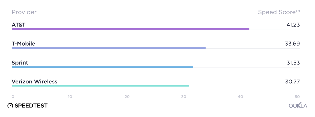
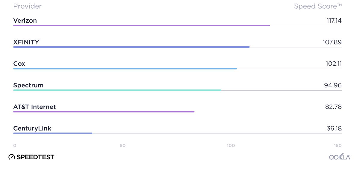
When we announced Ookla® Open Datasets from Ookla For Good™ in October, we were hoping to see exciting projects that raise the bar on the conversation about internet speeds and accessibility — and you delivered. From analyses of internet inequity in the United States to measures of data affluence in India, today we’re highlighting four projects that really show what this data can do. We also have a new, simpler tutorial on how you can use this data for your own efforts to improve the state of networks worldwide.

Highlighting the digital divide in the U.S.

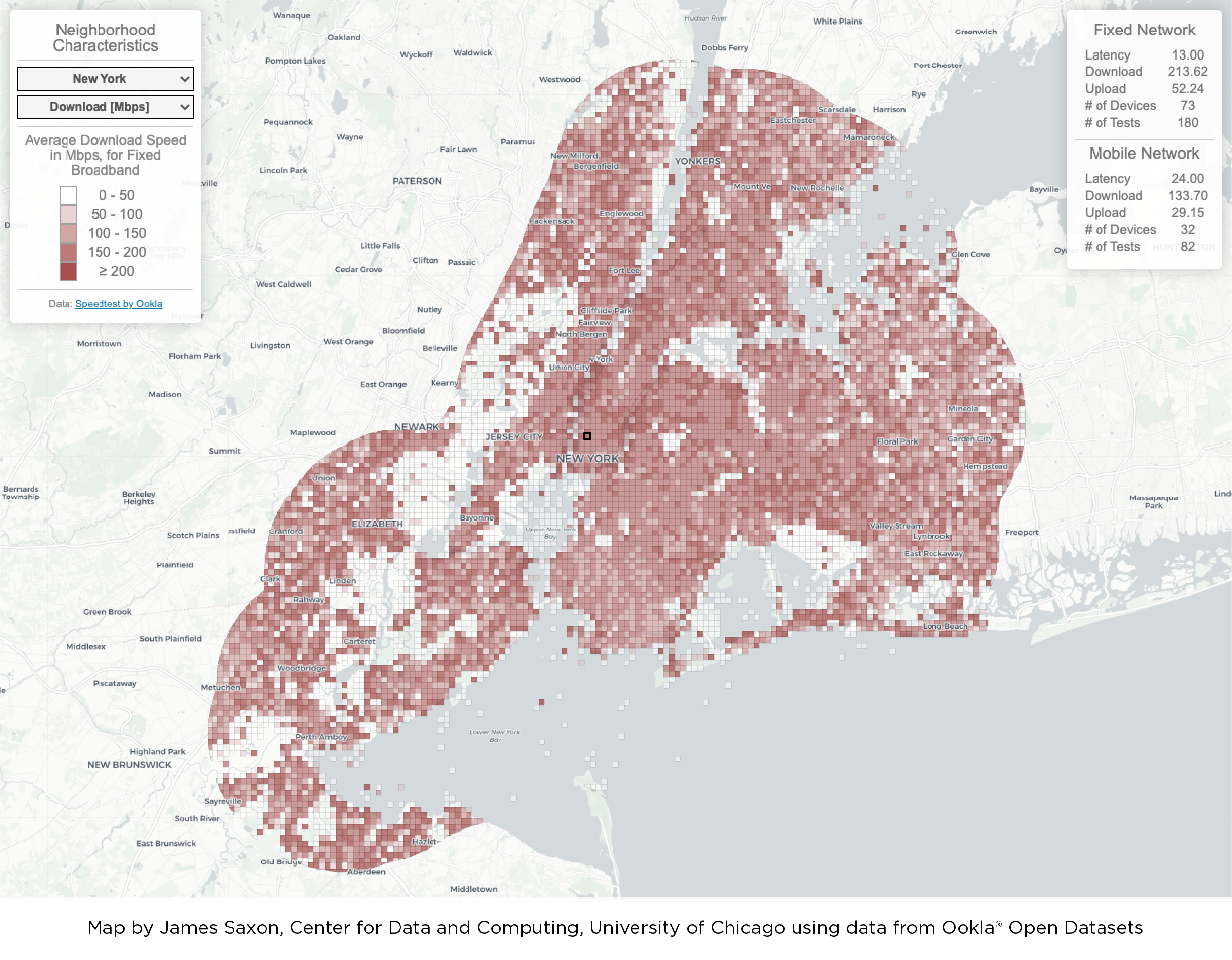
Jamie Saxon with the Center for Data and Computing at the University of Chicago married Ookla data on broadband performance with data from the American Community Survey to create interactive maps of the digital divide in 20 U.S. cities. These maps provide views into many variables that contribute to internet inequities.

Ookla_open_datasets_James_Saxon_0121-1

Building a data affluence map

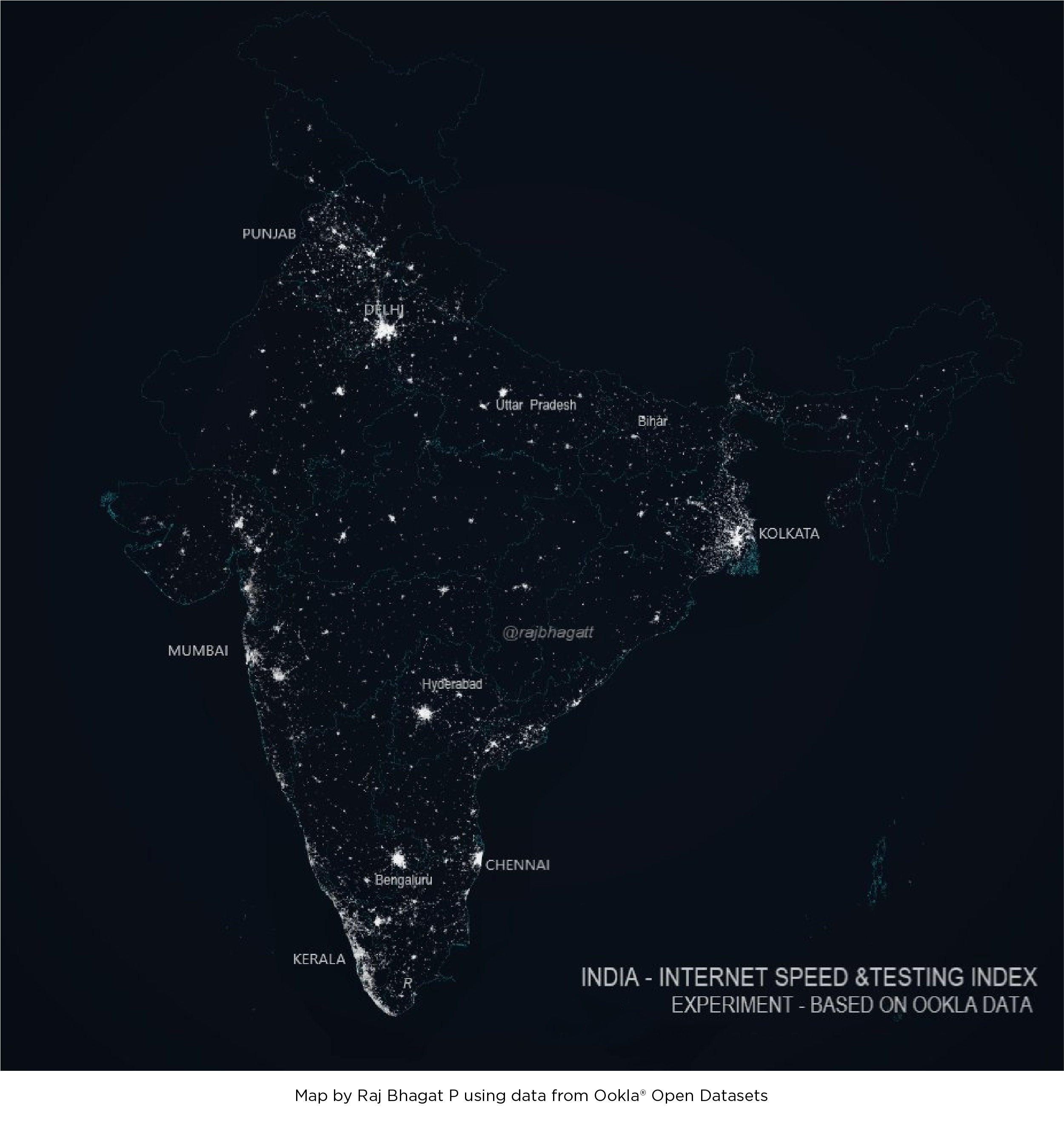
Raj Bhagat P shows how different variables can be combined with this map of data affluence that combines data on internet speeds and device counts in India.

Ookla_open_datasets_Raj-Bhagat-P_0121-1

Internet speeds are beautiful

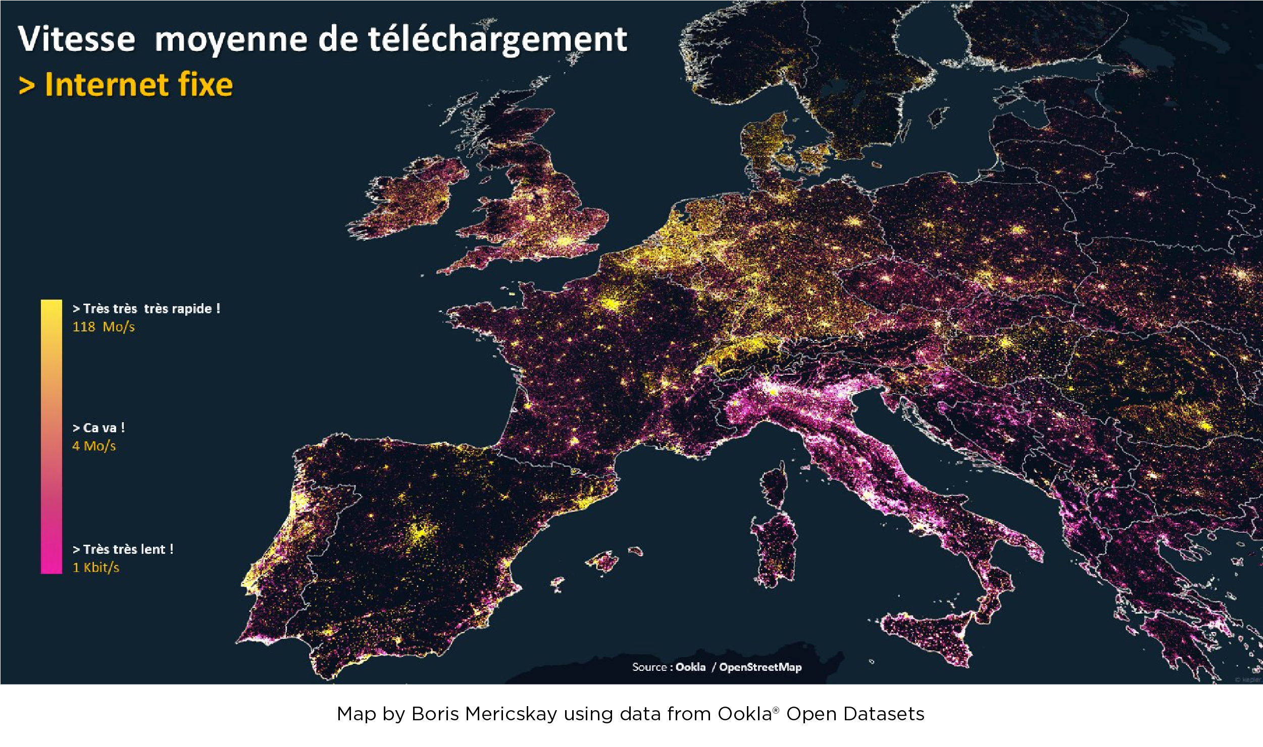
This map of fixed broadband speeds across Europe from Boris Mericskay shows that internet performance can be as visually stunning as a map of city lights.

Ookla_open_datasets_Boris-Mericskay_0121-1

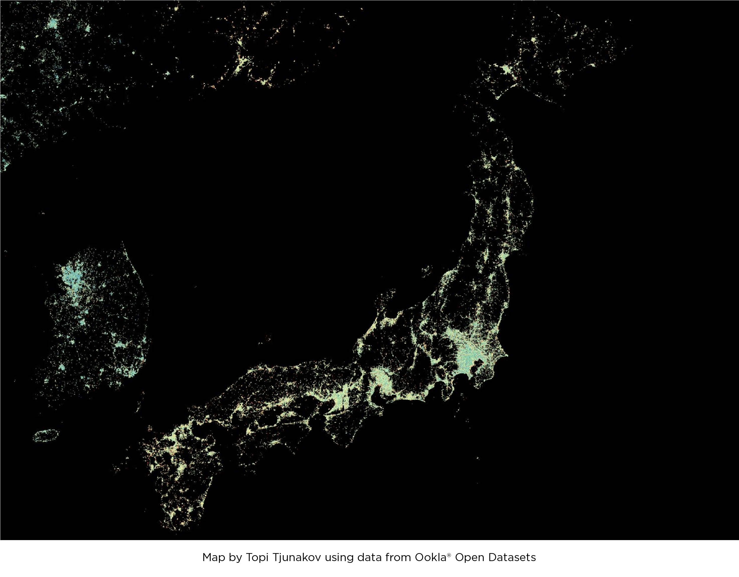
Topi Tjunakov created a similar image of internet speeds in and around Japan.

Ookla_open_datasets_Topi-Tjunakov_0121-1

Use Ookla Open Datasets to make your own maps

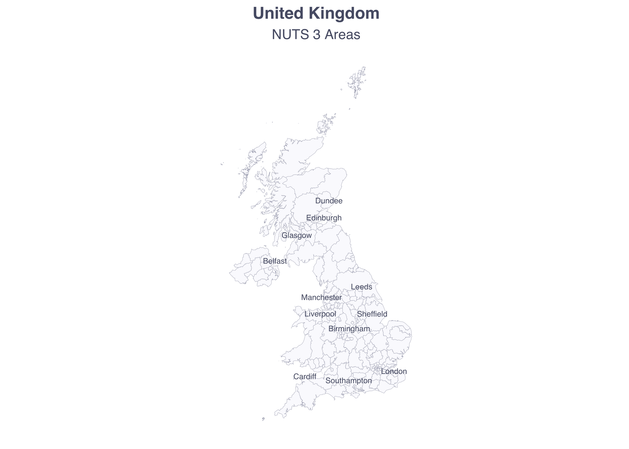
This section will demonstrate a few possible ways to use Ookla Open Datasets using the United Kingdom as an example. The ideas can be adapted for any area around the world. This tutorial uses the R programming language, but there are also Python tutorials available in the Ookla Open Data GitHub repository.

library(tidyverse)
library(patchwork)
library(janitor)
library(ggrepel)
library(usethis)
library(lubridate)
library(colorspace)
library(scales)
library(kableExtra)
library(knitr)
library(sf)

# colors for plots
purple <- "#A244DA"
light_purple <- colorspace::lighten("#A244DA", 0.5)
green <- colorspace::desaturate("#2DE5D1", 0.2)
blue_gray <- "#464a62"
mid_gray <- "#ccd0dd"
light_gray <- "#f9f9fd"

# set some global theme defaults
theme_set(theme_minimal())
theme_update(text = element_text(family = "sans", color = "#464a62"))
theme_update(plot.title = element_text(hjust = 0.5, face = "bold"))
theme_update(plot.subtitle = element_text(hjust = 0.5))

Ookla Open Datasets include quarterly performance and test count data for both mobile networks and fixed broadband aggregated over all providers. The tests are binned into global zoom level 16 tiles which can be thought of as roughly a few football fields. As of today, all four quarters of 2020 are available and subsequent quarters will be added as they complete.

Administrative unit data

I chose to analyse the mobile data at the Nomenclature of Territorial Units for Statistics (NUTS) 3 level (1:1 million). These administrative units are maintained by the European Union to allow for comparable analysis across member states. NUTS 3 areas mean:

  • In England, upper tier authorities and groups of unitary authorities and districts
  • In Wales, groups of Principal Areas
  • In Scotland, groups of Council Areas or Islands Areas
  • In Northern Ireland, groups of districts

To make a comparison to the U.S. administrative structure, these can be roughly thought of as the size of counties. Here is the code you’ll want to use to download the NUTS shapefiles from the Eurostat site. Once the zipfile is downloaded you will need to unzip it again in order to read it into your R environment:

# create a directory called “data”
dir.create("data")
use_zip("https://gisco-services.ec.europa.eu/distribution/v2/nuts/download/ref-nuts-2021-01m.shp.zip", destdir = "data")

uk_nuts_3 <- read_sf("data/ref-nuts-2021-01m.shp/NUTS_RG_01M_2021_3857_LEVL_3.shp/NUTS_RG_01M_2021_3857_LEVL_3.shp") %>%
  filter(CNTR_CODE == "UK") %>%
  st_transform(4326) %>%
  clean_names() %>%
  mutate(urbn_desc = case_when( # add more descriptive labels for urban variable
    urbn_type == 1 ~ "Urban",
    urbn_type == 2 ~ "Intermediate",
    urbn_type == 3 ~ "Rural"
  ),
  urbn_desc = factor(urbn_desc, levels = c("Urban", "Intermediate", "Rural")))

# contextual city data
uk_cities <- read_sf("https://opendata.arcgis.com/datasets/6996f03a1b364dbab4008d99380370ed_0.geojson") %>%
  clean_names() %>%
  filter(fips_cntry == "UK", pop_rank <= 5)

ggplot(uk_nuts_3) +
  geom_sf(color = mid_gray, fill = light_gray, lwd = 0.08) +
  geom_text_repel(data = uk_cities, 
                           aes(label = city_name, geometry = geometry), 
                           family = "sans", 
                           color = blue_gray, 
                           size = 2.2, 
                           stat = "sf_coordinates",
                           min.segment.length = 2) +
  labs(title = "United Kingdom",
       subtitle = "NUTS 3 Areas") +
  theme(panel.grid.major = element_blank(),
        panel.grid.minor = element_blank(),
        axis.text = element_blank(),
        axis.title = element_blank())

plot_uk-1-1

Adding data from Ookla Open Datasets

You’ll want to crop the global dataset to the bounding box of the U.K. This will include some extra tiles (within the box but not within the country, i.e. some of western Ireland), but it makes the data much easier to work with later on.

uk_bbox <- uk_nuts_3 %>%
  st_union() %>% # otherwise would be calculating the bounding box of each individual area
  st_bbox()
  

Each of the quarters are stored in separate shapefiles. You can read them in one-by-one and crop them to the U.K. box in the same pipeline.

# download the data with the following code:

use_zip("https://ookla-open-data.s3.amazonaws.com/shapefiles/performance/type=mobile/year=2020/quarter=1/2020-01-01_performance_mobile_tiles.zip", destdir = "data")
use_zip("https://ookla-open-data.s3.amazonaws.com/shapefiles/performance/type=mobile/year=2020/quarter=2/2020-04-01_performance_mobile_tiles.zip", destdir = "data")
use_zip("https://ookla-open-data.s3.amazonaws.com/shapefiles/performance/type=mobile/year=2020/quarter=3/2020-07-01_performance_mobile_tiles.zip", destdir = "data")
use_zip("https://ookla-open-data.s3.amazonaws.com/shapefiles/performance/type=mobile/year=2020/quarter=4/2020-10-01_performance_mobile_tiles.zip", destdir = "data")

# and then read in those downloaded files
mobile_tiles_q1 <- read_sf("data/2020-01-01_performance_mobile_tiles/gps_mobile_tiles.shp") %>%
  st_crop(uk_bbox)
mobile_tiles_q2 <- read_sf("data/2020-04-01_performance_mobile_tiles/gps_mobile_tiles.shp") %>%
  st_crop(uk_bbox)
mobile_tiles_q3 <- read_sf("data/2020-07-01_performance_mobile_tiles/gps_mobile_tiles.shp") %>%
  st_crop(uk_bbox)
mobile_tiles_q4 <- read_sf("data/2020-10-01_performance_mobile_tiles/gps_mobile_tiles.shp") %>%
  st_crop(uk_bbox)

As you see, the tiles cover most of the area, with more tiles in more densely populated areas. (And note that you still have tiles included that are outside the boundary of the area but within the bounding box.)

ggplot(uk_nuts_3) +
  geom_sf(color = mid_gray, fill = light_gray, lwd = 0.08) +
  geom_sf(data = mobile_tiles_q4, fill = purple, color = NA) +
  geom_text_repel(data = uk_cities, 
                           aes(label = city_name, geometry = geometry), 
                           family = "sans", 
                           color = blue_gray, 
                           size = 2.2, 
                           stat = "sf_coordinates",
                           min.segment.length = 2) +
  labs(title = "United Kingdom",
       subtitle = "Ookla® Open Data Mobile Tiles, NUTS 3 Areas") +
  theme(panel.grid.major = element_blank(),
        panel.grid.minor = element_blank(),
        axis.text = element_blank(),
        axis.title = element_blank())

tile_map-1-3

Now that the cropped tiles are read in, you’ll use a spatial join to determine which NUTS 3 area each tile is in. In this step, I am also reprojecting the data to the British National Grid (meters). I’ve also added a variable to identify the time period (quarter).

tiles_q1_nuts <- uk_nuts_3 %>%
  st_transform(27700) %>% # British National Grid
  st_join(mobile_tiles_q1 %>% st_transform(27700), left = FALSE) %>%
  mutate(quarter_start = "2020-01-01")

tiles_q2_nuts <- uk_nuts_3 %>%
  st_transform(27700) %>%
  st_join(mobile_tiles_q2 %>% st_transform(27700), left = FALSE) %>%
  mutate(quarter_start = "2020-04-01")

tiles_q3_nuts <- uk_nuts_3 %>%
  st_transform(27700) %>%
  st_join(mobile_tiles_q3 %>% st_transform(27700), left = FALSE) %>%
  mutate(quarter_start = "2020-07-01")

tiles_q4_nuts <- uk_nuts_3 %>%
  st_transform(27700) %>%
  st_join(mobile_tiles_q4 %>% st_transform(27700), left = FALSE) %>%
  mutate(quarter_start = "2020-10-01")

In order to make the data easier to work with, combine the tiles into a long dataframe with each row representing one tile in one quarter. The geometry now represents the NUTS region, not the original tile shape.

tiles_all <- tiles_q1_nuts %>%
  rbind(tiles_q2_nuts) %>%
  rbind(tiles_q3_nuts) %>%
  rbind(tiles_q4_nuts) %>%
  mutate(quarter_start = ymd(quarter_start)) # convert to date format

With this dataframe, you can start to generate some aggregates. In this table you’ll include the tile count, test count, quarter and average download and upload speeds.

Exploratory data analysis

aggs_quarter <- tiles_all %>%
  st_set_geometry(NULL) %>%
  group_by(quarter_start) %>%
  summarise(tiles = n(),
            avg_d_mbps = weighted.mean(avg_d_kbps / 1000, tests), # I find Mbps easier to work with
            avg_u_mbps = weighted.mean(avg_u_kbps / 1000, tests),
            tests = sum(tests)) %>%
  ungroup()


knitr::kable(aggs_quarter) %>%
  kable_styling()

aggregates_table_kj

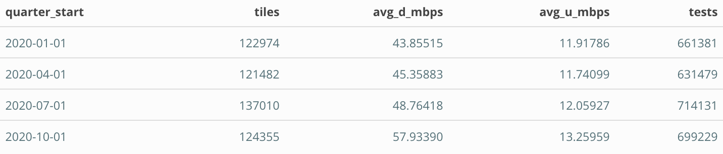
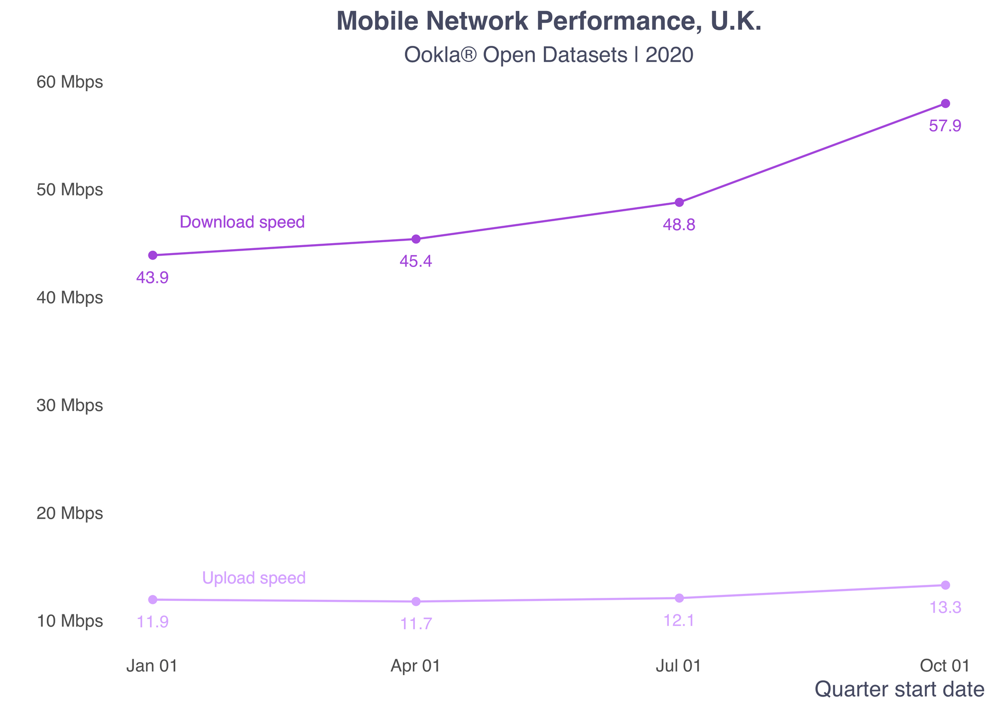
We can see from this table that both download and upload speeds increased throughout the year, with a small dip in upload speeds in Q2. Next, you’ll want to plot this data.

ggplot(aggs_quarter, aes(x = quarter_start)) +
  geom_point(aes(y = avg_d_mbps), color = purple) +
  geom_line(aes(y = avg_d_mbps), color = purple, lwd = 0.5) +
  geom_text(aes(y = avg_d_mbps - 2, label = round(avg_d_mbps, 1)), color = purple, size = 3, family = "sans") +
  geom_text(data = NULL, x = ymd("2020-02-01"), y = 47, label = "Download speed", color = purple, size = 3, family = "sans") +
  geom_point(aes(y = avg_u_mbps), color = light_purple) +
  geom_line(aes(y = avg_u_mbps), color = light_purple, lwd = 0.5) +
  geom_text(aes(y = avg_u_mbps - 2, label = round(avg_u_mbps, 1)), color = light_purple, size = 3, family = "sans") +
  geom_text(data = NULL, x = ymd("2020-02-05"), y = 14, label = "Upload speed", color = light_purple, size = 3, family = "sans") +
  labs(y = "", x = "Quarter start date",
       title = "Mobile Network Performance, U.K.",
       subtitle = "Ookla® Open Datasets | 2020") +
  theme(panel.grid.minor = element_blank(),
        panel.grid.major = element_blank(),
        axis.title.x = element_text(hjust=1)) +
  scale_y_continuous(labels = label_number(suffix = " Mbps", scale = 1, accuracy = 1)) +
  scale_x_date(date_labels = "%b %d")

line_up_down-1

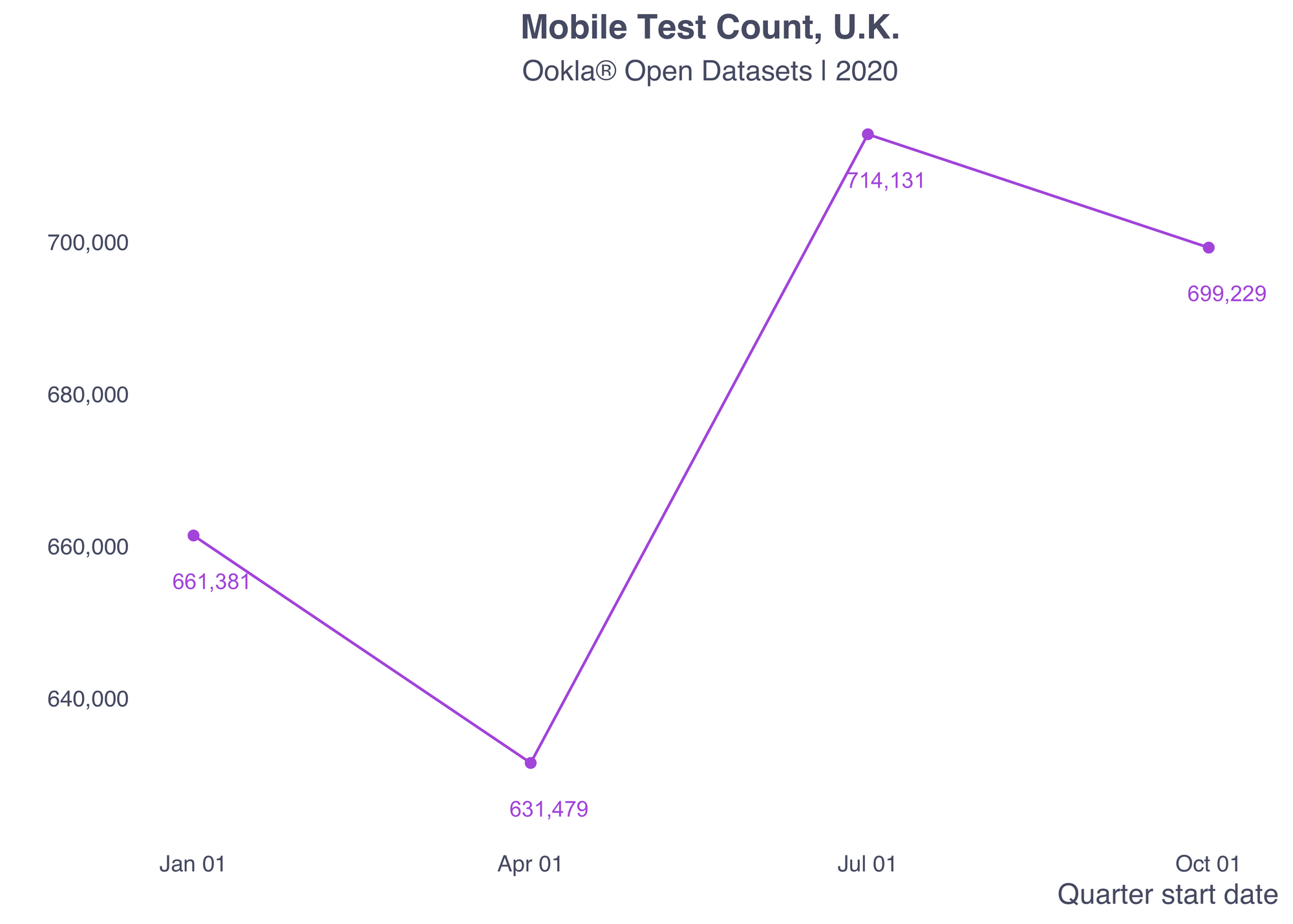
Examining test counts

We also saw above that the number of tests decreased between Q1 and Q2 and then peaked in Q3 at a little over 700,000 before coming back down. The increase likely followed resulted from interest in network performance during COVID-19 when more people started working from home. This spike is even more obvious in chart form.

ggplot(aggs_quarter, aes(x = quarter_start)) +
  geom_point(aes(y = tests), color = purple) +
  geom_line(aes(y = tests), color = purple, lwd = 0.5) +
  geom_text(aes(y = tests - 6000, label = comma(tests), x= quarter_start + 5), size = 3, color = purple) +
  labs(y = "", x = "Quarter start date",
       title = "Mobile Test Count, U.K.",
       subtitle = "Ookla® Open Datasets | 2020") +
  theme(panel.grid.minor = element_blank(),
        panel.grid.major = element_blank(),
        axis.title.x = element_text(hjust=1),
        axis.text = element_text(color = blue_gray)) +
  scale_y_continuous(labels = comma) +
  scale_x_date(date_labels = "%b %d")

line_tests-1-1

Data distribution

Next, I wanted to check the distribution of average download speeds.

ggplot(tiles_all) + 
  geom_histogram(aes(x = avg_d_kbps / 1000, group = quarter_start), size = 0.3, color = light_gray, fill = green) + 
  scale_x_continuous(labels = label_number(suffix = " Mbps", accuracy = 1)) +
  scale_y_continuous(labels = comma) +
  facet_grid(quarter_start ~ .) +
  theme(panel.grid.minor = element_blank(), 
        panel.grid.major = element_blank(), 
        axis.title.x = element_text(hjust=1),
        axis.text = element_text(color = blue_gray),
        strip.text.y = element_text(angle = 0, color = blue_gray)) + 
  labs(y = "", x = "", title = "Mobile Download Speed Distribution by Tile, U.K.", 
       subtitle = "Ookla® Open Datasets | 2020")

histogram-1-1

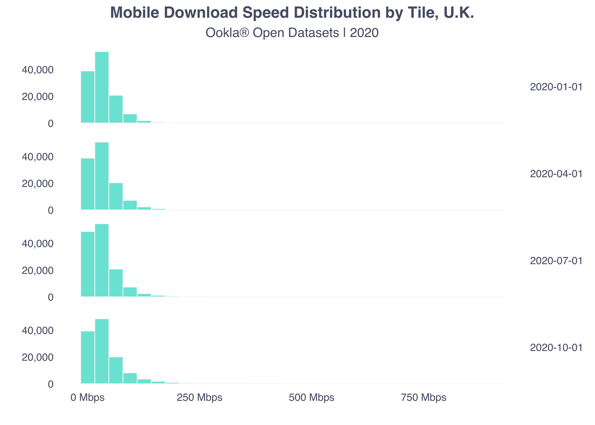
The underlying distribution of average download speeds across the tiles has stayed fairly stable.

Mapping average speed

Making a quick map of the average download speed in each region across the U.K. is relatively simple.

# generate aggregates table
nuts_3_aggs <- tiles_all %>%
  group_by(quarter_start, nuts_id, nuts_name, urbn_desc, urbn_type) %>%
  summarise(tiles = n(),
            avg_d_mbps = weighted.mean(avg_d_kbps / 1000, tests), # I find Mbps easier to work with
            avg_u_mbps = weighted.mean(avg_u_kbps / 1000, tests),
            tests = sum(tests)) %>%
  ungroup()
ggplot(nuts_3_aggs %>% filter(quarter_start == "2020-10-01")) +
  geom_sf(aes(fill = avg_d_mbps), color = blue_gray, lwd = 0.08) +
  scale_fill_stepsn(colors = RColorBrewer::brewer.pal(n = 5, name = "BuPu"), labels = label_number(suffix = " Mbps"), n.breaks = 4, guide = guide_colorsteps(title = "")) +
  theme(panel.grid.minor = element_blank(),
        panel.grid.major = element_blank(),
        axis.title.x = element_text(hjust=1),
        legend.text = element_text(color = blue_gray),
        axis.text = element_blank()) +
  labs(title = "Mobile Download Speed, U.K.", subtitle = "Ookla® Open Datasets | Q4 2020")

choropleth-1-1

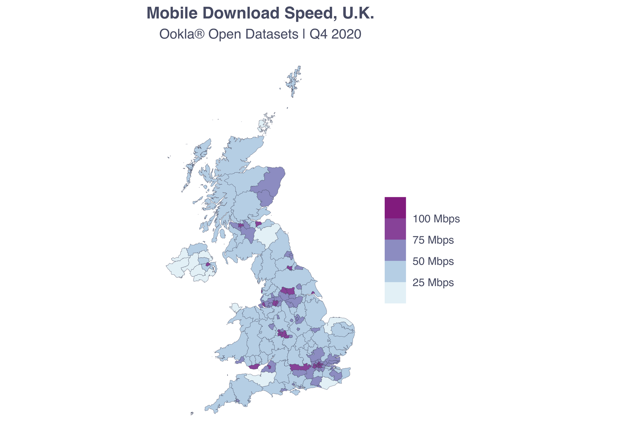
As you can see, the areas around large cities have faster download speeds on average and the lowest average download speeds are typically in more rural areas.

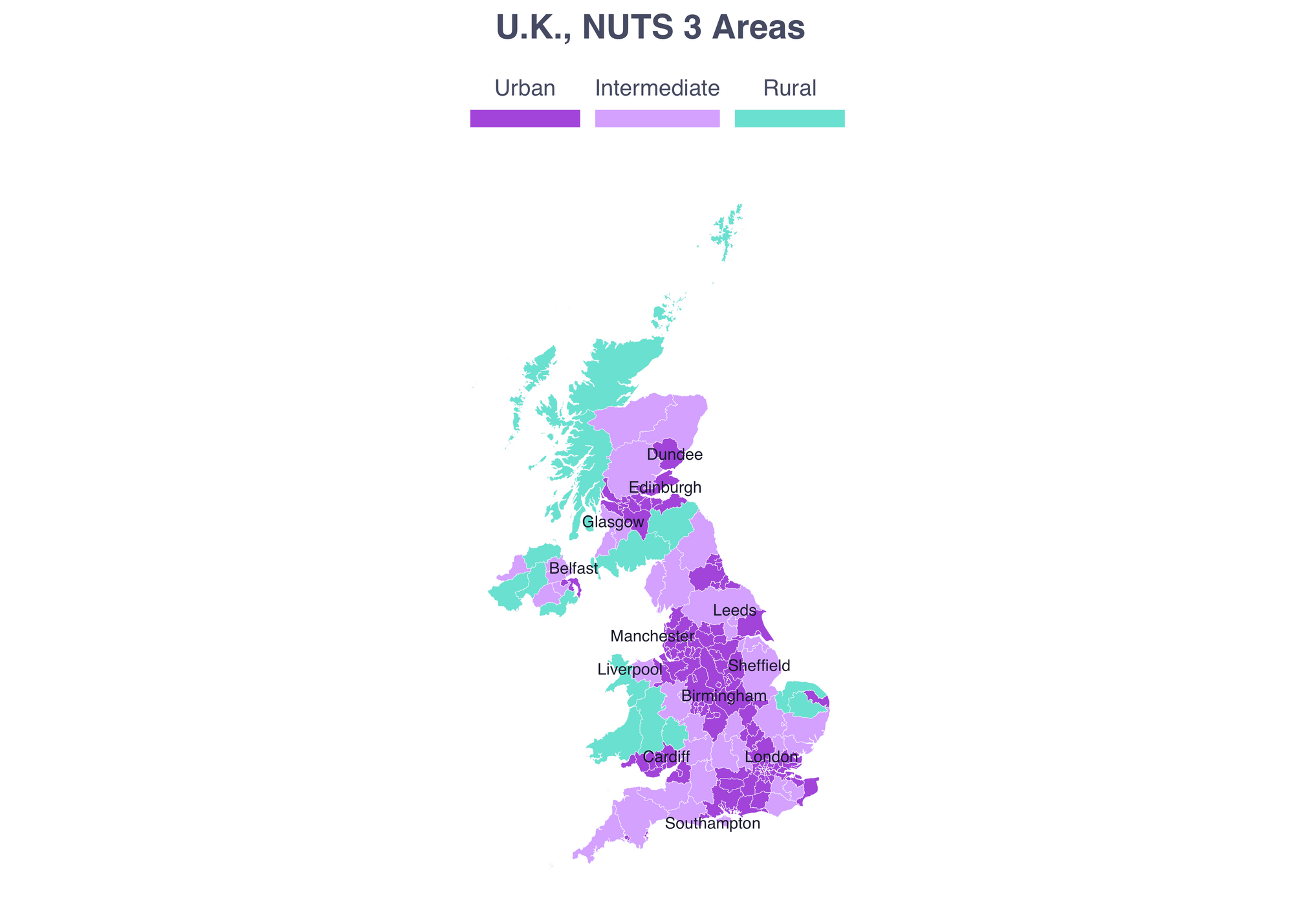
Rural and urban analysis

People are often interested in the difference between mobile networks in urban and rural areas. The Eurostat NUTS data includes an urban indicator with three levels: rural, intermediate and urban. This typology is determined primarily by population density and proximity to a population center.

ggplot(uk_nuts_3) +
  geom_sf(aes(fill = urbn_desc), color = light_gray, lwd = 0.08) +
  geom_text_repel(data = uk_cities, 
                           aes(label = city_name, geometry = geometry), 
                           family = "sans", 
                           color = "#1a1b2e", 
                           size = 2.2, 
                           stat = "sf_coordinates",
                           min.segment.length = 2) +
  scale_fill_manual(values = c(purple, light_purple, green), name = "", guide = guide_legend(direction = "horizontal", label.position = "top", keywidth = 3, keyheight = 0.5)) +
  labs(title = "U.K., NUTS 3 Areas") +
  theme(panel.grid.major = element_blank(),
        panel.grid.minor = element_blank(),
        axis.text = element_blank(),
        axis.title = element_blank(),
        legend.position = "top")

rural_urban_reference-1

Data distribution overall and over time

When you aggregate by the urban indicator variable different patterns come up in the data.

# generate aggregates table
rural_urban_aggs <- tiles_all %>%
  st_set_geometry(NULL) %>%
  group_by(quarter_start, urbn_desc, urbn_type) %>%
  summarise(tiles = n(),
            avg_d_mbps = weighted.mean(avg_d_kbps / 1000, tests), # I find Mbps easier to work with
            avg_u_mbps = weighted.mean(avg_u_kbps / 1000, tests),
            tests = sum(tests)) %>%
  ungroup()

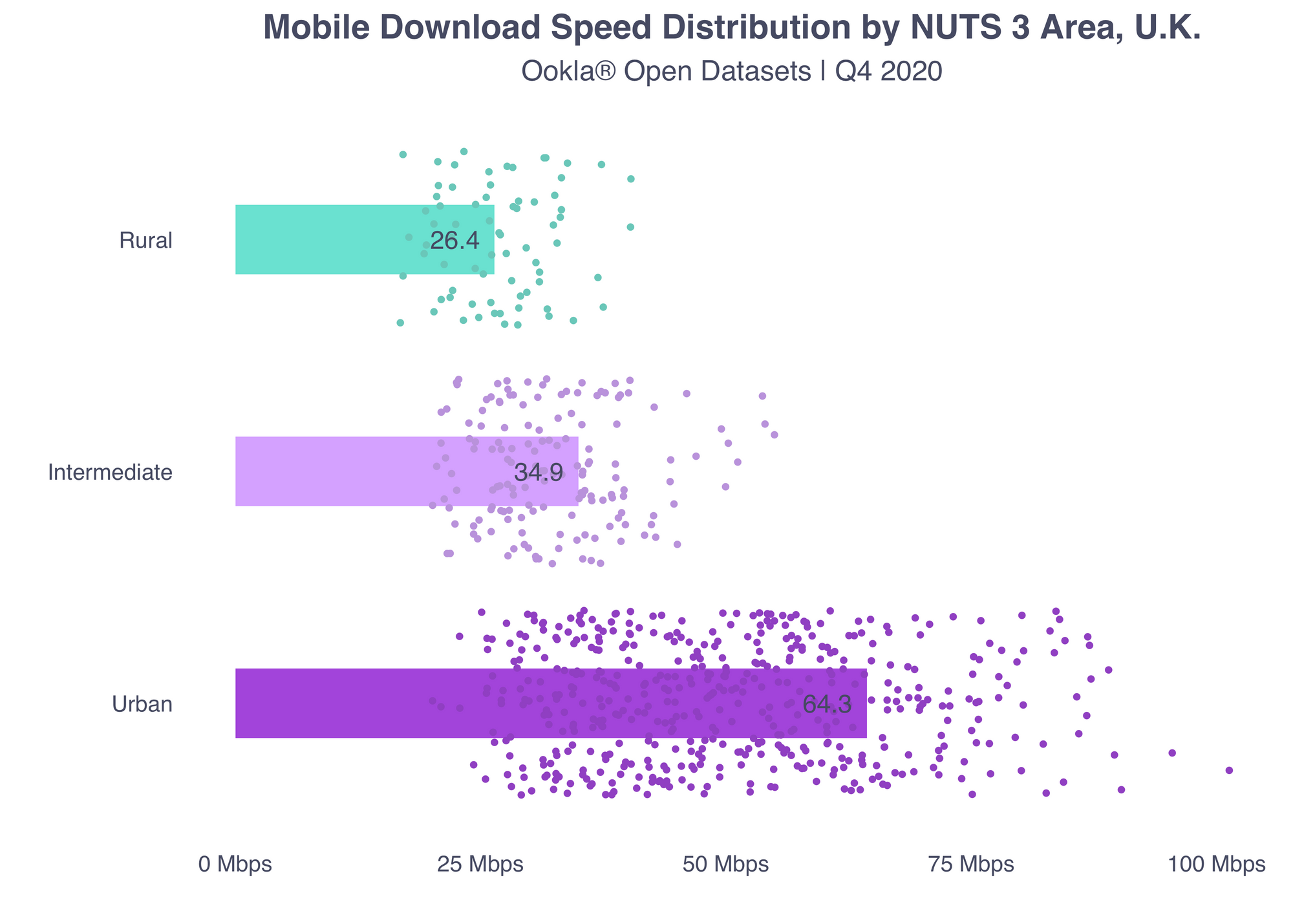
As you might expect, the download speeds during Q4 are faster in urban areas than in rural areas – with the intermediate ones somewhere in between. This pattern holds for other quarters as well.

ggplot(rural_urban_aggs %>% filter(quarter_start == "2020-10-01"), aes(x = avg_d_mbps, y = urbn_desc, fill = urbn_desc)) +
  geom_col(width = .3, show.legend = FALSE) +
  geom_jitter(data = nuts_3_aggs, aes(x = avg_d_mbps, y = urbn_desc, color = urbn_desc), size = 0.7) + 
  geom_text(aes(x = avg_d_mbps - 4, label = round(avg_d_mbps, 1)), family = "sans",  size = 3.5, color = blue_gray) +
  scale_fill_manual(values = c(purple, light_purple, green)) +
  scale_color_manual(values = darken(c(purple, light_purple, green))) +
  scale_x_continuous(labels = label_number(suffix = " Mbps", scale = 1, accuracy = 1)) +
  theme(panel.grid.minor = element_blank(),
        panel.grid.major = element_blank(),
        axis.title.x = element_text(hjust=1),
        legend.position = "none",
        axis.text = element_text(color = blue_gray)) +
  labs(y = "", x = "", 
       title = "Mobile Download Speed Distribution by NUTS 3 Area, U.K.", 
       subtitle = "Ookla® Open Datasets | 2020")  

rural_urban_bar-1-2
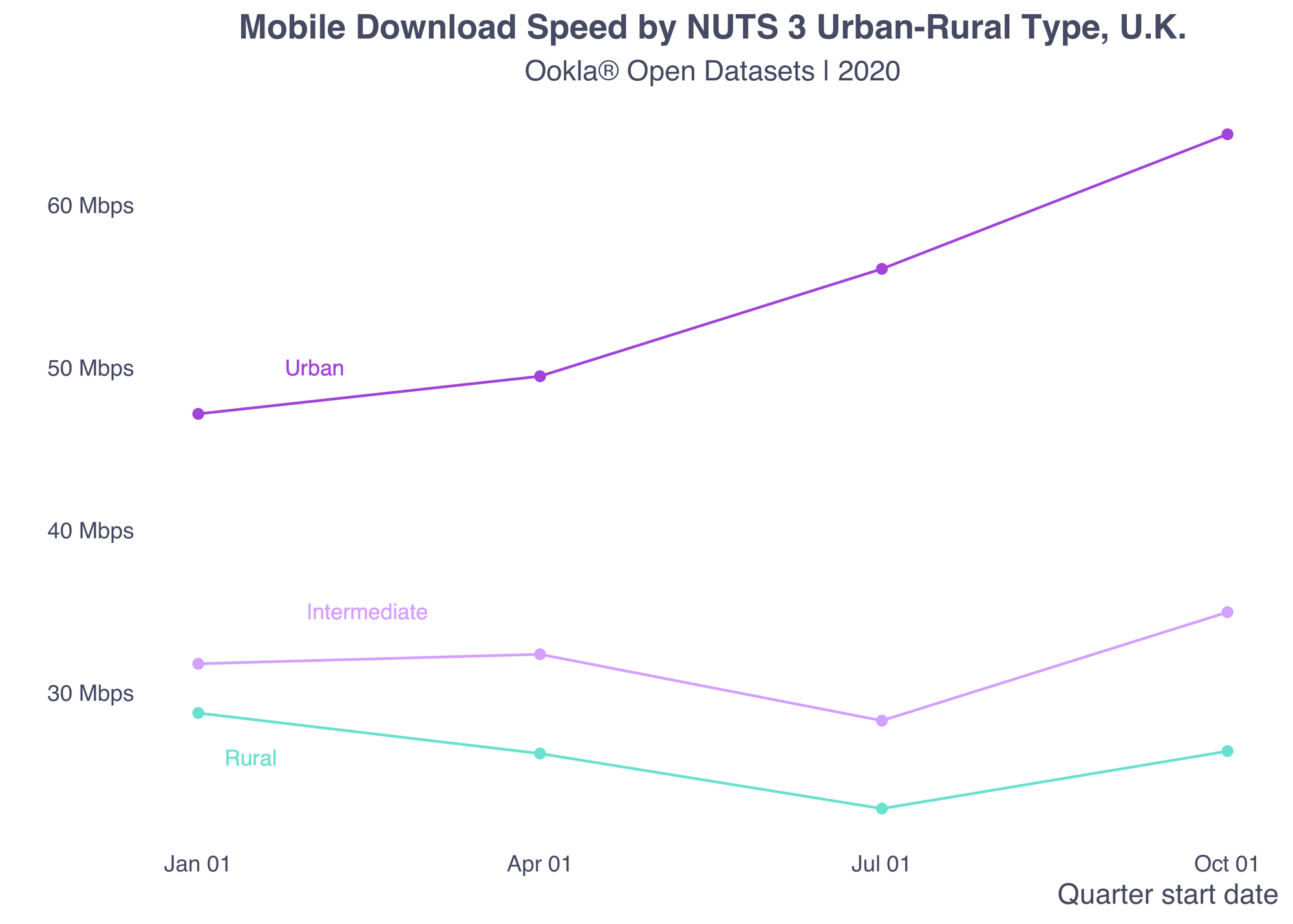
Interestingly though, the patterns differ when you look at a time series plot. Urban mobile networks steadily improve, while the intermediate and rural areas saw slower average download speeds starting in Q2 before going back up after Q3. This is likely the result of increased pressure on the networks during stay-at-home orders (although this graph is not conclusive evidence of that).

ggplot(rural_urban_aggs) +
  geom_line(aes(x = quarter_start, y = avg_d_mbps, color = urbn_desc)) +
  geom_point(aes(x = quarter_start, y = avg_d_mbps, color = urbn_desc)) +
  # urban label
  geom_text(data = NULL, x = ymd("2020-02-01"), y = 50, label = "Urban", color = purple, family = "sans", size = 3) +
  # intermediate label
  geom_text(data = NULL, x = ymd("2020-02-15"), y = 35, label = "Intermediate", color = light_purple, family = "sans", size = 3) +
  # rural label
  geom_text(data = NULL, x = ymd("2020-01-15"), y = 26, label = "Rural", color = green, family = "sans", size = 3) +
  scale_color_manual(values = c(purple, light_purple, green)) +
  scale_x_date(date_labels = "%b %d") +
  scale_y_continuous(labels = label_number(suffix = " Mbps", scale = 1, accuracy = 1)) +
  theme(panel.grid.minor = element_blank(),
        panel.grid.major = element_blank(),
        axis.title.x = element_text(hjust=1),
        legend.position = "none",
        axis.text = element_text(color = blue_gray)) +
  labs(y = "", x = "Quarter start date", 
       title = "Mobile Download Speed by NUTS 3 Urban-Rural Type, U.K.", 
       subtitle = "Ookla® Open Datasets | 2020") 

rural_urban_line-1-1

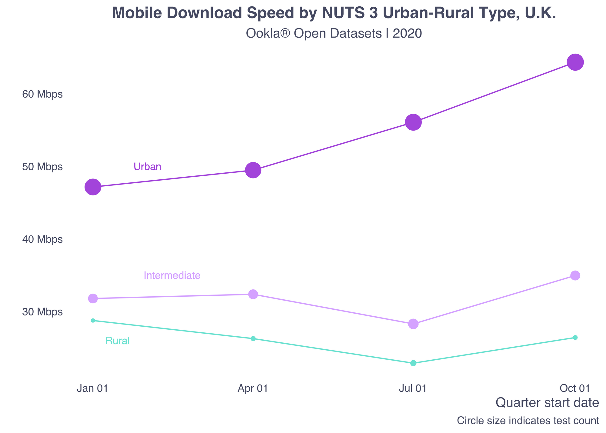
When you repeat the same plot but map the test count to the site of the point, you can see why the overall download speed increased steadily. The number of tests in urban areas is much higher than in intermediate and rural areas, thus pulling up the overall average.

ggplot(rural_urban_aggs) +
  geom_line(aes(x = quarter_start, y = avg_d_mbps, color = urbn_desc)) +
  geom_point(aes(x = quarter_start, y = avg_d_mbps, color = urbn_desc, size = tests)) +
  # urban label
  geom_text(data = NULL, x = ymd("2020-02-01"), y = 50, label = "Urban", color = purple, family = "sans", size = 3) +
  # intermediate label
  geom_text(data = NULL, x = ymd("2020-02-15"), y = 35, label = "Intermediate", color = light_purple, family = "sans", size = 3) +
  # rural label
  geom_text(data = NULL, x = ymd("2020-01-15"), y = 26, label = "Rural", color = green, family = "sans", size = 3) +
  scale_color_manual(values = c(purple, light_purple, green)) +
  scale_x_date(date_labels = "%b %d") +
  scale_y_continuous(labels = label_number(suffix = " Mbps", scale = 1, accuracy = 1)) +
  theme(panel.grid.minor = element_blank(),
        panel.grid.major = element_blank(),
        axis.title.x = element_text(hjust=1),
        legend.position = "none",
        axis.text = element_text(color = blue_gray)) +
  labs(y = "", x = "Quarter start date", 
       title = ("Mobile Download Speed by NUTS 3 Urban-Rural Type, U.K."), 
       subtitle = "Ookla® Open Datasets | 2020",
       caption = "Circle size indicates test count")  

rural_urban_line_size-1-1

Spotlighting regional variances

Parsing the data by specific geographies can reveal additional information.

bottom_20_q4 <- nuts_3_aggs %>% 
  filter(quarter_start == "2020-10-01") %>% 
  top_n(n = -20, wt = avg_d_mbps) %>%
  mutate(nuts_name = fct_reorder(factor(nuts_name), -avg_d_mbps))
map <- ggplot() +
  geom_sf(data = uk_nuts_3, fill = light_gray, color = mid_gray, lwd = 0.08) +
  geom_sf(data = bottom_20_q4, aes(fill = urbn_desc), color = mid_gray, lwd = 0.08, show.legend = FALSE) +
  geom_text_repel(data = uk_cities, 
                           aes(label = city_name, geometry = geometry), 
                           family = "sans", 
                           color = blue_gray, 
                           size = 2.2, 
                           stat = "sf_coordinates",
                           min.segment.length = 2) +
  scale_fill_manual(values = c(purple, light_purple, green), name = "", guide = guide_legend(direction = "horizontal", label.position = "top", keywidth = 3, keyheight = 0.5)) +
  labs(title = NULL,
       subtitle = NULL) +
  theme(panel.grid.major = element_blank(),
        panel.grid.minor = element_blank(),
        axis.text = element_blank(),
        axis.title = element_blank(),
        legend.position = "top")
barplot <- ggplot(data = bottom_20_q4, aes(x = avg_d_mbps, y = nuts_name, fill = urbn_desc)) +
  geom_col(width = .5) +
  scale_fill_manual(values = c(purple, light_purple, green), guide = guide_legend(direction = "horizontal", label.position = "top", keywidth = 3, keyheight = 0.5, title = NULL)) +
  scale_x_continuous(labels = label_number(suffix = " Mbps", scale = 1, accuracy = 1)) +
  theme(panel.grid.minor = element_blank(),
        panel.grid.major = element_blank(),
        axis.title.x = element_text(hjust=1),
        legend.position = "top",
        axis.text = element_text(color = blue_gray)) +
  labs(y = "", x = "", 
       title = ("Slowest 20 NUTS 3 Areas by Download Speed, U.K."), 
       subtitle = "Ookla® Open Datasets | Q4 2020") 
# use patchwork to put it all together
barplot + map

bottom_20-1-2
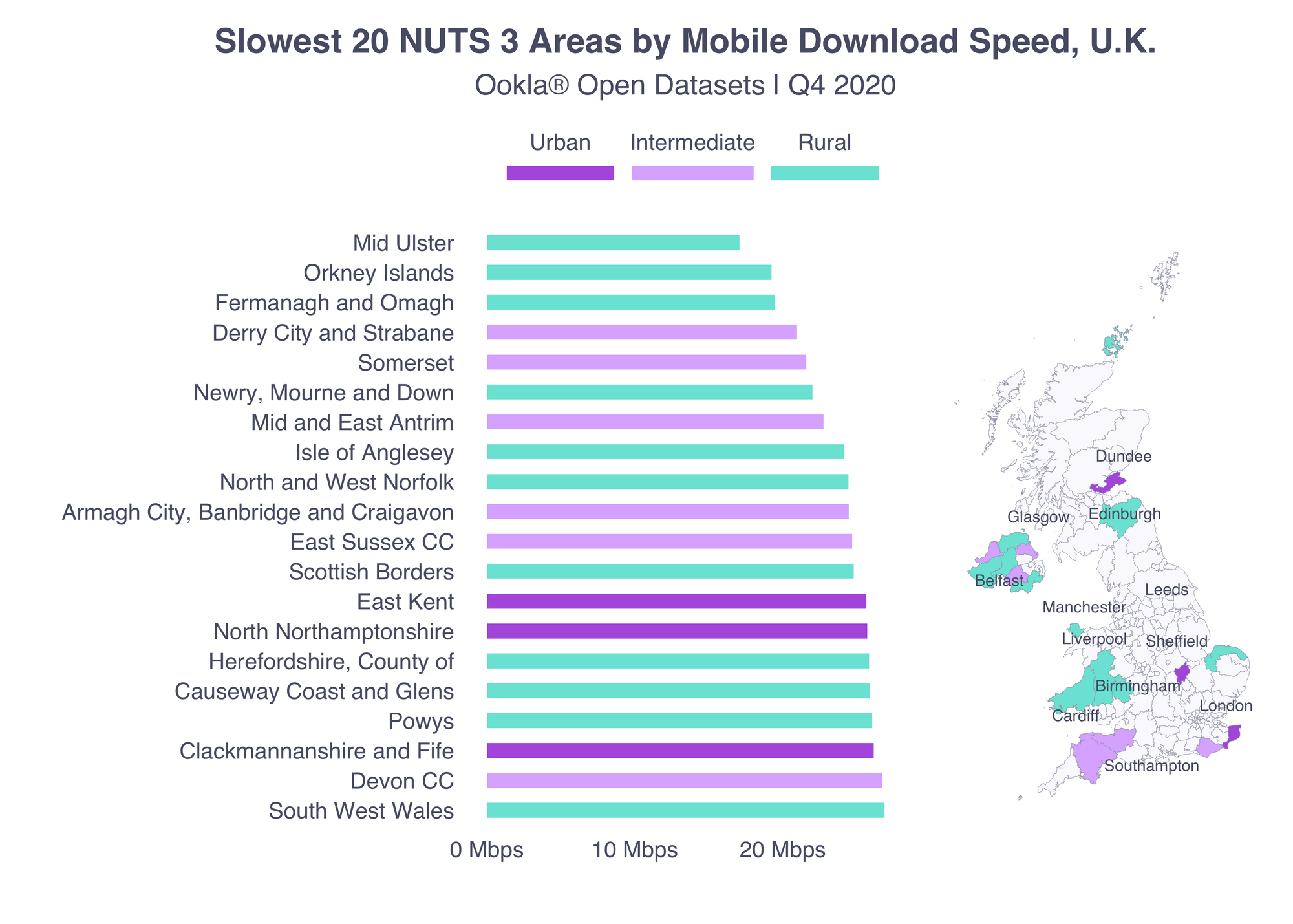
Among the 20 areas with the lowest average download speed in Q4 2020 there were three urban areas and six intermediate. The rest were rural.

top_20_q4 <- nuts_3_aggs %>% 
  filter(quarter_start == "2020-10-01") %>% 
  top_n(n = 20, wt = avg_d_mbps) %>%
  mutate(nuts_name = fct_reorder(factor(nuts_name), avg_d_mbps))
top_map <- ggplot() +
  geom_sf(data = uk_nuts_3, fill = light_gray, color = mid_gray, lwd = 0.08) +
  geom_sf(data = top_20_q4, aes(fill = urbn_desc), color = mid_gray, lwd = 0.08, show.legend = FALSE) +
  geom_text_repel(data = uk_cities, 
                           aes(label = city_name, geometry = geometry), 
                           family = "sans", 
                           color = blue_gray, 
                           size = 2.2, 
                           stat = "sf_coordinates",
                           min.segment.length = 2) +
  scale_fill_manual(values = c(purple, light_purple, green), name = "", guide = guide_legend(direction = "horizontal", label.position = "top", keywidth = 3, keyheight = 0.5)) +
  labs(title = NULL,
       subtitle = NULL) +
  theme(panel.grid.major = element_blank(),
        panel.grid.minor = element_blank(),
        axis.text = element_blank(),
        axis.title = element_blank(),
        legend.position = "top")
top_barplot <- ggplot(data = top_20_q4, aes(x = avg_d_mbps, y = nuts_name, fill = urbn_desc)) +
  geom_col(width = .5) +
  scale_fill_manual(values = c(purple, light_purple, green), guide = guide_legend(direction = "horizontal", label.position = "top", keywidth = 3, keyheight = 0.5, title = NULL)) +
  scale_x_continuous(labels = label_number(suffix = " Mbps", scale = 1, accuracy = 1), breaks = c(50, 100)) +
  theme(panel.grid.minor = element_blank(),
        panel.grid.major = element_blank(),
        axis.title.x = element_text(hjust=1),
        legend.position = "top",
        axis.text = element_text(color = blue_gray)) +
  labs(y = "", x = "", 
       title = "Fastest 20 NUTS 3 Areas by Mobile Download Speed, U.K.", 
       subtitle = "Ookla® Open Datasets | Q4 2020") 
top_london <- ggplot() +
  geom_sf(data = uk_nuts_3 %>% filter(str_detect(fid, "UKI")), fill = light_gray, color = mid_gray, lwd = 0.08) +
  geom_sf(data = top_20_q4 %>% filter(str_detect(nuts_id, "UKI")), aes(fill = urbn_desc), color = mid_gray, lwd = 0.08, show.legend = FALSE) +
  geom_text_repel(data = uk_cities %>% filter(city_name == "London"), 
                           aes(label = city_name, geometry = geometry), 
                           family = "sans", 
                           color = "black", 
                           size = 2.2, 
                           stat = "sf_coordinates",
                           min.segment.length = 2) +
  scale_fill_manual(values = c(purple, light_purple, green), name = "", guide = guide_legend(direction = "horizontal", label.position = "top", keywidth = 3, keyheight = 0.5)) +
  labs(title = NULL,
       subtitle = NULL) +
  theme(panel.grid.major = element_blank(),
        panel.grid.minor = element_blank(),
        axis.text = element_blank(),
        axis.title = element_blank(),
        legend.position = "top",
        panel.border = element_rect(colour = blue_gray, fill=NA, size=0.5))
top_map_comp <- top_map + inset_element(top_london, left = 0.6, bottom = 0.6, right = 1, top = 1)

top_barplot + top_map_comp

top_20-1-1
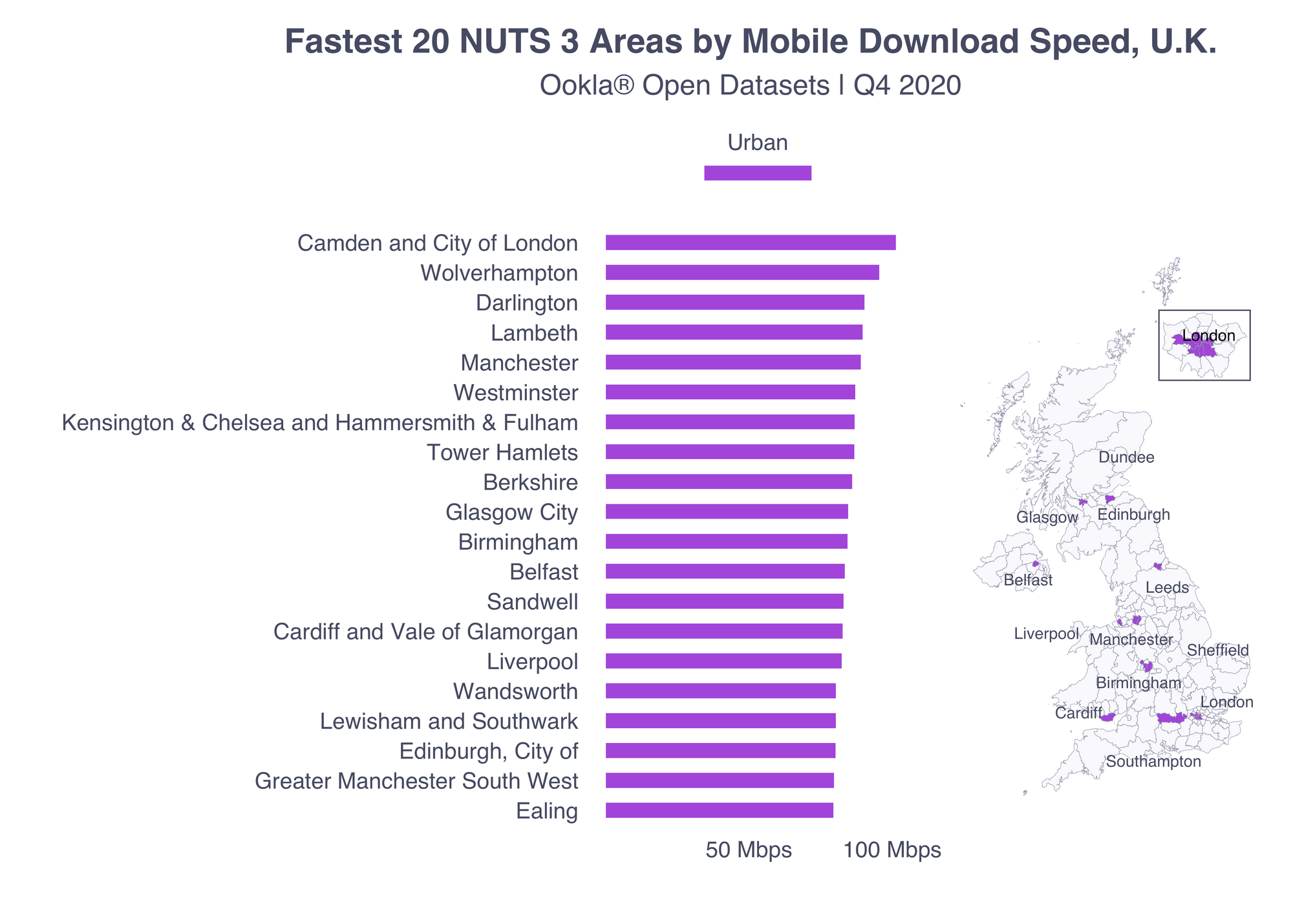
Meanwhile, all of the fastest 20 NUTS 3 areas were urban.

What else you can do with this data

Don’t forget there are also more tutorials with examples written in Python and R. Aside from what I showed here, you could do an interesting analysis looking at clustering patterns, sociodemographic variables and other types of administrative units like legislative or school districts.

We hope this tutorial will help you use Ookla’s open data for your own projects. Please tag us if you share your projects on social media using the hashtag #OoklaForGood so we can learn from your analyses.

Ookla retains ownership of this article including all of the intellectual property rights, data, content graphs and analysis. This article may not be quoted, reproduced, distributed or published for any commercial purpose without prior consent. Members of the press and others using the findings in this article for non-commercial purposes are welcome to publicly share and link to report information with attribution to Ookla.

| November 7, 2016

Cleveland Wins the World Series… of Mobile Speed

Cubs fans rejoiced early Thursday morning when Cleveland’s final play landed in Anthony Rizzo’s glove and ended the 108-year curse of the goat. But they might not realize that all of their celebratory tweets, selfies and phone calls may have been interminably delayed if that game had taken place in Chicago.

That’s because Speedtest data shows the one contest Cleveland did win this past week was the battle for the fastest mobile internet speeds.

While neither ball field had amazing speeds (something that won’t surprise you if you’ve tried to connect to the internet at any crowded event), fans at games held in Cleveland were treated to an average download speed nearly twice as fast as those at Chicago’s Wrigley Field.

What’s interesting about results from World Series games is that the average upload speed at Cleveland’s Progressive Field is even faster than the average download speed — something that’s rarely true on mobile networks. Meanwhile, Wrigley Field’s average upload speed was only slightly faster than that in Yan Gomes’s native Brazil. Fans connecting on T-Mobile had a clear advantage in upload speed at both fields, while those using AT&T experienced the slowest connections overall.

For reference, average mobile download speed in the U.S. was 19.61 Mbps in Q1-Q2 2016. Average upload speed was 7.94 Mbps. Chicago’s average download speed was 18.14 Mbps and average upload was 9.56 Mbps, while Cleveland’s average speeds were 20.73 Mbps for downloads and 8.97 Mbps for uploads. That means the download speed at Wrigley Field was less than half Chicago’s average, while the download speed Progressive Field was a little slower than Cleveland’s overall. The Progressive Field upload speed was 75% higher than Cleveland’s average.<

Test stats

Cleveland also triumphed in overall tests taken with 333 Speedtest results at Progressive Field and only 75 at Wrigley. You might also notice the lack of results from Sprint customers at Wrigley. Rapt attention or failure to connect, we decline to speculate. But we can only share the stats we have.

So if you want to help prove your home field, stadium, rink, or court is the faster than your rival’s, download our app for Android or iOS and take a Speedtest at the next game. Tweet your result at us with #Crowdspeed or watch here for our next analysis.

Victory Parade

Fear not faithful Cubs fans, your mobile speeds at Grant Park during Friday’s victory celebration, though slow, were pretty impressive for the seventh largest gathering in human history. The average upload speed was 5.88 Mbps and the average download was 3.42 Mbps.

While those speeds might frustrate a U.S. mobile user on any random day, you were probably so immersed in the glory of your historic victory that you didn’t even notice. We can tell, because only 34 tests were taken.

World Series and to Cleveland fans for winning the World Series of internet speeds! If you want to capture the title of fastest sports venue in America next year for your team, be sure to take a Speedtest at the home games. Between plays and celebratory tweets, of course.

Ookla retains ownership of this article including all of the intellectual property rights, data, content graphs and analysis. This article may not be quoted, reproduced, distributed or published for any commercial purpose without prior consent. Members of the press and others using the findings in this article for non-commercial purposes are welcome to publicly share and link to report information with attribution to Ookla.

| September 5, 2023

College Towns Where Mobile Gaming Makes the Grade (And Where it Fails)

August means back to school in the northern hemisphere and students across the United States are settling into carefully chosen schools, ready to embark on new adventures. While they may have chosen those schools based on academics, athletics, and even location, there may be a hidden benefit for some students: great mobile gaming. We analyzed Speedtest Intelligence® from 100 college towns across the U.S. with a large percentage of students where college is a major part of the industry to look for the kind of mobile performance that lends itself to a strong mobile gaming experience. We also took a sidebar look at 10 schools that are known for their varsity esports programs to see how they stack up.

Introducing Game Score

We know what online gamers care most about: low “ping” in competitive games, voice chat quality and stability, quickly downloading new games and patches, live streaming, and cloud gaming. We developed Game Score to provide insight into the metrics that matter most to that game experience: download speed, upload speed, and latency and jitter measurements taken to real-world game servers. Game Score includes calculations on median performance as well as 10th and 90th percentile performance to provide a trustworthy assessment of expected network performance.

College towns with the best (and worst) mobile gaming experience

Speedtest Intelligence data from Q2 2023 reveals that three states: Maryland, Michigan, and California contain most of the top 10 college towns from our list for mobile Game Score on all cellular technologies for all providers combined.

Mobile Game Score in Select U.S. College Towns
Speedtest Intelligence® | Q2 2023
A map of the United States with map markers over select college towns. Hovering over a map marker reveals the name of the town and its Mobile Game Score.

Top college towns for mobile gaming

Students living in College Park, Maryland; Annapolis, Maryland; East Lansing, Michigan; Berkeley, California; and Ann Arbor, Michigan can expect top mobile gaming performance, though all the towns on this list do very well. Dover represented for Delaware, State College for Pennsylvania, and Providence for Rhode Island. Madison, New Jersey very narrowly missed out on the top 10. Click the map above for performance information in each town.

These would all be good towns to try your skill at MOBAs like League of Legends, real-time strategy games like StarCraft II, or Battle Royales like Call of Duty: Warzone or Fall Guys where the game mechanics typically rely on real-time communication or reaction. Who knows, your new virtual friends and rivals could be the start of your new IRL community.

College towns where mobile game performance lags

The 10 college towns with the lowest game scores based on Speedtest® data from Q2 2023 are more geographically distributed than the top 10. Socorro, New Mexico had the lowest Game Score on this list, followed by Anchorage, Alaska; Bozeman, Montana; Starkville, Mississippi; and Hanover, New Hampshire. Missoula, Montana; Fayetteville, Arkansas, Bowling Green, Kentucky; Middlebury, Vermont; and College Station, Texas rounded out the bottom 10. These college towns might be better suited for games where players try to best themselves, like practicing math with Sudoku or brushing up on adulting with a game like Florence.

Mobile gaming in places with top varsity esports programs

We took a close look at mobile Game Score in Q2 2023 for 10 locations that are home to colleges with some of the top varsity esports programs.

Mobile Game Score in Select Varsity Esports Locations
Speedtest Intelligence® | Q2 2023
A map of the United States with map markers over select college towns. Hovering over a map marker reveals the name of the town and its Mobile Game Score.

Berkeley, California, home to UC Berkeley, had the highest Game Score on this list. It was also the only location that made both the “college towns” and “varsity esports” lists, with most of these places primarily known for more than their universities. Irvine, California, second on this list, is home to UC Irvine. Dallas, Texas, home of UT Dallas, may have room to complain to the administration about their mobile performance as they had the lowest Game Score on this list. Akron, Ohio (University of Akron); St. Louis, Missouri (Maryville University); and Oxford, Ohio (Miami University) followed closely.

Most notable for the competitive nature of esports is the range of performance here, with nine of these varsity esports university towns showing mobile game scores that would not qualify them for the top 10 in the U.S. overall.

We’re excited for your feedback on mobile gaming where you’re at, so please take a Speedtest on Android or iOS then send your thoughts and results to us via Twitter or Facebook. We’re also interested in your suggestions for what locations to cover next year. You can also check month-by-month performance for your town and compare expected speeds for internet providers in the Speedtest Performance Directory, and if you’re struggling to connect to an online game at all, check out Downdetector® for details on service outages.

If you’re a network operator interested in Game Score performance on your network, contact us.

Ookla retains ownership of this article including all of the intellectual property rights, data, content graphs and analysis. This article may not be quoted, reproduced, distributed or published for any commercial purpose without prior consent. Members of the press and others using the findings in this article for non-commercial purposes are welcome to publicly share and link to report information with attribution to Ookla.

| February 11, 2020

New Consumer Sentiment Data Reveals Relationship Between Network Performance and Customer Satisfaction

At Ookla® we believe speeds are a foundational measure of customer experience. But what happens when a customer is getting great speeds and still isn’t happy with their provider? Would that provider even know? This is why we ask Speedtest® users to rate their provider on a five-star scale at the end of a test. The resulting data forms the core of Consumer SentimentTM, a new dashboard in Speedtest Intelligence®. With Consumer Sentiment, we can gauge customer satisfaction and pair that information with performance data to get a full picture of customer experience.

We analyzed Consumer Sentiment data on ratings from the United States in Q4 2019 to gauge some of the nuances of customer satisfaction.

Overall customer satisfaction varies widely by location and operator

Ookla’s five-star rating system gauges a customer’s overall satisfaction with a provider’s service and brand. Comparing ratings data across the home states of the top four mobile operators in the U.S., we saw that customers’ perception of their operators varies between the states.

chart-mobile-ops-ratings-us

Speedtest Intelligence shows T-Mobile consistently had among the best ratings with their highest average rating (3.7) in Kansas and their lowest (3.5) in both Texas and Washington. Average customer ratings for AT&T ranged between a low of 2.9 in their home state of Texas to a high of 3.5 in Washington State. Sprint’s highest average rating (3.8) was in their home state of Kansas, while their lowest rating (2.7) was in Texas. Verizon’s highest rating (3.4) was in Kansas and New York, while their lowest (2.9) was in Washington.

Kansas showed the highest ratings for almost all operators, with the exception of AT&T which was 0.1 higher in Washington than in Kansas. Texas showed the lowest. This Consumer Sentiment data from Speedtest Intelligence forms a jumping off point for providers to investigate what else might be going on in those locations, whether it’s infrastructure that needs improvement or a perception challenge.

Performance data plus Consumer Sentiment tells a broader story

We paired Speedtest Intelligence data on mean download speed in each of the states considered with Consumer Sentiment ratings to see how speed might affect customer satisfaction.
Ookla_Download_Speeds_Customer_Ratings_Mobile_Operators_US_0220
We found that having the fastest mean download speed in a location does not necessarily indicate that an operator will have the highest Consumer Sentiment ratings. In two states, Kansas and Washington, the operator with the fastest speed also had (or tied for) the highest rating. In New York, however, Verizon had the fastest speed, while T-Mobile had the highest rating. In Texas, Sprint had the fastest speed and the lowest rating.

Analyzing performance at different ratings tiers

To better understand the relationship between network performance and customer satisfaction, we broke out performance results by star ratings. Looking more deeply at mean performance data at each ratings tier, we can see that consumers with higher speeds and lower latency generally gave higher ratings.

chart-mean-fixed-download

chart-mean-fixed-upload-1

chart-mean-fixed-latency-5

Location alone does not account for satisfaction

Based on the “happy Kansas, unhappy Texas” data above, it might be easy to assume that satisfaction is regional. However, such an assumption could cause a provider to overlook important nuances of customer contentment. For example, an examination of Consumer Sentiment ratings data from the five boroughs of New York City reveals that satisfaction varied among the boroughs and between ratings by mobile and fixed customers.

chart-mobile-ops-ratings-nyc

A fixed broadband provider might think Manhattan was the unhappiest borough of all, when in fact they had the highest Consumer Sentiment ratings among mobile customers. The story in Queens was the opposite, with that borough showing the highest overall satisfaction for fixed broadband we saw in all of New York City. Meanwhile, their overall satisfaction on mobile was among the lowest reported.
Ookla_Mobile_Fixed_Speeds_Ratings_NYC_0220
As we saw above with the state data, the locations with the fastest speeds were not necessarily the locations with the highest Consumer Sentiment ratings.

There is much more to explore here, and Consumer Sentiment in Speedtest Intelligence gives providers a new layer of data to understand how consumers’ real-life experience impacts their satisfaction. Consumer Sentiment can be tracked over time and benchmarked against competitors, without the overhead of custom market research. Curious how satisfied your customers are with their overall network performance? Request a demo of the new Consumer Sentiment dashboard in Speedtest Intelligence.

Ookla retains ownership of this article including all of the intellectual property rights, data, content graphs and analysis. This article may not be quoted, reproduced, distributed or published for any commercial purpose without prior consent. Members of the press and others using the findings in this article for non-commercial purposes are welcome to publicly share and link to report information with attribution to Ookla.

| January 6, 2020

Football Playoffs Take Out Sports Betting Site FanDuel

The NFL playoffs are an inopportune time for a fantasy sports and betting site like FanDuel to be down, but a period of increased usage is exactly what can take a website out of commission. Downdetector® reports that FanDuel crashed on January 4, 2020 and January 5, 2020, just when football fans were reaching near peak excitement for the season. We have data on when FanDuel went down, how severe those outages were and where frustrated users were located.

How the outages played out

FanDuel Outages During Playoffs per Downdetector®
January 4-5, 2020
Date Reports Approx. Duration of Reports (Hours)
January 4, 2020 (outage 1) 1140 1.25
January 4, 2020 (outage 2) 5757 3.50
January 5, 2020 2248 7.00

January 4 (outages 1 and 2)

The Texans had barely started playing the Bills on Saturday, January 4 when reports of FanDuel being down started rolling in, primarily from Chicago, Brooklyn and Pittsburgh. This outage was relatively short, but then so was the reprieve.

New outage reports spiked right about kickoff time for the Titans v. Patriots. This outage was both more severe, showing 5 times as many reports, and lasted longer. Sports fans in Philadelphia, Pittsburgh and Indianapolis provided the highest number of outage reports.

Pennsylvania and Indiana are two states where FanDuel users can legally bet online.

January 5

On Sunday, January 5, it was the Seahawks v. Eagles that gave FanDuel the most trouble with an outage that started right before kickoff and petered along for about 7 hours. The highest concentration of reports came from Pennsylvania, home territory of the Eagles.

Will FanDuel be ready for The Big Game?

Outages are not isolated incidents, and previous outages on November 28 and December 29 could have been warning signals for FanDuel site managers. We hope these issues don’t pop up again when fans around the world tune into the Big Game on February 2, but we can’t say for certain.

If you’re concerned about outages on your site, Downdetector can help. Downdetector helps reduce downtime by providing data on regions and services affected that can point to a root cause. Learn more about how Downdetector can help you.

Ookla retains ownership of this article including all of the intellectual property rights, data, content graphs and analysis. This article may not be quoted, reproduced, distributed or published for any commercial purpose without prior consent. Members of the press and others using the findings in this article for non-commercial purposes are welcome to publicly share and link to report information with attribution to Ookla.

| July 12, 2017

Analyzing Internet Speeds at the Busiest Airports in North America

The last time we analyzed internet speeds at airports in North America, we focused entirely on the busiest airports in the U.S. As part of our series on the fastest airports around the world, this time we’re expanding to include the busiest airports across the entire North American continent.

Using Speedtest data from March-May 2017, we’re ranking free airport Wi-Fi and cellular speeds at 30 airports from Calgary to Panamá City. For airports we’ve examined before, we’ve also included details on how much their speeds have improved, or (sadly) declined.

Fastest airport Wi-Fi

Free airport Wi-Fi is clearly an expectation travelers have at North American airports and many airports are rising to the challenge. Once again, Denver International’s Wi-Fi is fast. In fact, downloads at Denver’s airport are 27% faster than the last time we crunched the numbers. Even better, it’s the fastest Wi-Fi we’ve seen at any airport on the planet. Second fastest in North America and (as far as airports we’ve examined in Africa, Asia, Europe and North America) second fastest in the world is Vancouver International Airport.


Flyers at international airports in Philadelphia, San Francisco, Seattle-Tacoma and Calgary should also be delighted with the free airport Wi-Fi they see at those hubs—all of which are faster than any free airport Wi-Fi we saw in Asia, Europe or Africa. Though mostly slower than the average mobile Wi-Fi download speed in the U.S. (57.31 Mbps) and Canada (51.17 Mbps), travelers at these airports should have no complaints about Wi-Fi speeds.

Wi-Fi download speeds at airports in Boston, Dallas-Fort Worth and Mexico City are about as fast as those in Moscow or Seoul. Miami’s speed is similar to that in Delhi. Meanwhile the speeds in Toronto, Atlanta and Montréal were slower than any Wi-Fi we saw in Africa, though comparable to many airports in China. The Wi-Fi at Benito Juárez is 87% faster than Mexico’s country average for mobile Wi-Fi of 14.81 Mbps.

We were delighted to see how much some airports had improved their Wi-Fi download speeds in the last 6 months. San Francisco, in particular, offered a 718% improvement. Boston was up 283%, LaGuardia increased 145% and Orlando 124%. And then there are the airports where Wi-Fi got slower: Miami, Chicago, and Newark all saw double-digit drops.

We saw no tests on the published free airport Wi-Fi SSIDs in San Salvador, Cancún, Panamá City and San José. Guadalajara did not seem to have free airport Wi-Fi.

Fastest airport cell

Canada’s airports rule when it comes to the fastest cellular service at airports in North America. Of the top five airports with the fastest download speeds over cellular, only one (Detroit) is located in the U.S., and pretty close to the Canadian border at that. That makes sense considering Canada has the fastest cellular download speeds for the country as a whole (33.40 Mbps) of any of the countries included in this analysis. Vancouver and Toronto had particularly fast cellular download speeds, faster than any other airports we’ve examined, including those in Munich or Rome.


Of the next 10 fastest airports for cellular downloads, Mexico City is the only one not in the U.S. Ranging from nearly 20 Mbps to just over 30 Mbps, download speeds at these airports most closely resemble those in South Africa.

It’s a little surprising how many major U.S. airports have cellular download speeds that are about half as slow as the country-wide average of 22.64 Mbps during the same time period. Monseñor Óscar Arnulfo Romero International Airport in San Salvador fares better with a download speed that’s more than twice as fast as the El Salvadorean average of 8.13 Mbps.

Elsewhere on the continent, airport speeds more closely mirror country averages. Of the airports we looked at in Mexico, both Benito Juárez and Guadalajara closely straddle the country average of 19.75 Mbps, while Cancún falls a little behind. Tocumen is only somewhat slower than the 13.03 Mbps average download speed in Panamá and Juan Santamaría International Airport in San José is barely above Costa Rica’s 3.37 Mbps.

The 60% improvement in cellular download speeds at Denver International is impressive and Phoenix Sky Harbor, LaGuardia, George Bush Metropolitan and Detroit Intercontinental all showed double-digit increases. Disappointing, though is the fact that cellular download speeds decreased at 9 of the 30 airports we’d previously surveyed.

Wi-Fi or cell?

The answer to this question very much varies depending on which airport you’re at, providing you’re somewhere that both free airport Wi-Fi and cellular service are available.


Canadian airports have such great cellular speeds that you can skip the Wi-Fi. Even though Wi-Fi is technically faster in Calgary. And you’re better off with Wi-Fi in Mexico City.

U.S. airports are all over the map when it comes to choosing Wi-Fi or cell. Nothing beats the Wi-Fi download speed at the Denver airport and, in general, Wi-Fi tends to be faster than cell speeds at airports in the western (but not southwestern) U.S. Wi-Fi is better than cell throughout the northeastern U.S. Meanwhile, airports from Houston to Orlando have better cellular service. But then you’re back to Wi-Fi in Miami.

Regional trends

Canada

Canada has great cellular speeds overall but the Wi-Fi varies a lot by airport. It’s poor at the two easternmost airports we looked at and wonderfully fast at the two westernmost airports.

Central America

Free Wi-Fi is a no-go at the Central American airports we looked at and cellular speeds varied widely depending on the country.

Mexico

Cellular service is a safe bet in Mexico. Though free Wi-Fi is faster at Benito Juárez International Airport, it’s either not available or untested at the other two airports we surveyed and the cellular speeds aren’t terrible at any of the three.

United States

Because we looked at so many airports in the U.S., it became difficult to draw larger trend lines through the data. Unless you’re at LaGuardia or LAX, cellular speeds are pretty good. Free Wi-Fi is generally available, though slow in Atlanta, Minneapolis, Orlando and Phoenix. We’re excited that cellular speeds are getting better in most places and mystified by the places where Wi-Fi is even slower than before.

Do these findings mirror your experience? Do you want us to check out other airports? Take a Speedtest on iOS or Android to help us all better understand internet performance around the globe.

Editor’s note: This article was updated on July 14, 2017 to include data on Vancouver Airport’s Wi-Fi once the SSID was confirmed.

Ookla retains ownership of this article including all of the intellectual property rights, data, content graphs and analysis. This article may not be quoted, reproduced, distributed or published for any commercial purpose without prior consent. Members of the press and others using the findings in this article for non-commercial purposes are welcome to publicly share and link to report information with attribution to Ookla.

| June 12, 2018

How Much Have Wi-Fi Speeds Improved at the Largest Airports in the US and Canada?

Summer’s here and travelers across North America are flooding airports with suitcases and mobile devices, so we’re back with a fresh look at Wi-Fi speeds in the busiest airports in the U.S. and Canada. We can’t help you with the long security lines, but we can give you a heads up on whether the Wi-Fi’s fast enough to keep you entertained or if you’re better off wandering in search of the best coffee on each concourse.

This year we looked at Speedtest results from January through April 2018 on free Wi-Fi at each airport. We then compared this year’s speeds with those from March through May 2017 as outlined in our fastest airports coverage last year.

Seattle takes the lead

Seattle has now taken the crown of fastest airport Wi-Fi in North America from Denver, a strong contender that had held the title for two years running. Seattle’s also faster than our other global winners from last year including Gold Coast Airport in Australia, Congonhas-São Paulo Airport in Brazil, Dubai International, Seoul Incheon International Airport in South Korea, Sheremetyevo International Airport in Russia and Mohammed V International Airport in Morocco.

One interesting note about Denver’s Wi-Fi setup is that they appear to have separate SSIDs set up for 5 GHz and 2.4 GHz connections. The 5 GHz band is very effective for providing lots of capacity within relatively short distance and usually at faster speeds. But some older devices only operate on 2.4 GHz connections, so it’s nice to see that option called out, and 2.4 GHz can provide connectivity over a longer distance which could be crucial at a large airport like Denver. With a mean download speed of 18.04 Mbps, Denver’s 2.4 GHz SSID was significantly slower than its 5 GHz counterpart. We saw a similar split of service when investigating speeds at Seoul Incheon International Airport.

Third place Calgary had the fastest Wi-Fi download speed of any of the airports we looked at in Canada.

There are far too many airports on this list with a mean download of less than 10 Mbps. Free Wi-Fi is good. Free Wi-Fi that’s fast enough to keep travelers happily entertained is even better.

Atlanta’s massive improvement

In Atlanta, mean download speed over Hartsfield-Jackson’s free public Wi-Fi jumped over 2,124% since last year, despite being out of commission for 10 days after a cyber attack. Other airports with very impressive improvements to mean download speed over Wi-Fi include Orlando (over 282%) and Montréal (over 233%).


Keeping on top of Wi-Fi improvements can make all the difference in a fast-paced world. For example though Denver’s still fast, their speeds remained relatively flat while Seattle’s jumped 135.9% to take the lead.

What does it take to vastly improve the speeds on a Wi-Fi network? In 2014, Atlanta built a free wireless network based on 802.11a/b/g/n technology. According to Sharon Brown, Assistant General Manager of IT Operations at Hartsfield-Jackson Atlanta International Airport, the improvements we saw are related to recent implementation of approximately 1400 Cisco 3802 access points which use 802.11ac Wave 2 and m-Gig technology. This supports a higher wireless network speed and more robust wireless coverage throughout the passenger terminal. They’re also using four Cisco 8540 next-generation Wireless LAN Controllers, operating in high availability mode and 3850XU switches with UPOE capabilities to support the 3802 access points at a network speed of 5.5G. The 3850 switches also allow for 10G uplinks to the distribution layer of the network. And three 20G circuits from the local carrier help facilitate all that passenger traffic. A professional site survey utilizing Ekahau® Site Survey Pro is part of ongoing efforts Atlanta is making to fine-tune their network.

Orlando’s Wi-Fi network benefited from similar upgrades. Jason Gross, Assistant Manager of Networks at Greater Orlando Aviation Authority said, “At the time that the Ookla report came out last year, we were in the midst of replacing our older 802.11b/g/n APs with newer 802.11ac Wave 2 APs.” As part of larger renovation projects at the airport, Gross said, “We engaged our Wi-Fi equipment vendor, Aruba Networks, to work out a design that would provide better coverage and more consistent service to our customers. The design involves steering more clients to the 5 GHz band and implementing a high-density design to cover the 2.4 GHz and 5 GHz channels in a non-overlapping manner. This makes it more likely for a client to connect to an access point on a clearer channel.” The Orlando airport has also removed a 10 Mbps cap and increased their bandwidth to the internet from 1 Gbps to 5 Gbps. Orlando continuously monitors utilization to ensure they always have enough capacity to meet demand from the travelling public.

Overall improvement is great, but it’s also important to note that speed still matters. For example, the mean download speed at Montréal–Pierre Elliott Trudeau International is still at the bottom of our list despite a massive percentage improvement.

And there were far too many airports that saw declines in Wi-Fi speeds including: Detroit (58.9% decrease), Miami (27.1% decline) and Dallas Fort Worth (25.6% decline).

How are the speeds where you’re traveling? Take a Speedtest on iOS or Android to help us all better understand internet performance around the globe.

Ookla retains ownership of this article including all of the intellectual property rights, data, content graphs and analysis. This article may not be quoted, reproduced, distributed or published for any commercial purpose without prior consent. Members of the press and others using the findings in this article for non-commercial purposes are welcome to publicly share and link to report information with attribution to Ookla.

| August 21, 2018

Which College Campus Scores the Fastest Wi-Fi?

It’s back to school in the U.S., which can only mean it’s time for the college football season. We care about those long-standing rivalries as much as you do, and we couldn’t wait until game day to pit our favorite teams against each other. So we found a new angle for all that “my team is better than yours” energy: who has the fastest campus Wi-Fi speeds?

To get a pregame answer to “who’s the best?” we looked at download speed for all Wi-Fi Speedtest results. We limited data to those from the internet service provider (ISP) for each campus for the first half of 2018. For context, the average Wi-Fi download speed in the U.S. was 81.91 Mbps during Q1-Q2 2018.

Old Wagon Wheel (October 5, 2018)

Utah vs BYU

Utah is home to the first big grudge match of the year and it’s here that we find Utah State’s Wi-Fi is more than twice as fast as BYU’s. Sorry, Cougars! It’s worth noting that Utah State has the fastest Wi-Fi of any campus discussed in this article. Utah State’s Wi-Fi is even 36.8% faster than the average Wi-Fi download speed for the state of Utah in Q1-Q2 2018.

Florida State–Miami (October 6, 2018)

Florida vs Miami

Our next matchup pits the Florida State Seminoles against the Miami Hurricanes in a rivalry that’s often one of the most-watched football games. If you’re watching that game over Wi-Fi, though, you’ll want to do it from the Tallahassee campus because their Wi-Fi is 24.5% faster than what you’ll find at the University of Miami. Even though that’s 24.2% slower than the state of Florida’s average Wi-Fi speed of 75.96 Mbps during the same period.

Red River Showdown (October 6, 2018)

Texas Vs Oklahoma

For over 100 years, the Oklahoma Sooners have been battling the Texas Longhorns. We can’t say who will win the THREE trophies awarded to the winner of this year’s game, but we can say that on the Wi-Fi front it’s Texas for the win (though both schools have speeds worth bragging about).

Third Saturday in October (October 20, 2018)

Tennessee Vs Alabama

When Alabama’s Crimson Tide meets the Tennesseee Volunteers on the field in Knoxville this year, they will be coming from behind (at least when it comes to Wi-Fi speeds). That’s because the average download speed on the University of Tennessee campus network is 42.7% faster than at Alabama.

World’s Largest Outdoor Cocktail Party (October 27, 2018)

Georgia Vs Florida

What will the crowd be discussing as they tailgate in advance of the Florida-Georgia game? Georgia Bulldog fans might be bragging about their Wi-Fi speeds, which are 23.8% faster than those at the University of Florida. Don’t bring it up among the Florida Gators, though. Unless you want ‘em to get fighting mad.

Saban Bowl (November 3, 2018)

LSU Vs Alabama

We already know from the Third Saturday in October that Wi-Fi speeds are a sore subject for Alabama fans. Hopefully they’ll have won the game against the Tennessee Volunteers because their Wi-Fi matchup with the LSU Tigers is even more brutal. The average download speed over Wi-Fi on the Louisiana State University network is 137.4% faster than on Alabama’s.

Bedlam Series (November 10, 2018)

Oklahoma Vs Oklahoma State

The Oklahoma Sooners couldn’t beat the Texas Longhorns when it came to Wi-Fi download speed, but they’ve got the Oklahoma State Cowboys nicely handled with a 14.5% lead in this intrastate rivalry. Still, considering that the average Wi-Fi download speed for the state of Oklahoma was 67.58 Mbps during the same period, both these schools are doing well.

Big Game (November 17, 2018)

Cal Vs Standord
The California Golden Bears have met the Stanford Cardinal team on the field 120 times but we’re pretty sure this is the first time they’re face to face on Wi-Fi speeds. We were a little surprised to find how thoroughly California trounces Stanford with an 87.8% lead when it comes to download speed. For comparison, the state of California showed a mean Wi-Fi download speed of 87.71 Mbps in Q1-Q2 2018.

The Game (November 17, 2018)

Yale Vs Harvard

If Wi-Fi was football (and we admit it’s not), it would take a hail mary for Harvard to beat Yale with Wi-Fi speeds like these. We’re not going to rub in this defeat by calculating the percentage here.

The Crosstown Showdown (November 17, 2018)

UCLA Vs USC

Yes, we know no one actually calls it this, but it’s catchy, right? We love to see a close match-up like this when it comes to Wi-Fi speeds. If download was the only determinant, the Victory Bell would be painted blue (this year) to honor UCLA’s win. Both schools well outpace L.A.’s average Wi-Fi download speed of 86.17 Mbps during the same period.

Apple Cup (November 23, 2018)

As Ookla’s headquarters are located in Seattle, this one’s personal for us. All dirt roads may lead to Pullman, but the office Dawgs have to concede that Wazzu has the better Wi-Fi download speed. With an average download speed of 94.34 Mbps over Wi-Fi for Washington state as a whole, both schools have some room to make up.

Civil War (November 23, 2018)

Oregon Vs Oregon State
Oregon may lead this 124-year-old rivalry when it comes to football games, but the Oregon State Beavers have it when it comes to Wi-Fi download speed with a 66.6% lead over the Oregon Ducks. For comparison, the average Wi-Fi download speed in Oregon state was 82.25 Mbps during the same period.

Clean, Old-Fashioned Hate (November 24, 2018)

Georgia Vs Georgia Tech

Clean, old-fashioned hate indeed. The Wi-Fi contest between Georgia and Georgia Tech is technically too close to call. Well done Georgia Bulldogs and Georgia Tech Yellow Jackets! Both schools are relatively far behind the state of Georgia’s average of 80.02 Mbps for Wi-Fi downloads in Q1-Q2 2018.

Duel in the Desert (November 24, 2018)

If the Territorial Cup was awarded for fastest Wi-Fi, it would go to the Arizona Wildcats who have a 62.6% lead in download speed over the Arizona State Sun Devils (and the fourth fastest campus Wi-Fi of any school in this article). In case you’re wondering, the average Wi-Fi download speed in the state of Arizona was 83.71 during the same period.

Iron Bowl (November 24, 2018)

Auburn Vs Alabama

Poor Alabama, if you didn’t have so many rivalries… Auburn for the win here as the Tigers come in with a blazing fast Wi-Fi download speed on their campus network. At least Alabama’s Crimson Tide rocks football? The state of Alabama’s average download speed over Wi-Fi was 58.58 Mbps.

Notre Dame–USC (November 24, 2018)

Notre Dame Vs USC

We’re sorry to say that Notre Dame would not be awarded the Jeweled Shillelagh if this game was based on Wi-Fi speed, as the USC Trojans dominate with an 83.0% faster download speed on their campus network than the Fighting Irish.

Paul Bunyan’s Axe (November 24, 2018)

Minnesota Vs Wisconsin

No one was worried about Wi-Fi when the Minnesota Golden Gophers and the Wisconsin Badgers first met on the field back in 1890. Wisconsin should start worrying now, though, because the download speed on Minnesota’s campus network is less than half of what Wisconsin enjoys.

Backyard Brawl (September 3, 2022)

Pittsburgh Vs W. Virginia

You might have to wait until 2022 to watch the Pittsburgh Panthers kick off against the West Virginia Mountaineers, but we can tell you right now which of the two campuses has the fastest Wi-Fi: West Virginia University by 76.8%.

Texas–Texas A&M (in memoriam)

Texas Vs Texas

Unless there’s some conference rearrangement, we may never get to watch Texas A&M’s Aggies play the Texas Longhorns again. But this rivalry dies hard in Texas (and anywhere else fans bleed orange or maroon). If the campuses were to face off today using Wi-Fi download speed alone, the Longhorns would have it. Hook ‘em.

Both campuses do well to beat the state of Texas’s 88.85 Mbps average download speed over Wi-Fi.

A full look at the campus Wi-Fi standings

To understand where the campus Wi-Fi networks we examined rank overall, we compiled all the above results. Oregon State takes first place, Utah State second and Yale third. On the other end of the spectrum, the University of Alabama was in last place, Harvard was second to last and the University of Pittsburgh third to last.

Campus Wi-Fi Speeds
Speedtest Data | Q1-Q2 2018
Campus Mean Download (Mbps)
Oregon State University 128.90
Utah State University 125.46
Yale 124.74
University of Arizona 119.52
University of Texas, Austin 116.56
Auburn University 115.14
UCLA 114.09
Texas A&M 105.78
University of Minnesota 104.24
University of Southern California 102.83
University of Oklahoma 100.58
University of California, Berkeley 96.86
Oklahoma State University 87.86
Louisiana State University 87.56
University of Oregon 77.37
Washington State University 75.49
Arizona State University 73.50
West Virginia University 71.91
University of Washington 68.84
Brigham Young University 67.42
University of Georgia 66.51
Georgia Tech 66.31
Ohio State University 62.14
Florida State University 57.58
University of Notre Dame 56.18
University of Florida 53.08
University of Tennessee 52.63
Stanford 51.57
University of Wisconsin, Madison 50.13
University of Miami 46.25
University of Pittsburgh 40.67
Harvard 37.16
University of Alabama 36.88

Is your favorite team not listed here (ahem, Clemson, Michigan, Lehigh)? Take a Speedtest using the Wi-Fi on your campus network, and we’ll check back next year to see how the rivalries stack up.

Ookla retains ownership of this article including all of the intellectual property rights, data, content graphs and analysis. This article may not be quoted, reproduced, distributed or published for any commercial purpose without prior consent. Members of the press and others using the findings in this article for non-commercial purposes are welcome to publicly share and link to report information with attribution to Ookla.