
Читать отчет на русском
With one of the largest economies in the world and also the largest landmass, Russia makes for an interesting case study of internet speeds. We examined Speedtest® data on mobile and fixed broadband speeds as well as 4G Availability during Q2-Q3 2019 to see how Russia compares to the ten largest economies in the world. We also analyzed data from Russia’s oblasts and most populous cities to determine how speeds and availability vary across Russia’s vast geography.
Russia ranked ninth for fixed broadband download speed among the world’s largest economies
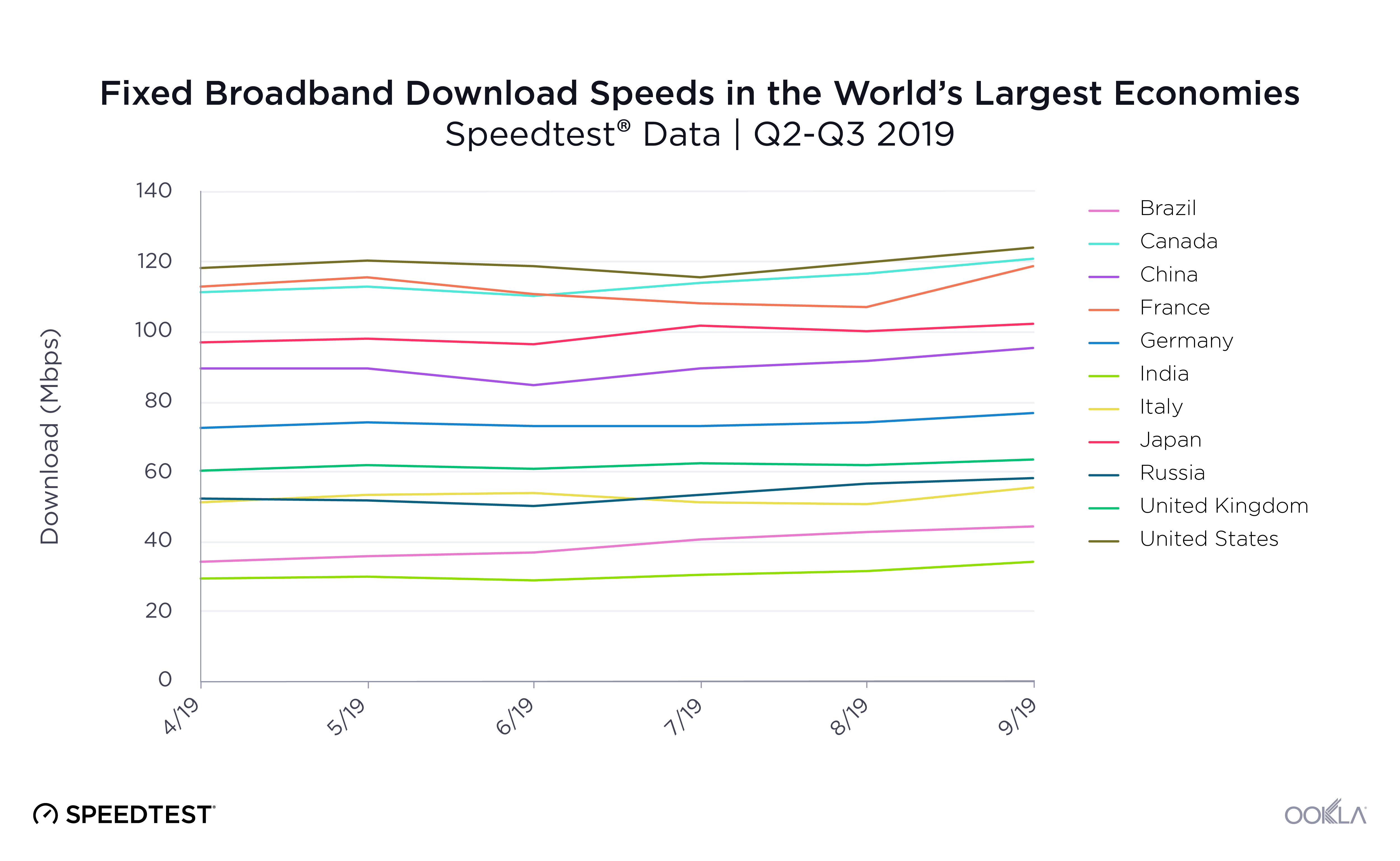
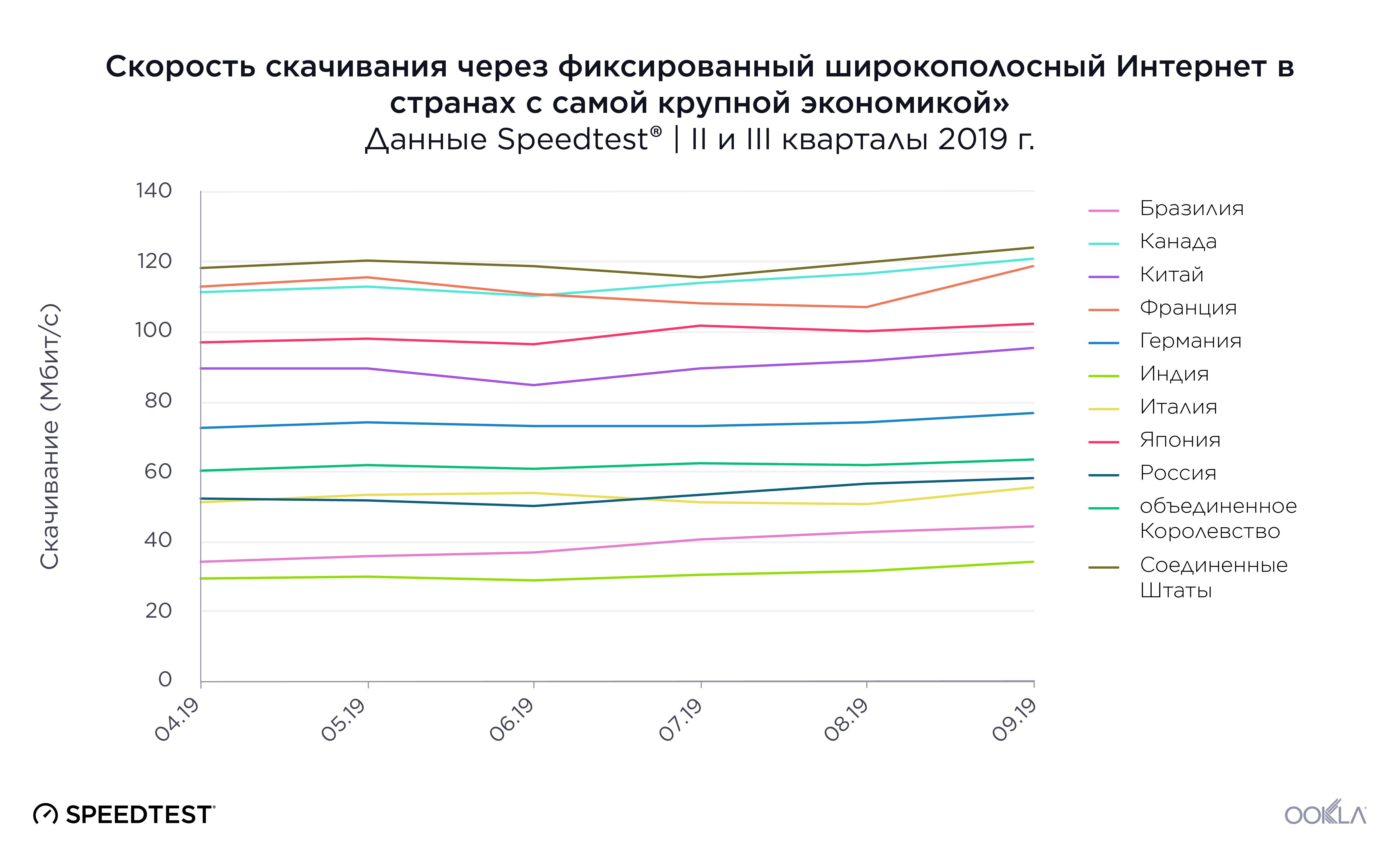
Russia’s mean download speed over fixed broadband trailed behind most of the world’s largest economies during Q2-Q3 2019. Russia placed ninth out of the 11 countries with a mean download speed of 53.46 Mbps during this period. Two other BRIC countries, Brazil and India, were slower than Russia with mean download speeds of 38.41 Mbps and 30.58 Mbps, respectively. The fourth BRIC country, China, placed fifth with a mean download over fixed broadband of 91.60 Mbps.
The United States secured the top spot among countries with the highest GDP with a mean download speed of 122.25 Mbps, 128.7% faster than Russia and 299.8% faster than India. Canada and France, ranked second and third, respectively, had almost identical mean download speeds of 112.86 Mbps and 112.84 Mbps, respectively.
On a month by month level, it’s interesting to note that most of the countries’ rankings did not change during this period — the exceptions were Russia and Italy which vied for eighth and ninth place and Canada which overtook France.
Brazil had the most significant gain during Q2-Q3 2019, with an increase in mean download speed of 29.5% (from 34.23 Mbps in April to 44.34 Mbps in September). India and Russia also experienced notable increases in their speeds. India’s mean download speed increased by 16.5%, while Russia experienced an 11.0% increase in mean download speed in the span of six months. These improvements open the door to the possibility of higher rankings for all three countries in the future.
Rankings on upload speed over fixed broadband did not match those for download speeds. Russia ranked well at third place (with a mean upload speed of 55.78 Mbps) during Q2-Q3 2019 when comparing upload speeds among countries with the highest GDP. Upload speeds on the top three spots showed a significant gap between Japan’s first place 105.83 Mbps and Russia’s 55.78 Mbps, a drop of 47.3%. Brazil, Germany and the U.K. fell to the last three spots in this category with upload speeds ranging from 15.62 Mbps to 19.21 Mbps. First-place Japan’s mean upload speed was a remarkable 577.5% faster than that of the U.K. during Q2-Q3 2019.
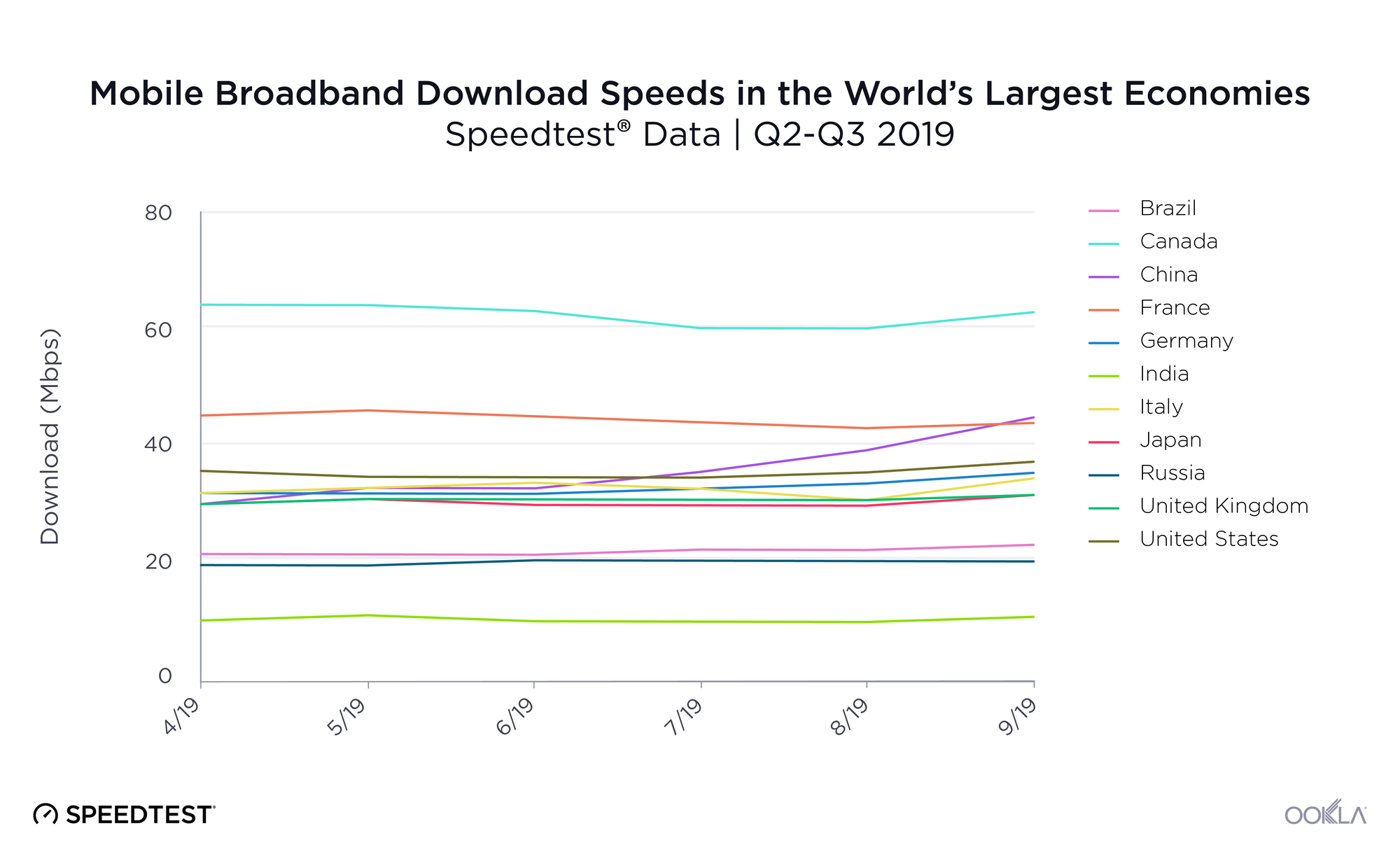
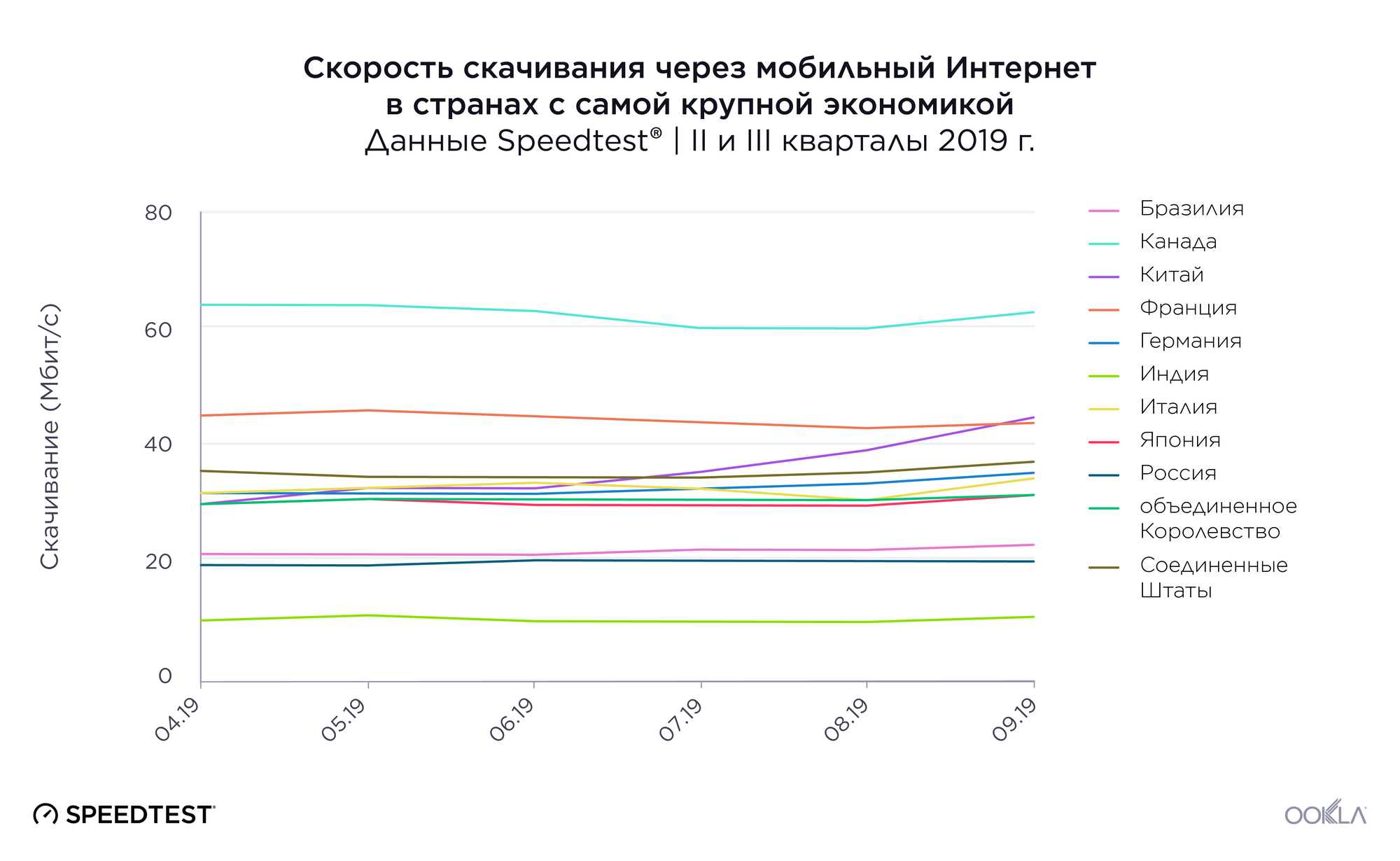
Speedtest data on mean download speeds over mobile reveals Canada, France, and China led the world’s largest economies during Q2-Q3 2019 with mean download speeds ranging between 36.68 Mbps and 62.62 Mbps. In tenth place, Russia once again landed in the bottom three along with Brazil and India. At 19.86 Mbps, Russia’s mean download speed on mobile was 68.3% slower than Canada’s.
While there were significant shifts in the rankings of mobile download speed on a month by month basis, China was the only country that experienced a major increase in mobile speed during Q2-Q3 2019. From April to September, China’s mean download speed on mobile increased by a notable 51.3%. This increase makes it more likely for China to lead the group in this category in the future. 5G will of course play a role in mobile speed increases. According to the Ookla 5G MapTM, China, Germany, Italy, the U.K. and the U.S. are the only countries on this list with commercially available 5G as of November 18, 2019.
Russia also ranked poorly for mean upload speeds on mobile broadband during Q2-Q3 2019, coming in eighth with 9.40 Mbps when compared with the world’s largest economies. China ranked first with a mean upload speed of 14.86 Mbps, followed by Canada and Italy with mean upload speeds of 13.85 Mbps and 12.61 Mbps, respectively. Russia’s mean upload speed was 36.7% slower than China’s.
Japan, Brazil, and India made up the bottom three with mean upload speeds of 9.38 Mbps, 9.07 Mbps and 4.20 Mbps, respectively. First-place China’s mean upload speed was 253.8% faster than eleventh-place India’s mean upload speed during this period.
Russia’s 4G Availability was 60.4%
| Country |
4G Availability |
| Japan |
98.8% |
| China |
96.7% |
| U.S. |
94.0% |
| Canada |
91.3% |
| U.K. |
88.0% |
| India |
87.9% |
| France |
86.4% |
| Italy |
85.0% |
| Germany |
68.9% |
| Russia |
60.4% |
| Brazil |
47.3% |
Russia ranked tenth for 4G Availability among the world’s largest economies during Q2-Q3 2019 with only 60.4% of surveyed locations in Russia having access to 4G LTE. This is not surprising given the vast land mass that Russian operators must contend with when building out mobile networks, as Russia is 80.1% larger in area than the next biggest country, Canada.
Japan had the highest 4G Availability on our list at 98.8%. China was a close second at 96.7% and the United States third at 94.0%. There was a significant gap in 4G Availability between eighth place Italy and ninth place Germany. Brazil completes the list in eleventh place.
Internet speeds vary widely between Russia’s largest cities
Fixed broadband download speeds in Russia’s largest cities
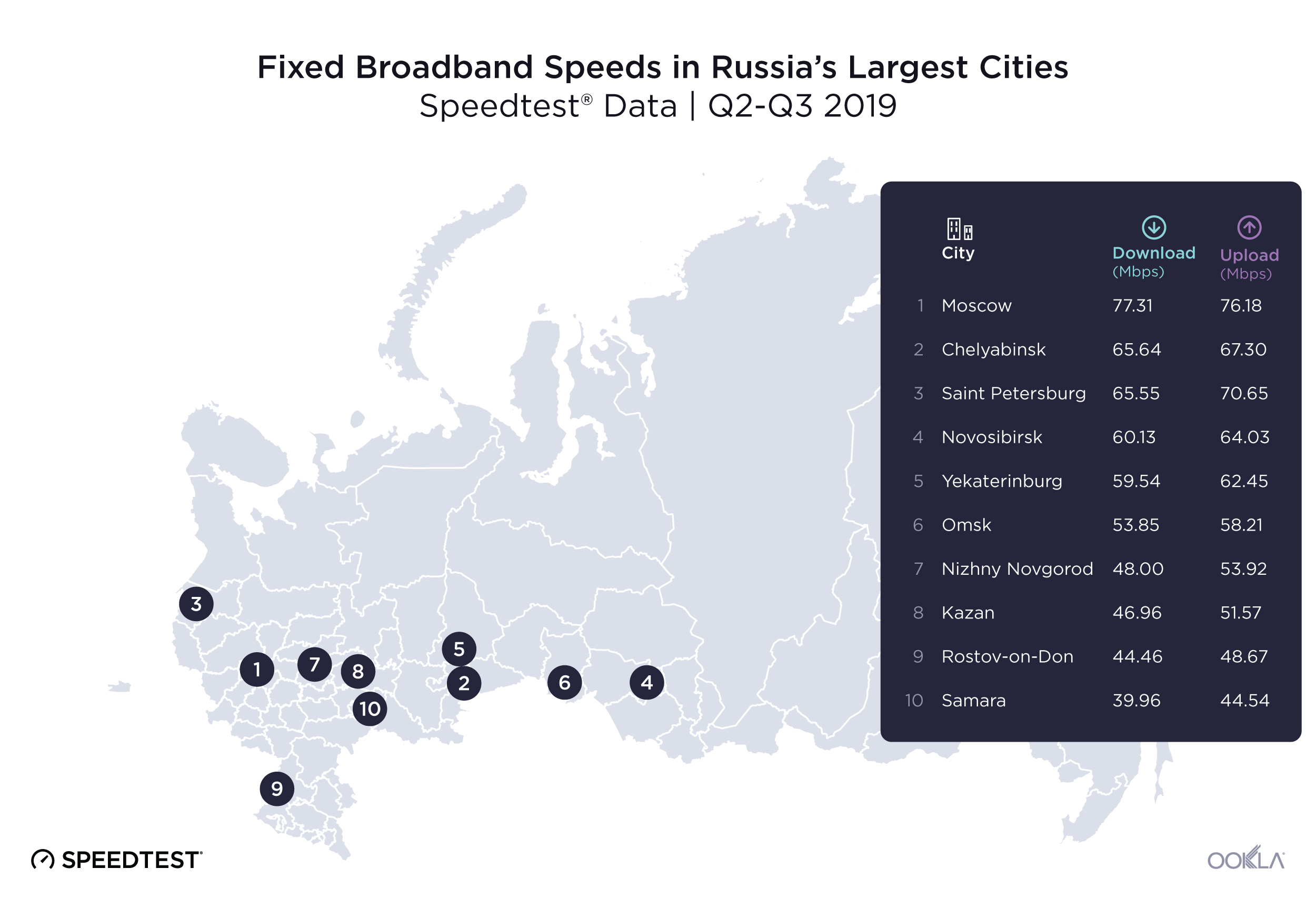
Speedtest data for mean download speed over fixed broadband showed a disparity among Russia’s most populous cities during Q2-Q3 2019. First place Moscow, both the most populous city on the list and Russia’s capital, had a mean download speed of 77.31 Mbps during Q2-Q3 2019. Moscow’s mean download speed over fixed broadband was 93.5% faster than last-place Samara’s at 39.96 Mbps.
Mean upload speeds on fixed broadband indicated a smaller gap between the fastest and slowest speeds. Moscow once again lead the group with a mean upload speed on fixed broadband of 76.18 Mbps, followed by Saint Petersburg with a mean upload speed of 70.65 Mbps. Rostov-on-Don and Samara ranked ninth and tenth with mean upload speeds of 48.67 Mbps and 44.54 Mbps, respectively. There was a 71.0% difference between Moscow’s mean upload speed and Samara’s during this period.
Mobile download speeds show less variation in Russia’s largest cities
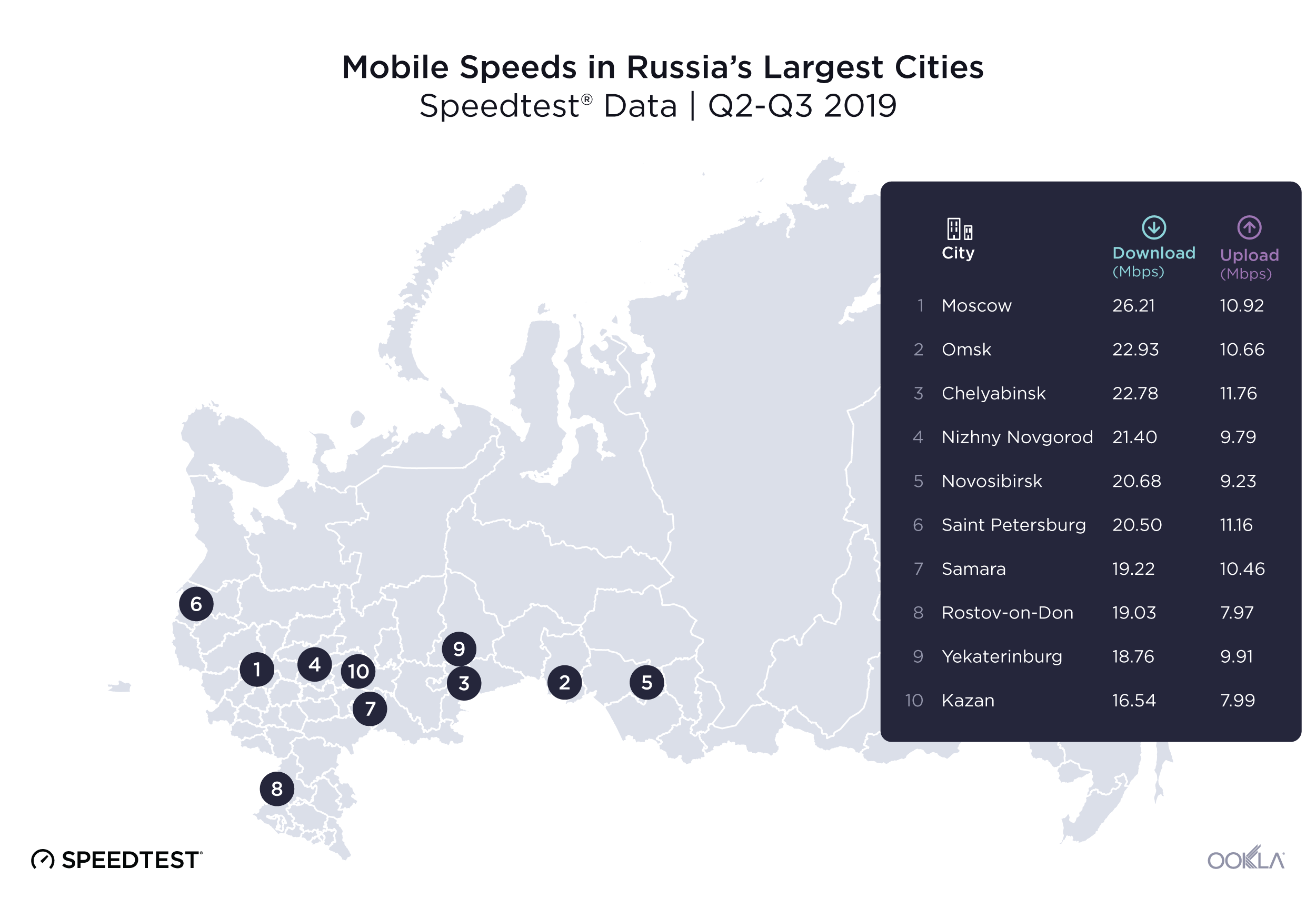
The gap between the fastest and slowest speeds in Russia’s largest cities was narrower on mobile broadband than on fixed during Q2-Q3 2019. Moscow ranked first with a mean download speed on mobile of 26.21 Mbps. Kazan had the slowest mean download speed at 16.54 Mbps. Moscow’s mean download speed was 58.5% faster than that of Kazan.
Chelyabinsk ranked first for mean upload speed on mobile broadband at 11.76 Mbps during Q2-Q3 2019. Saint Petersburg ranked second with 11.16 Mbps and Moscow ranked third with 10.92 Mbps. Rostov-on-Don ranked last with a mean upload speed of 7.97 Mbps, 32.2% slower than Chelyabinsk during this period.
4G Availability is relatively strong in Russia’s largest cities
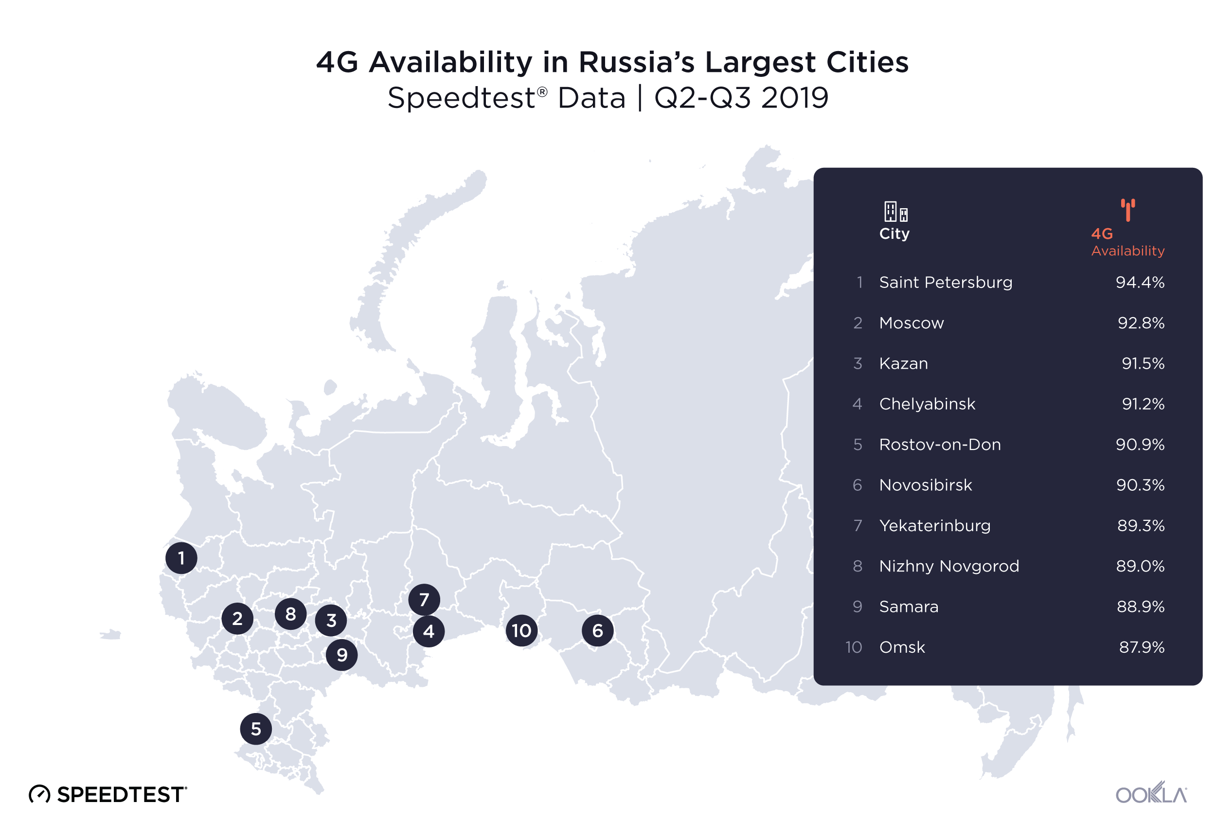
4G Availability during Q2-Q3 2019 was more consistent between Russia’s largest cities than internet speeds. Looking at 4G Availability during Q2-Q3 2019, Saint Petersburg was on top with 94.4% of surveyed locations showing access to 4G, followed by Moscow (92.8%) and Kazan (91.5%). Samara and Omsk ranked last for 4G Availability at 88.9% and 87.9%, respectively.
Internet speeds vary even more between Russia’s oblasts
We examined Speedtest data in Russia’s oblasts during Q2-Q3 2019 to see if there was any geographic logic to speeds. What we found was a large disparity in speeds that did not lend itself immediately to a geographic explanation.
Download speeds over fixed broadband are 175% faster in Russia’s fastest oblast than in the slowest
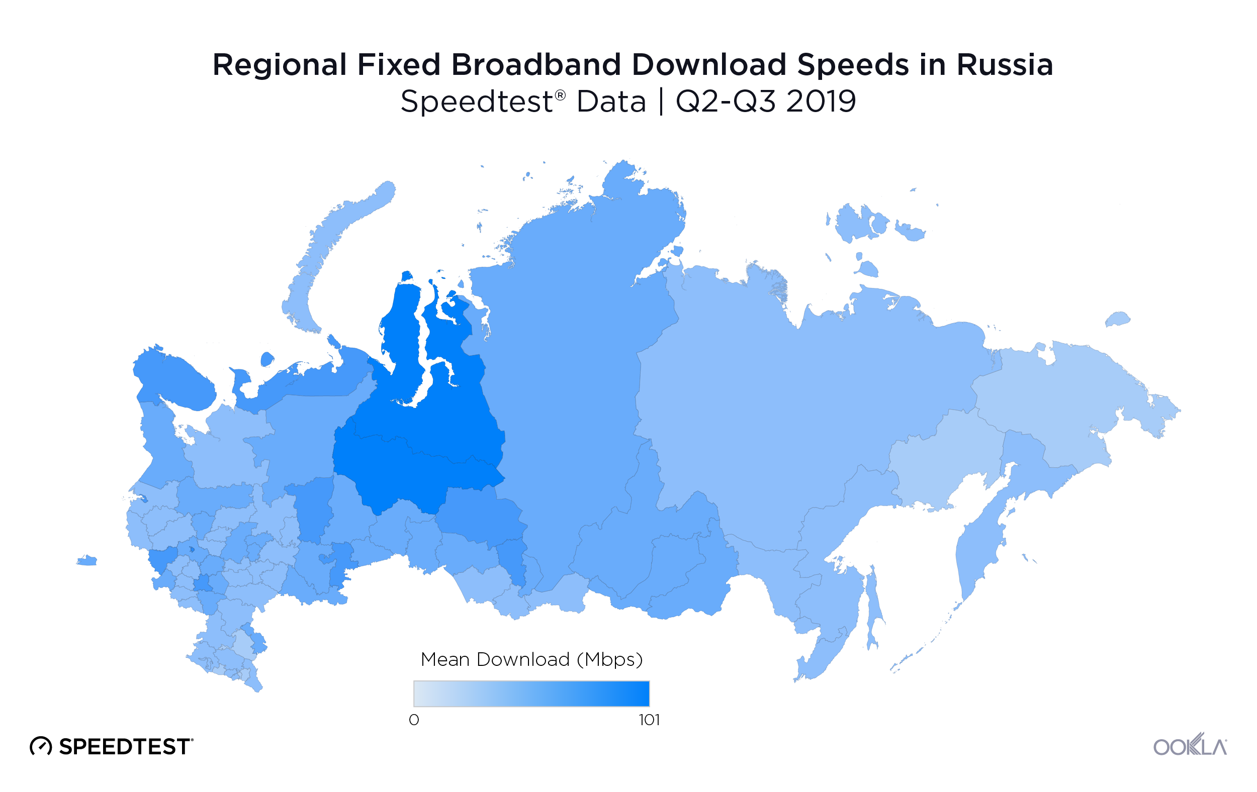
Murmansk, located near the border with Finland, was the fastest oblast in Russia during Q2-Q3 2019 with a mean download speed over fixed broadband of 71.13 Mbps. Kemerovo was second and Lipetsk third with mean download speeds of 68.32 Mbps and 66.37 Mbps, respectively. Kemerov is located in the south central region of the country, north of Russia’s border with Mongolia, Kazakhstan and China. Lipetsk is located closer to Europe, just east of Belarus.
Kaluga, Belgorod and Magadan were the three Russian oblasts with the slowest mean download speeds over fixed broadband in Q2-Q3 2019. First-place Murmank’s mean download speed was 175.0% faster than the mean download speed Magadan experienced during this period. Both Kaluga and Belgorod are located in the western part of the country, closer to Ukraine and Belarus. Magadan is on the other side of the country, closer to the Bering Sea and the Alaskan coast.
Mobile broadband speeds in Russia’s oblasts
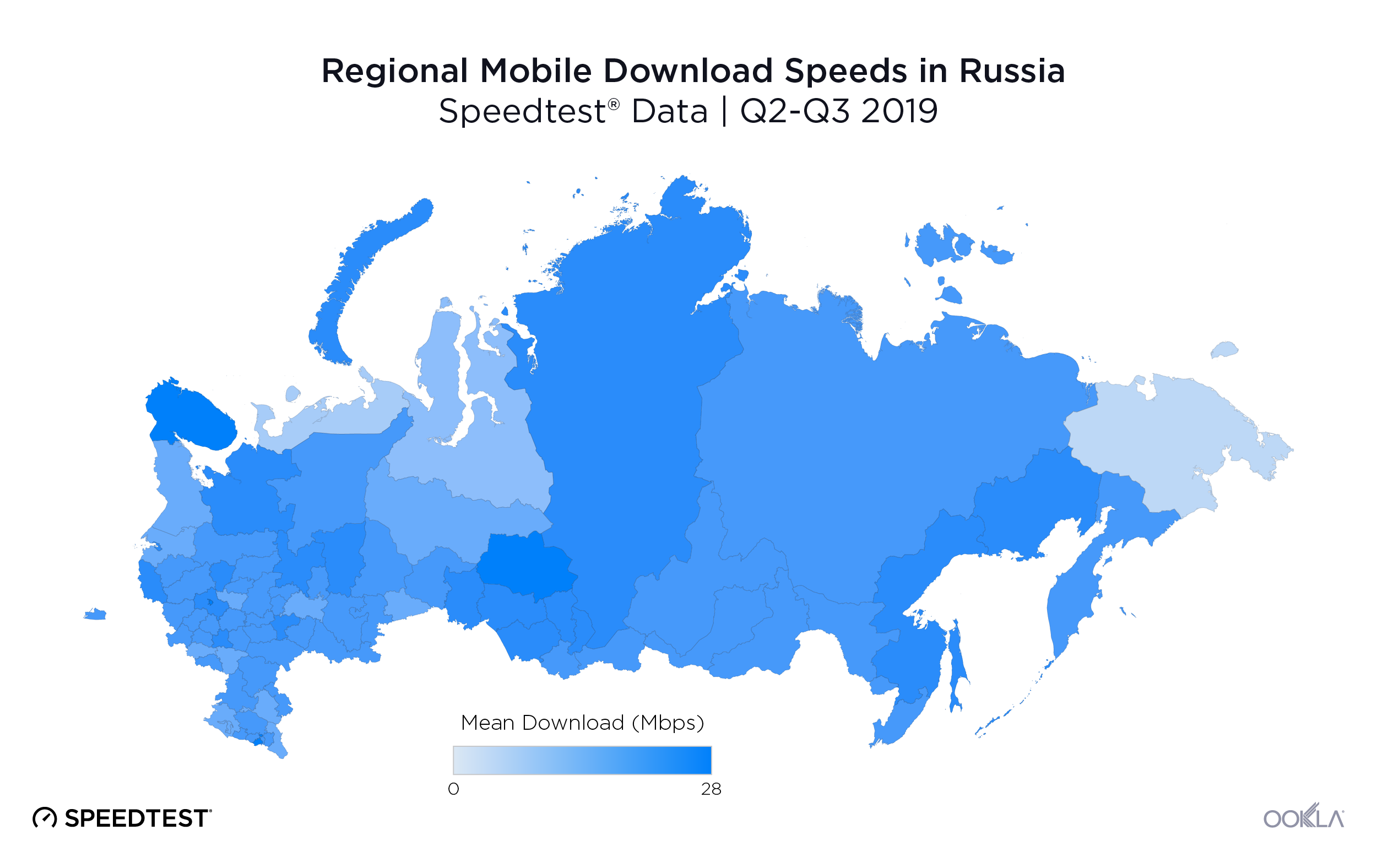
Aside for Murmansk and Kaluga, the list of oblasts with the fastest and slowest mean download speeds over mobile broadband during Q2-Q3 2019 was completely different from what we saw with fixed broadband. In addition, the range of speeds among Russian oblasts narrowed on mobile broadband.
Tomsk, located north of Kazakhstan, had the fastest mean download speed on mobile broadband at 25.91 Mbps during Q2-Q3 2019. Murmansk followed Tomsk with a mean download speed of 24.50 Mbps. Ulyanovsk, located in the southwest part of Russia, was third with a mean download speed of 23.11 Mbps.
The slowest oblast for mean download speed over mobile was Leningrad, followed by Vladimir and Kursk. All three oblasts are located on the west side of the country, closer to Europe than Asia. Kursk borders Ukraine, Vladimir borders Moscow Oblast and Leningrad borders both Estonia and Finland. First-place Tomsk’s mean download speed over mobile was 85.2% faster than Leningrad’s during Q2-Q3 2019.
Russian oblasts show wide variances in 4G Availability

4G Availability in Russian oblasts varied greatly, ranging from 37.1% to 75.5% of surveyed locations having access to 4G LTE during Q2-Q3 2019. Moscow Oblast had the highest 4G Availability during Q2-Q3 2019 at 75.5%, followed by Magadan’s 71.5% and Sakhalin’s 66.7%. Vologda Oblast had the lowest 4G Availability among Russian oblasts during Q2-Q3 2019 at 37.1%. Pskov Oblast was the second lowest at 37.3% and the Jewish Autonomous Oblast third at 37.5%.
Our analysis shows Russia is more competitive with BRIC countries when it comes to internet speeds and 4G Availability than it is to the world’s largest economies as a whole. Speeds and availability vary, though, between Russia’s largest cities and across oblasts. We’ll be watching this market closely to see if the improvements we saw carry forward into a brighter telecom future for Russia.
To find out more about internet speeds at the provider level or in a specific city, region or country, reach out to our team here.
Россия как государство с одной из крупнейших в мире экономик и самой большой территорией — интересная область для исследования скорости Интернета. На протяжении II и III кварталов 2019 года мы изучали данные Speedtest® о скорости мобильного и фиксированного широкополосного Интернета, а также о доступности 4G, чтобы сравнить показатели России с десятью другими странами с самой крупной в мире экономикой. Кроме того, мы проанализировали данные из областей России и самых густонаселенных городов, чтобы определить, как скорость и доступность различаются по огромной территории этой страны.
Россия заняла девятое место по скорости скачивания через фиксированный широкополосный Интернет среди стран с самой крупной в мире экономикой
Средняя скорость скачивания через фиксированный широкополосный Интернет в России оказалась ниже, чем в большинстве стран с самой крупной экономикой во II и III кварталах 2019 г. Россия заняла девятое место среди 11 стран со средней скоростью скачивания 53,46 Мбит/с за этот период. Скорость в двух других странах из объединения БРИК — в Бразилии и Индии — была ниже, чем в России: 38,41 Мбит/с и 30,58 Мбит/с соответственно. Китай, четвертая страна из объединения БРИК, заняла пятое место со средней скоростью скачивания через фиксированный широкополосный Интернет на уровне 91,60 Мбит/с.
Соединенные Штаты Америки возглавили список среди стран с самым высоким ВВП, показав среднюю скорость скачивания 122,25 Мбит/с — на 128,7% выше, чем Россия, и на 299,8% выше, чем Индия. В Канаде и Франции, которые заняли второе и третье места соответственно, средняя скорость скачивания практически идентична показателю США: 112,86 Мбит/с и 112,84 Мбит/с соответственно.
Если отслеживать данные по месяцам, интересно отметить, что рейтинг большинства стран не изменился за этот период, за исключением России и Италии, которые конкурировали за восьмое и девятое места, а также Канады, которая опередила Францию.
Самое значительное увеличение скорости во II и III кварталах наблюдалось в Бразилии, где средняя скорость скачивания выросла на 29,5% (с 34,23 Мбит/с в апреле до 44,34 Мбит/с в сентябре). Повышение скорости отмечалось также в Индии и России. Средняя скорость скачивания в Индии увеличилась на 16,5%, а в России — на 11,0% за шесть месяцев. Такие улучшения демонстрируют, что в будущем эти три страны потенциально могут улучшить свои позиции в рейтинге.
Рейтинги по скорости передачи данных через фиксированный широкополосный Интернет не совпадают с показателями для скорости скачивания. При сравнении скорости передачи данных в странах с самым высоким ВВП во II и III кварталах 2019 г. Россия заняла третье место (со средней скоростью передачи данных 55,78 Мбит/с). Наблюдается значительный разрыв между странами, занявшими первые три места по скорости передачи данных: разница между Японией, занявшей первое место с показателем 105,83 Мбит/с, и Россией со скоростью 55,78 Мбит/с составляет 47,3%. Бразилия, Германия и Великобритания занимают последние три места в этой категории со скоростью передачи данных в диапазоне от 15,62 Мбит/с до 19,21 Мбит/с. Средняя скорость передачи данных в Японии, занявшей первое место, во II и III кварталах 2019 г. была на 577,5% выше, чем в Великобритании.
Россия заняла 10-е место по скорости скачивания через мобильный Интернет
Данные Speedtest о средней скорости скачивания через мобильный Интернет показывают, что Канада, Франция и Китай заняли ведущие позиции среди стран с самой крупной в мире экономикой во II и III кварталах 2019 г. со средней скоростью скачивания от 36,68 Мбит/с до 62,62 Мбит/с. Россия заняла десятое место, снова в группе с Бразилией и Индией, которые оказались в числе последних. Средняя скорость скачивания через мобильный Интернет в России (19,86 Мбит/с) оказалась на 68,3% ниже, чем в Канаде.
По месяцам наблюдались значительные изменения в рейтингах по скорости скачивания через мобильный Интернет, однако Китай стал единственной страной, которая существенно увеличила скорость мобильного Интернета во II и III кварталах 2019 г. В период с апреля по сентябрь средняя скорость скачивания через мобильный Интернет в Китае выросла на 51,3%. При таком росте становится вероятнее, что Китай займет ведущую позицию в этой категории в будущем. Несомненно, 5G сыграет свою роль в повышении скорости мобильного Интернета. Согласно карте Ookla 5G MapTM, Китай, Германия, Италия, Великобритания и США — это единственные страны из представленного списка, в которых сеть 5G доступна на коммерческой основе, по данным на 18 ноября 2019 г.
Россия также получила низкий рейтинг по средней скорости передачи данных через мобильный Интернет во II и III кварталах 2019 г., заняв восьмое место с показателем 9,40 Мбит/с при сравнении с другими странами с самой крупной экономикой. Китай занял первое место со средней скоростью передачи данных 14,86 Мбит/с, а второе и третье места заняли Канада и Италия со средней скоростью передачи 13,85 Мбит/с и 12,61 Мбит/с соответственно. Средняя скорость передачи данных в России была на 36,7% ниже, чем в Китае.
Три нижние позиции заняли Япония, Бразилия и Индия со средней скоростью передачи данных 9,38 Мбит/с, 9,07 Мбит/с и 4,20 Мбит/с соответственно. Разница по средней скорости передачи данных между Китаем, занявшим первое место, и Индией, занявшей одиннадцатое место, составила 253,8% за этот период.
Доступность 4G в России составила 60,4%
| Страна |
Доступность 4G |
| Япония |
98,8% |
| Китай |
96,7% |
| США |
94,0% |
| Канада |
91,3% |
| Великобритания |
88,0% |
| Индия |
87,9% |
| Франция |
86,4% |
| Италия |
85,0% |
| Германия |
68,9% |
| Россия |
60,4% |
| Бразилия |
47,3% |
Россия заняла десятое место по доступности 4G среди стран с крупнейшей в мире экономикой во II и III кварталах 2019 года: только 60,4% расположений, в которых проводилось исследование в России, имели доступ к LTE-сети 4G. Такой результат не удивляет, если учитывать огромную территорию, которую необходимо охватывать российским операторам связи при строительстве мобильных сетей, поскольку Россия на 80,1% больше по площади, чем следующая по величине страна — Канада.
Максимальный показатель доступности 4G в нашем списке продемонстрировала Япония — 98,8%. С небольшим отрывом на втором месте Китай (96,7%), а на третьем — США (94%). Значительную разницу по доступности 4G можно отметить между Италией, занявшей восьмое место, и Германией, занявшей девятую позицию. Замыкает список Бразилия — одиннадцатое место.
Скорость Интернета значительно различается в крупных городах России
Скорость скачивания через фиксированный широкополосный Интернет в крупнейших городах России
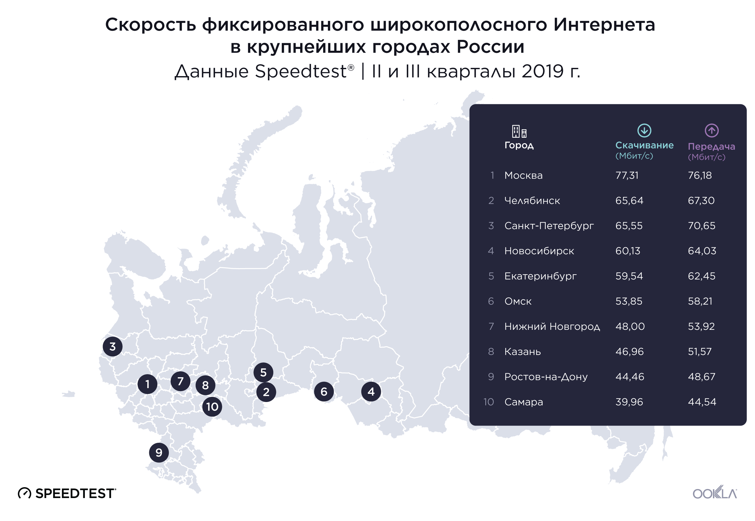
Данные Speedtest о средней скорости скачивания через фиксированный широкополосный Интернет показали значительные различия между самыми густонаселенными городами России во II и III кварталах 2019 г. Первое место заняла Москва, самый густонаселенный город и столица России, со средней скоростью скачивания 77,31 Мбит/с во II и III кварталах 2019 г. Средняя скорость скачивания в Москве была на 93,5% выше, чем в Самаре (39,96 Мбит/с), занявшей последнее место.
Различия по средней скорости передачи данных через фиксированный широкополосный Интернет были менее значительными между городами на первом и последнем местах. Москва снова заняла первое место в группе со средней скоростью передачи данных через фиксированный широкополосный Интернет на уровне 76,18 Мбит/с. За ней следует Санкт-Петербург со средней скоростью передачи данных 70,65 Мбит/с. Ростов-на-Дону и Самара заняли девятое и десятое места со средней скоростью передачи данных 48,67 Мбит/с и 44,54 Мбит/с соответственно. В этот период разница между средней скоростью передачи данных в Москве и Самаре составила 71%.
Различия по скорости скачивания через мобильный Интернет в самых крупных городах России не настолько значительны
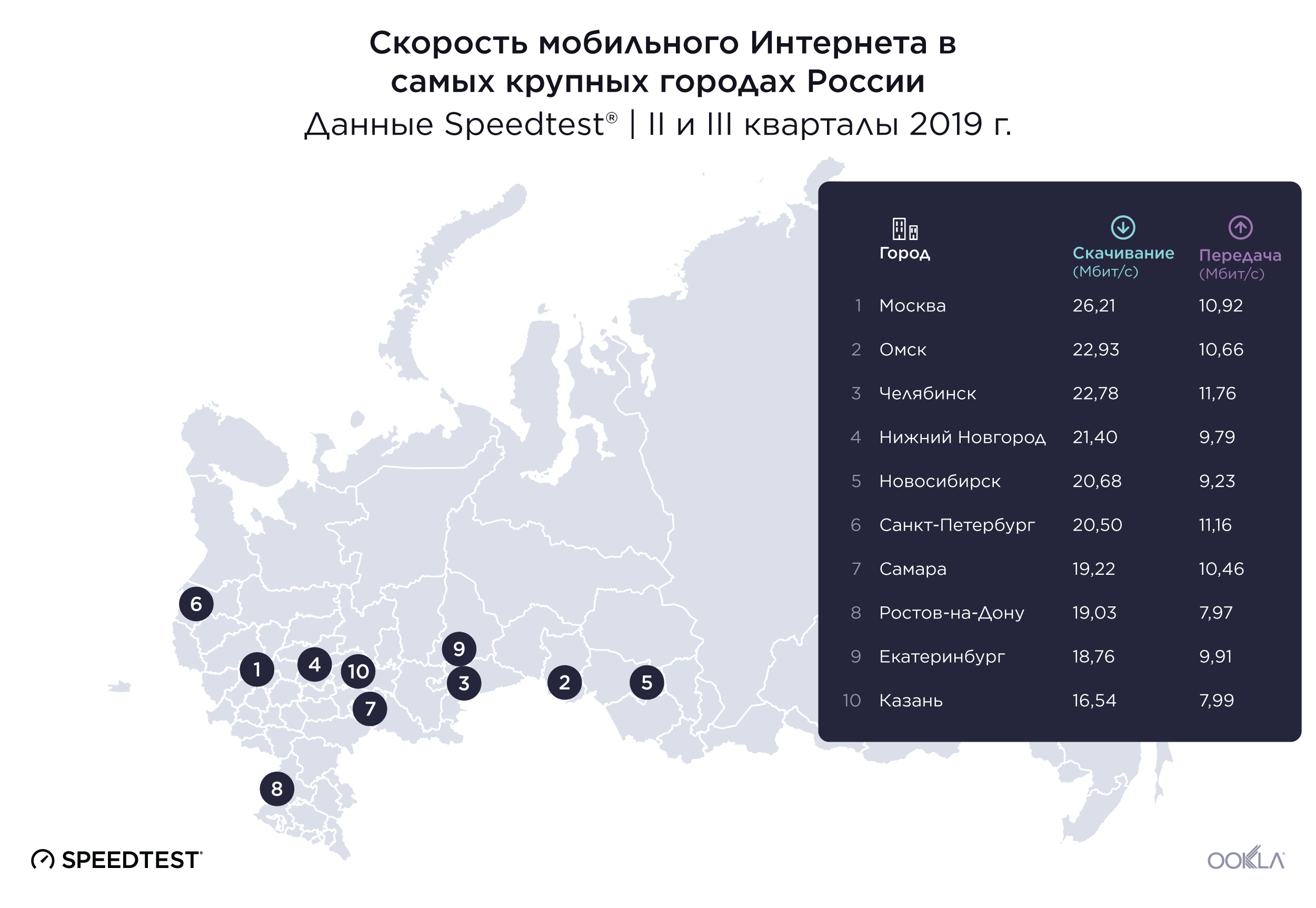
Разница между самой высокой и самой низкой скоростью в крупнейших городах России была меньше для мобильного Интернета, чем для фиксированного во II и III кварталах 2019 г. Москва заняла первое место со средней скоростью скачивания через мобильный Интернет 26,21 Мбит/с. Самая низкая средняя скорость скачивания была зафиксирована в Казани — 16,54 Мбит/с. Средняя скорость скачивания в Москве была на 58,5% выше, чем в Казани.
Челябинск занял первое место по средней скорости передачи данных через мобильный Интернет (11,76 Мбит/с) во II и III кварталах 2019 г. Санкт-Петербург занял второе место со скоростью 11,16 Мбит/с, а Москва — третье место со скоростью 10,92 Мбит/с. Ростов-на-Дону оказался на последнем месте со средней скоростью передачи данных 7,97 Мбит/с, которая была на 32,2% ниже, чем в Челябинске за этот период.
Доступность 4G относительно высока в крупнейших городах России
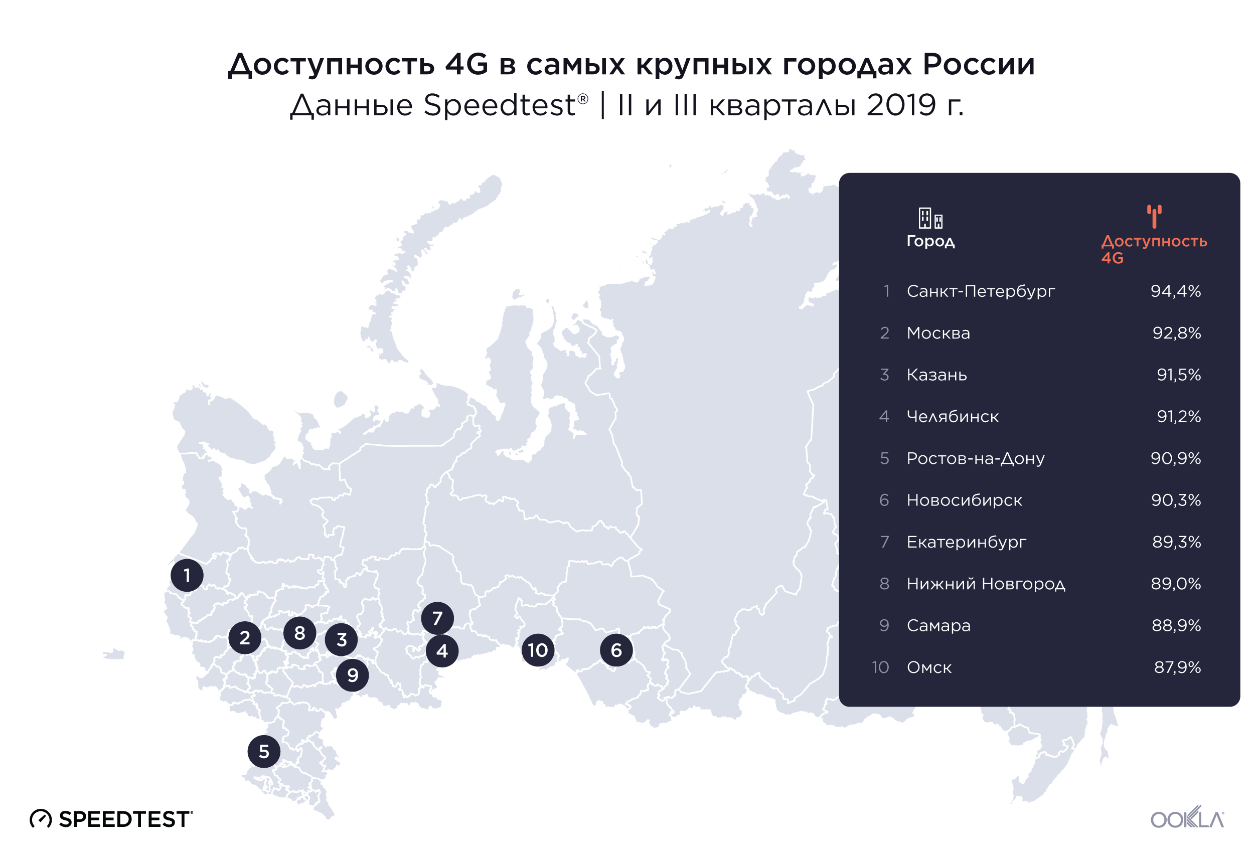
Показатели доступности 4G во II и III кварталах 2019 г. не так сильно варьировались в самых крупных городах России по сравнению со скоростью Интернета. По доступности 4G во II и III кварталах 2019 г. первое место занял Санкт-Петербург: в 94,4% расположений города доступна сеть 4G. За ним следуют Москва (92,8%) и Казань (91,5%). Самара и Омск заняли последние места в рейтинге по доступности 4G с показателями 88,9% и 87,9% соответственно.
Скорость Интернета различается еще больше между областями России
Мы изучили данные Speedtest по областям России за II и III кварталы 2019 г., чтобы определить, имеется ли какая-либо географическая закономерность, связанная со скоростью. Мы обнаружили значительные различия в скорости, которые не поддавались простому географическому объяснению.
Разница между самой высокой и самой низкой скоростью фиксированного широкополосного Интернета в областях России составила 175%
Во II и III кварталах средняя скорость скачивания через фиксированный широкополосный Интернет была выше всего в Мурманской области, расположенной возле границы с Финляндией, — 71,13 Мбит/с. Кемеровская область заняла второе, а Липецкая — третье место со средней скоростью скачивания 68,32 Мбит/с и 66,37 Мбит/с соответственно. Кемеровская область расположена в южно-центральном регионе страны, на север от границы России с Монголией, Казахстаном и Китаем. Липецкая область расположена ближе к Европе, на восток от Беларуси.
Калужская, Белгородская и Магаданская области — это три региона России с самой низкой средней скоростью передачи данных через фиксированный широкополосный Интернет во II и III кварталах 2019 г. Средняя скорость передачи в Мурманской области, занявшей первое место по этому показателю, была на 175% выше, чем аналогичный показатель в Магаданской области за этот период. Калужская и Белгородская области расположены в западной части страны, ближе к Украине и Беларуси. Магаданская область находится на противоположном конце страны, ближе к Беринговому морю и побережью Аляски.
Скорость мобильного Интернета в областях России
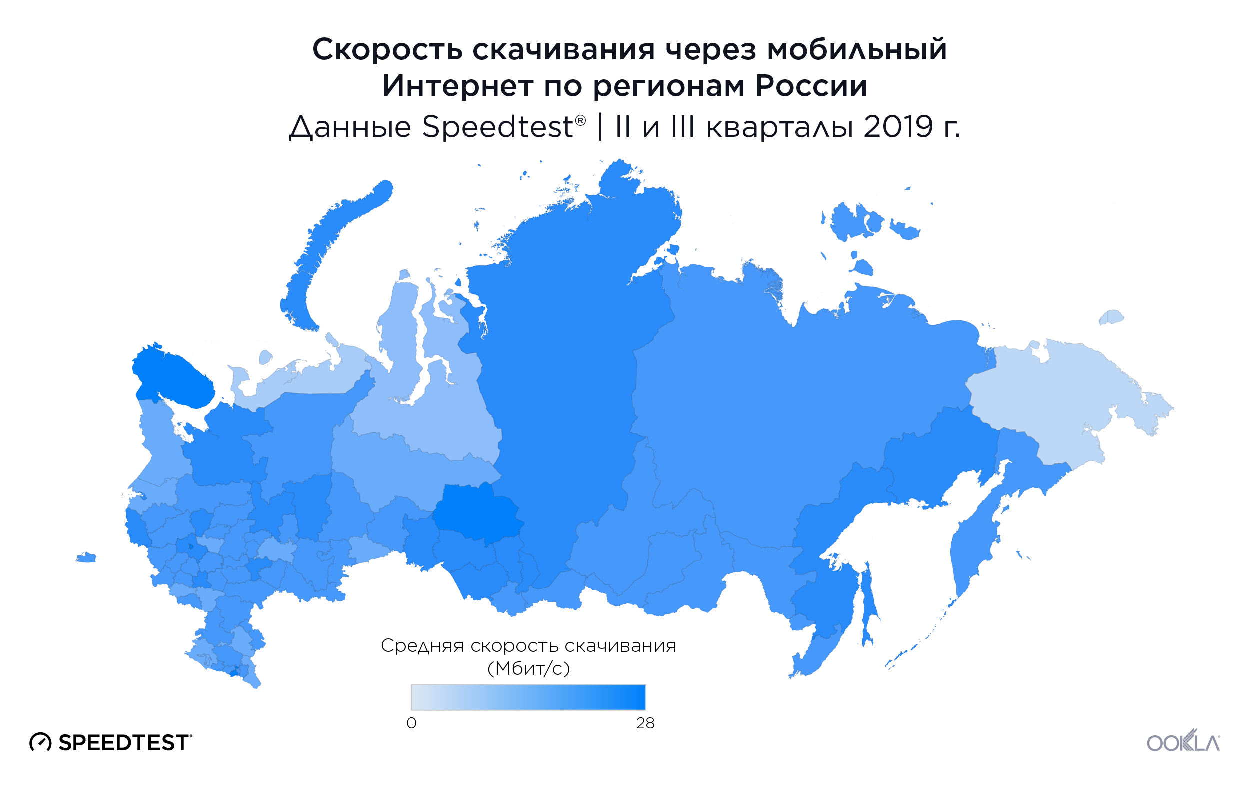
За исключением Мурманской и Калужской областей, список регионов с самой высокой и самой низкой средней скоростью скачивания через мобильный широкополосный Интернет во II и III кварталах 2019 г. значительно отличался от показателей для фиксированного широкополосного подключения. Более того, диапазон скорости мобильного Интернета среди областей России сократился.
Самая высокая средняя скорость скачивания через мобильный Интернет во II и III кварталах 2019 г. была зафиксирована в Томской области, расположенной на север от Казахстана, — 25,91 Мбит/с. Мурманская область заняла второе место после Томской со средней скоростью скачивания 24,50 Мбит/с. Ульяновская область, расположенная в юго-западной части России, заняла третье место со средней скоростью скачивания на уровне 23,11 Мбит/с.
Самая низкая средняя скорость скачивания через мобильный Интернет наблюдалась в Ленинградской области, за которой последовали Владимирская и Курская области. Все три области расположены в западной части страны, ближе к Европе, чем к Азии. Курская область граничит с Украиной, Владимирская — с Московской областью, а Ленинградская область — с Эстонией и Финляндией. Средняя скорость скачивания через мобильный Интернет в Томской области, занявшей первое место по этому показателю, была на 85,2% выше, чем в Ленинградской, во II и III кварталах 2019 г.
Области России демонстрируют значительные различия по доступности 4G
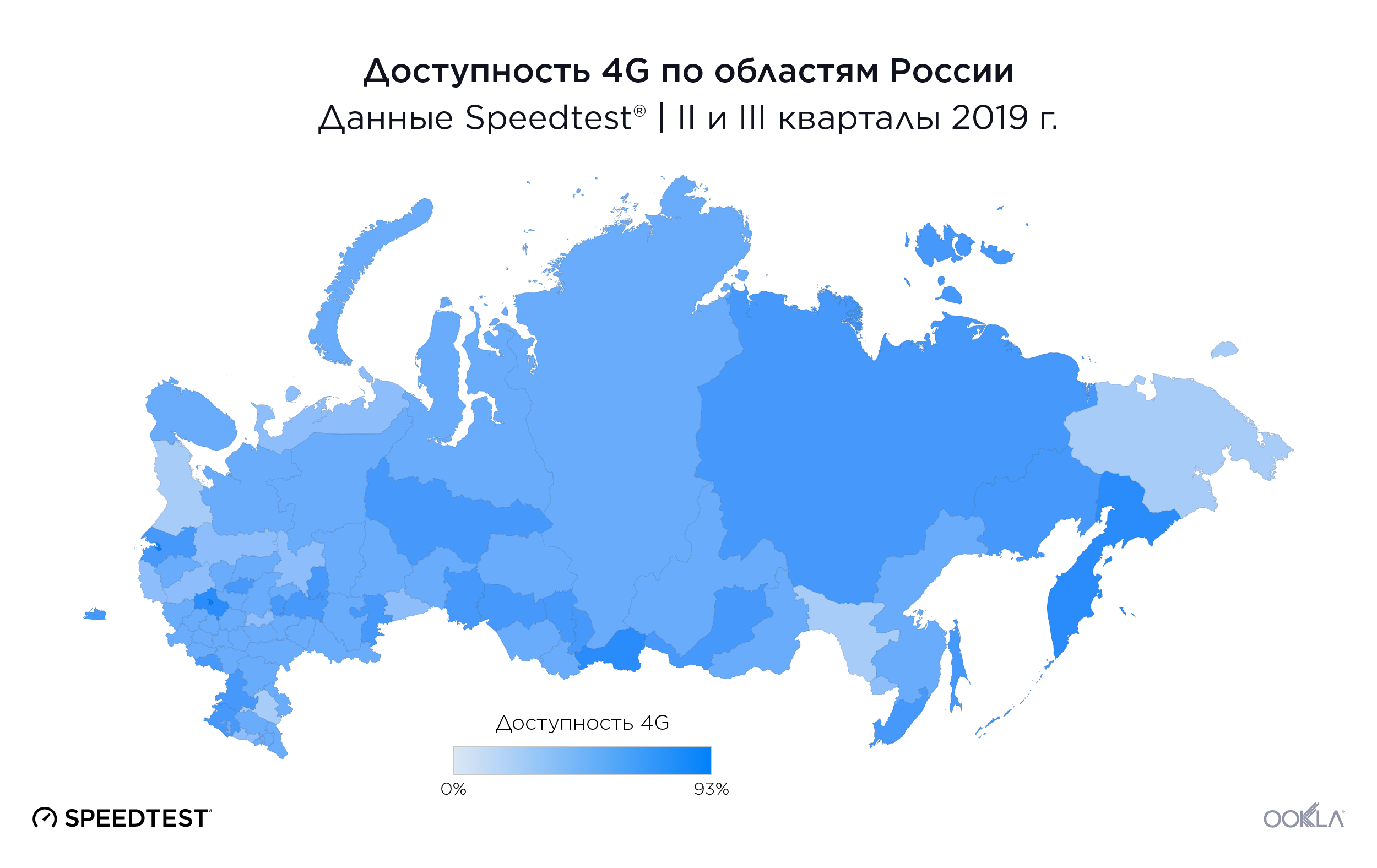
Во II и III кварталах 2019 г. доступность 4G по областям России значительно различалась: в исследуемых расположениях показатель доступности LTE-сети 4G колебался от 37,1% до 75,5%. В Московской области наблюдался самый высокий уровень доступности 4G во II и III кварталах 2019 г. — 75,5%. За ней последовали Магаданская (71,5%) и Сахалинская (66,7%) области. Самая низкая доступность 4G среди областей России во II и III кварталах 2019 г. была зарегистрирована в Вологодской области — 37,1%. Псковская область заняла предпоследнее место с показателем 37,3%, а Еврейская автономная область — третье место с конца с доступностью на уровне 37,5%.
Наш анализ демонстрирует, что показатели России лучше соотносятся со странами объединения БРИК в аспекте скорости Интернета и доступности 4G, чем со странами с самой крупной экономикой в целом. Однако скорость и доступность значительно различаются в крупнейших городах России и по областям. Мы будем пристально следить за этим рынком, чтобы узнать, приведут ли отмеченные улучшения к дальнейшему развитию телекоммуникаций в России.
Чтобы узнать больше о скорости Интернета на уровне отдельного провайдера, города, региона или страны, свяжитесь с нашей командой по этой ссылке.