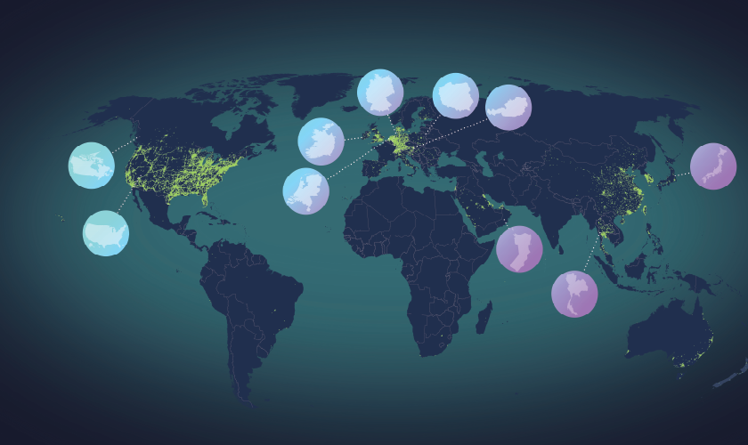
Football fans are excited to cheer on their team at the Big Game in Los Angeles this weekend. They will also undoubtedly stream and share the experience with friends, family, and coworkers from their mobile devices. Operators are ready, having invested heavily to make the mobile experience as seamless as possible. Competitive insights from Ookla® Wind® help ensure their network is ready to show off their latest 5G spectrum, and deliver blazing fast speeds to the crowd. While we can’t share the results of game day live walk tests and real-time network benchmarking, we have a glimpse into what goes into optimizing for an event of this scale.
Wind has a long history of benchmarking the most challenging large stadium events
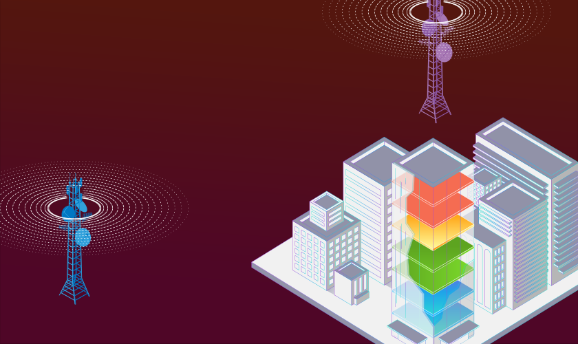
Network operators spend weeks and even months preparing for large stadium events because an outage, dead zone, or network congestion could become a high-profile publicity disaster. That’s why for the past nine years, the Wind team has helped network operators prepare and optimize their networks with multi-week preparatory engagements, including benchmark and optimization venue testing, live day-of RF command center support, and real-time analysis dashboards to make sure everything goes just right and any unforeseen problems are caught early and fixed.
Wind data previews what fans can expect from mobile networks on Sunday
The Wind team has already walk-tested inside and outside SoFi Stadium in Los Angeles multiple times with our handset-based Android Wind app starting weeks ahead of the big game to benchmark operator performance. We can’t reveal which operator has the best setup, but we can share anonymized data to show how operators perform in various locations through the upper concourse, between the 400-level and 500-level sections, for 4G LTE and 5G RSRP by provider, overall signal strength (RSRP) and signal quality (RSRQ) by provider over time, download and upload throughputs over time, as well as more technical 4G LTE and 5G data for carrier aggregation and modulation data.
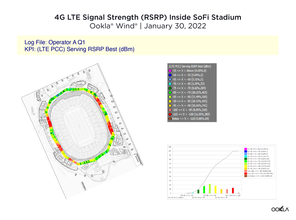
The GIF above shows 4G LTE signal strength (RSRP) for operators during our walk test with red showing a weak RSRP signal strength and green and blue showing stronger RSRP signals. As you can see, the anonymized data for Operator A shows strong 4G LTE signals throughout the stadium, with strong signals in the north and south of the of the stadium and four areas of red, weak RSRP signals abutting the VIP boxes on both the east and west sides of the stadium. Operator B has a similar map, though Operator B has narrow bands of strong signal and weak signal overlapping on the south side of the stadium. Operator C had strong signals in the north and east of the stadium, but lower 4G LTE signal strength in the southwest corner with few areas having RSRP signals over -80 dBm.
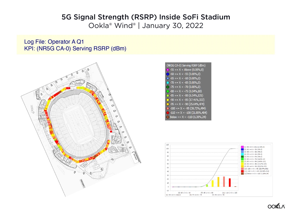
Strong 5G RSRP signal was harder to find in SoFi stadium during our walk test. Operator A had pervasive weaker signals throughout, though only a few areas of very low RSRP strength in the north and south of the maps. Operator B had concentrated areas of stronger 5G RSRP signal strength near the north and south wind tunnel openings of SoFi’s sleek stadium design, though much weaker signals in the east and west of the map, and some veritable 5G dead zones near for VIP ticket holders to the west. Operator C had a concentrated strong area in the south of the map opposite YouTube Theater, though overall had weaker signals.
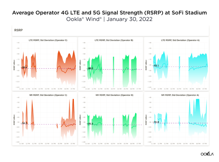
When viewing the walk test results over time, the overall average data shows similar signal strength (RSRP) between providers, though Operator A averaged a slightly higher signal strength (RSRP) over 4G LTE and 5G than the other operators.
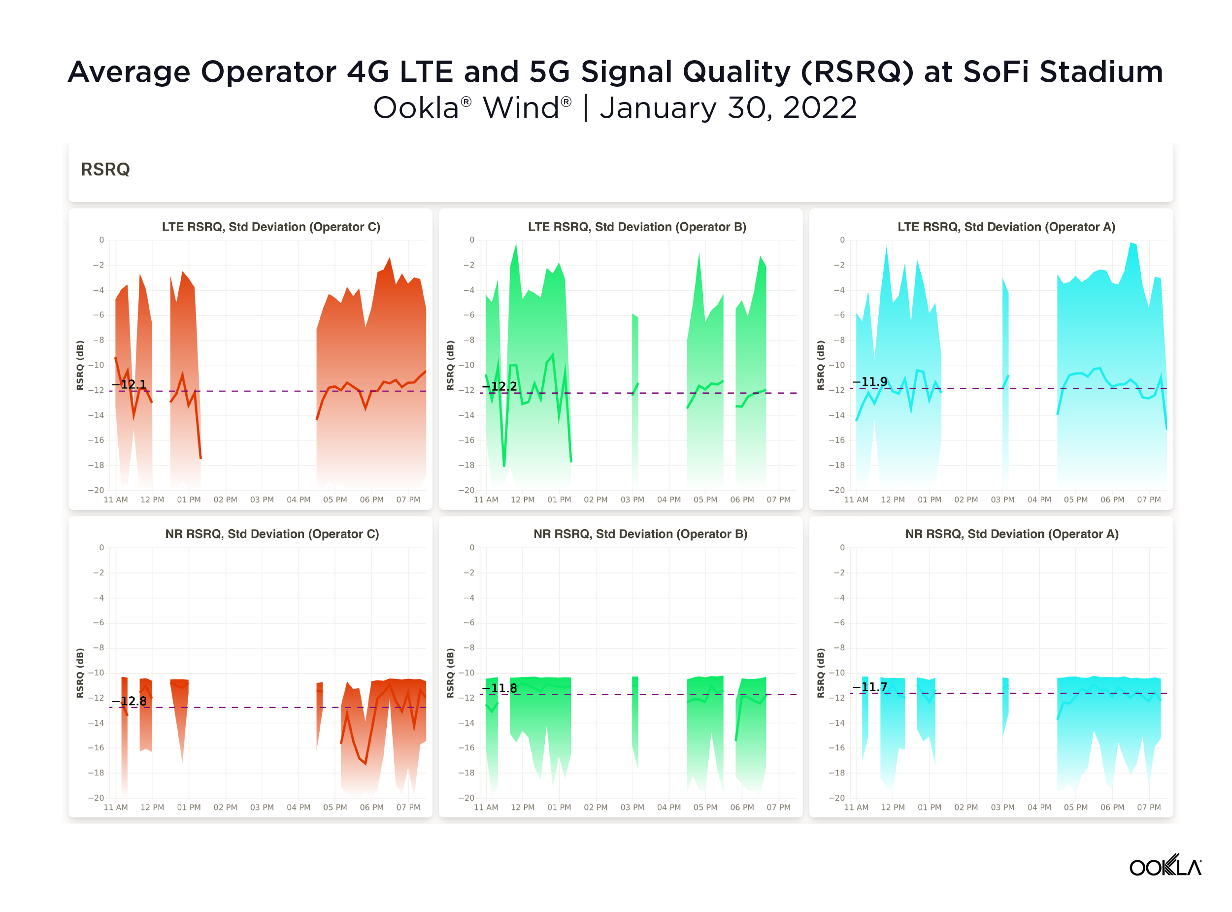
Signal quality (RSRQ) showed more parity between operators on both 4G LTE and 5G as you can see above.
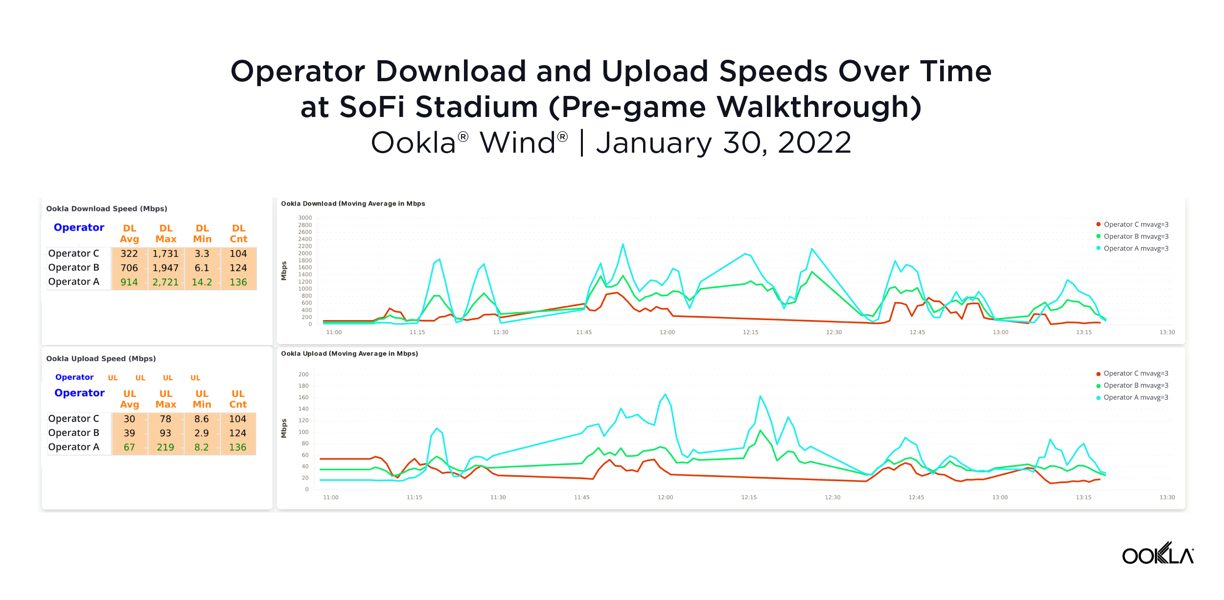
In addition to RF KPIs, the Wind walk test uses Speedtest Powered™ to measure where download and upload speeds peak and slow down throughout the stadium over time, both before and during the game. The above chart shows each provider’s download and upload speeds over the course of the walk test before the game, with each provider achieving a maximum download speed of over 1.70 Gbps, and average download speeds clocking in at 322 Mbps for Operator C, 706 Mbps for Operator B, and a blazing fast 914 Mbps for Operator C. Operator C also achieved maximum download speeds over 2.70 Gbps and upload speeds over 200 Mbps — much faster than its competitors.
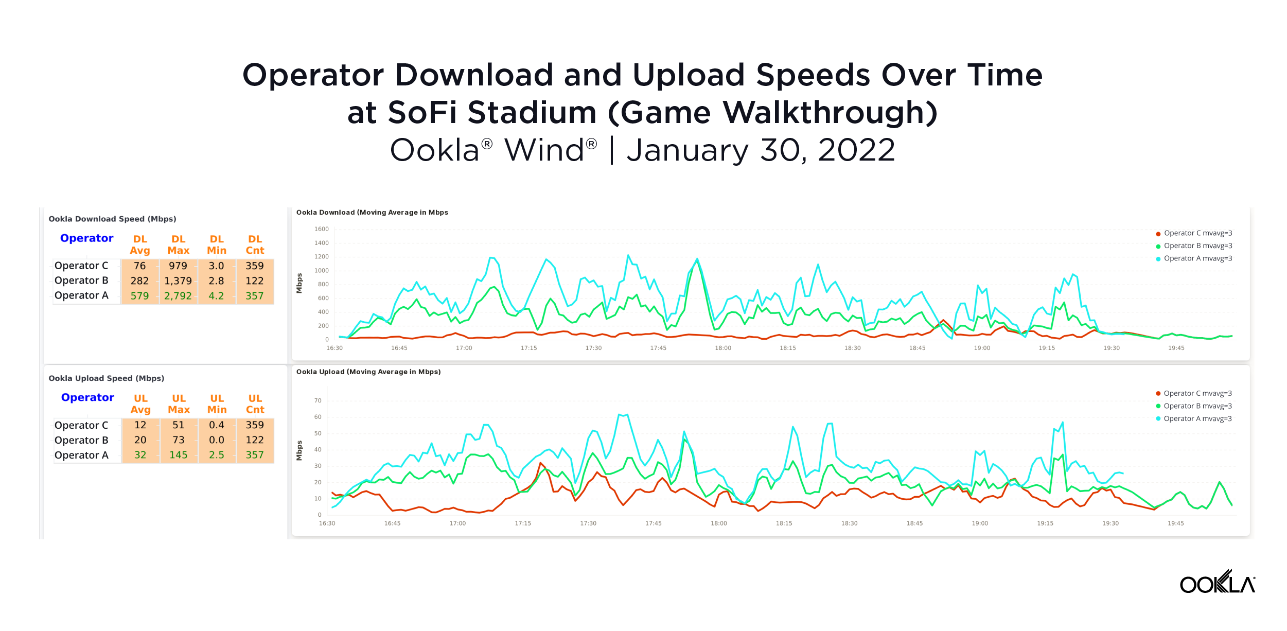
The Wind walk test performed during the game showed what congestion can do to a network and why consistent monitoring is so important. The above chart shows every operator’s average download and upload speeds roughly halved during our in-game walk test compared to the pre-game walk test. Operator C achieved an average download speed of 76 Mbps, Operator B at 282 Mbps, and Operator A still had the fastest average download speed at 579 Mbps.
Wind goes beyond basic signal RSRP and RSRQ data
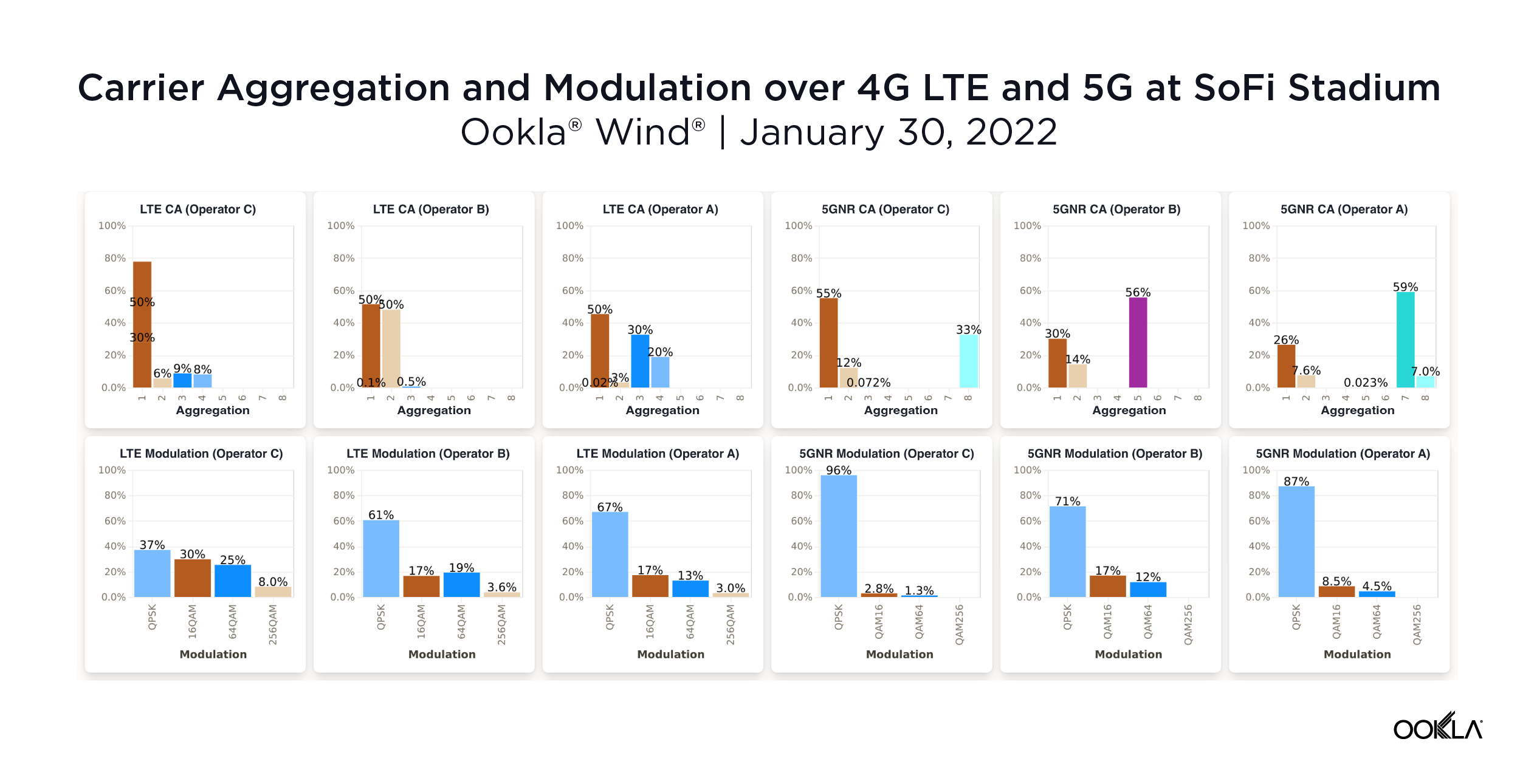
Wind expands beyond basic signal strength (RSRP) and signal quality (RSRQ) RF data as well. For example, we can see the amount of time above that carrier aggregation is utilized on each network and how many component carriers were aggregated. Additionally, we can see the utilization of various modulation types, with higher modulation schemes like QAM256 delivering more bits per unit of spectrum. Carrier aggregation with a large number of carriers and high modulation schemes can dramatically boost data speeds.
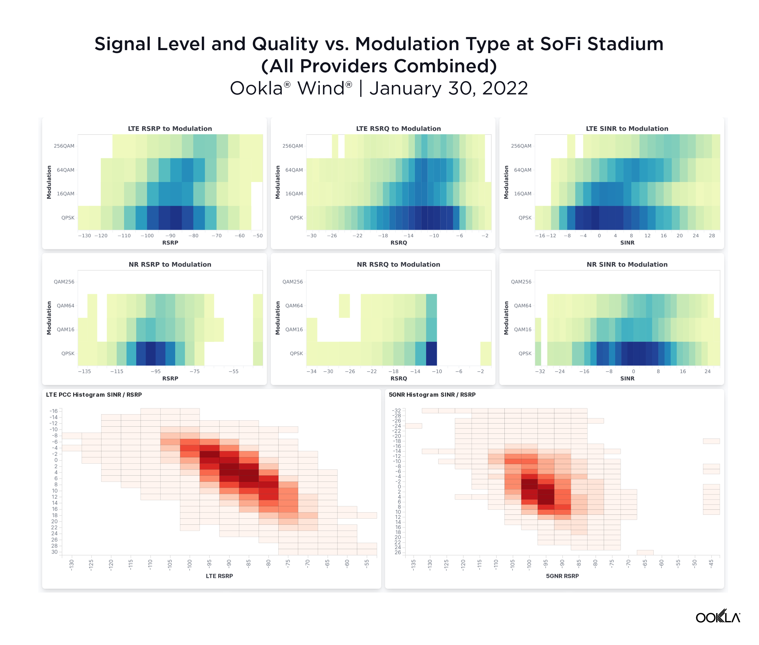
These charts indicate how modulation scheme varies with signal strength (RSRP) and signal quality (RSRQ). The darker the shaded colors, the more data points were collected. Since the darker shaded band is concentrated towards QPSK for 4G LTE, it is apparent that QPSK seems to be the most commonly used modulation scheme across all three operators. One would expect more prevalence of higher order modulations, which contributes to higher throughput, when the signal strength and quality get better (right side of the X-axis).
The Wind team provides real-time insights and support
Traditionally, walk and drive testing can take 24-48 hours to process data, but Wind delivers instant results to help RF engineers make adjustments in real time to make everyone’s game day as great as possible. In a few days, Wind engineers will be part of network command centers with our team providing live, dynamic benchmarking reports using our Wind cloud-based analytics Live-Stream Report™ dashboard throughout the game. Our live competitive analyses will help operator RF engineers optimize their network by looking at real-time RF KPIs and Speedtest Powered data, and allow operators to see how other networks are performing during our live walk test.
Wind Live-Stream Report™ at SoFi Stadium
Ookla® Wind® | January 30, 2022
The video above shows a short clip of the live Wind walk test from the semi-final game in Los Angeles on January 30, with green showing strong RSRP signal strength and red showing weaker RSRP on the map, and the refreshing blue and purple ribbon on the top left of Wind’s Android live edge reporting representing 4G LTE and 5G signal data, respectively. As you can see, the test shows moderate to low RSRP for this particular operator, with a jump in time around 10 seconds. At around 15 seconds, the video switches to the Speedtest Powered throughput data to show download and upload speeds on the network in real time.
We’re as excited as anyone for Sunday’s big game. We’re even more excited to know that folks on networks that have prepared using Wind will be able to share their experience with everyone at home. If you’re interested in using Wind to prepare for a large, in-person event, please reach out.
Ookla retains ownership of this article including all of the intellectual property rights, data, content graphs and analysis. This article may not be quoted, reproduced, distributed or published for any commercial purpose without prior consent. Members of the press and others using the findings in this article for non-commercial purposes are welcome to publicly share and link to report information with attribution to Ookla.