| March 10, 2025

5G at Maha Kumbh: How Networks Handled the World’s Largest Gathering

The Maha Kumbh Mela, which took place in Prayagraj between January 12 and February 26, 2025, was one of the biggest religious gatherings in history. This event also served as a large-scale stress test for India’s 5G networks, which launched commercially in October 2022. With millions relying on mobile connectivity in a high-density environment, telecom operators faced the challenge of ensuring uninterrupted service amid surging network traffic.

Key Takeaways

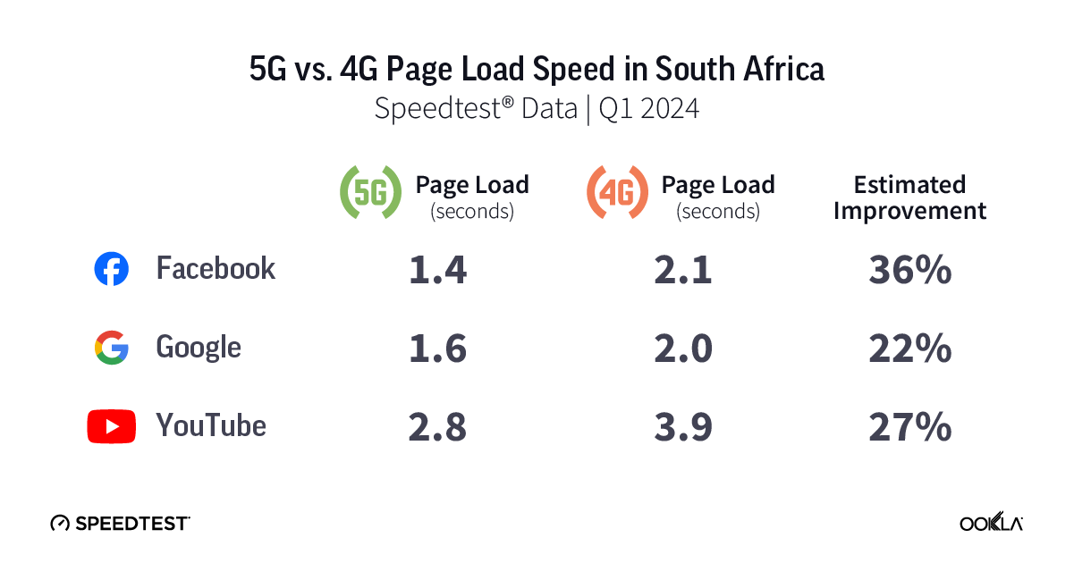
  • 5G maintained a significant performance advantage over 4G during Maha Kumbh 2025, despite periods of congestion. While 5G download speeds dropped from 259.67 Mbps in early January to 151.09 Mbps at peak congestion on January 26, it later recovered to 206.82 Mbps by the end of the event. In contrast, 4G speeds remained consistently lower, ranging from 13.38 Mbps to 21.68 Mbps, making 5G at least nine times faster even at its lowest point.
  • Jio led 5G performance, with a median download speed of 201.87 Mbps, followed by Airtel at 165.23 Mbps. Meanwhile, 4G networks struggled under heavy user density, with Vi India recording 4G median download speed at just 20.06 Mbps, followed by Jio (18.19 Mbps), Airtel (17.65 Mbps), and BSNL (11.64 Mbps).
  • Jio reported 83.9% 5G availability, nearly twice that of Airtel’s 42.4%, ensuring broader coverage and more consistent connectivity for users. Jio’s aggressive 5G rollout leveraged the 700 MHz low-band spectrum, enabling wider signal coverage across the densely packed mela ground.
  • 5G significantly improved response times, reducing delays in browsing and video playback even under heavy network congestion. Jio and Airtel reported 5G page load times of 1.99 seconds, compared to longer 4G load times, with Jio at 2.40 seconds, Airtel at 2.36 seconds, Vi India at 2.44 seconds, and BSNL at 2.70 seconds. A similar trend was seen in video streaming, where Jio and Airtel reported 5G video start times of 1.79 seconds. While 4G remained functional, its higher latency and slower response times made it less effective for web browsing and video streaming at such a large-scale event.

A Massive Gathering with High Connectivity Demand

The Kumbh Mela, held every 12 years at rotating locations in India, is one of the largest religious gatherings in the world. The 2025 Maha Kumbh Mela, a special occasion occurring once every 144 years, took place in Prayagraj, Uttar Pradesh, from January 13 to February 26. The event attracted over 660 million devotees by the concluding day, creating an unprecedented demand for mobile connectivity as attendees relied on their devices for communication, navigation, and digital transactions.

The sheer scale of the event presents unique challenges for telecom providers, as mobile networks will need to support massive spikes in voice and data traffic. The increasing penetration of smartphones, coupled with the rising demand for high-speed internet, has made telecom infrastructure a key enabler of the modern Kumbh experience. To address these demands, telecom operators deployed temporary network infrastructure, and enhanced radio and backhaul capacity.

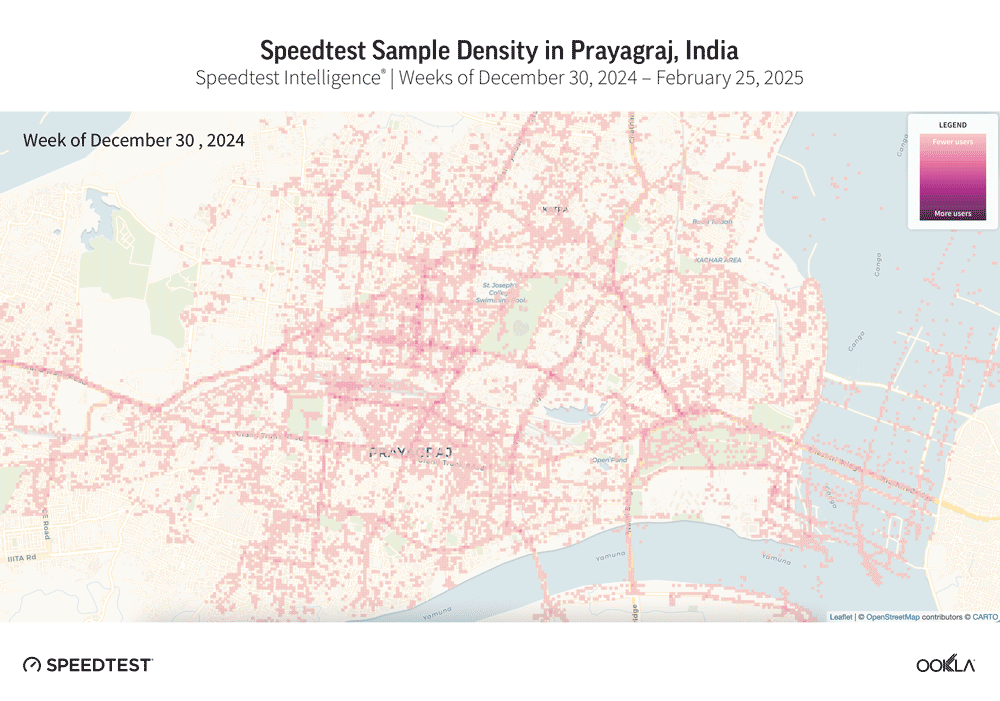
The Speedtest® sample density shows a gradual increase in activity around the Triveni Sangam, the confluence point of the three holy rivers, as the Maha Kumbh 2025 progresses. Sample density remains low in early January but rises significantly from January 20 onward, peaking between January 27 and February 17 during key bathing dates. Elevated sample density persists until the last week of the festival.

Animation of maps of Speedtest Sample Density in Prayagraj, India

The Department of Telecommunications (DoT), have instructed telecom operators to implement extensive infrastructure enhancements. In Prayagraj city, 328 new towers have been installed. Additionally, 575 new Base Transceiver Stations (BTS) have been deployed, and 1,462 existing BTS units have been upgraded, as well as tens of Cells on Wheels deployed to bolster network capacity. 

To further enhance connectivity and crowd management, Maha Kumbh 2025 integrated advanced technological innovations, including AI-powered surveillance cameras for real-time crowd monitoring and RFID wristbands to track missing individuals. A dedicated mobile app provided real-time location tracking, emergency alerts, and navigation assistance for pilgrims. Additionally, disaster management centers were equipped with satellite communication systems and emergency response kiosks to ensure uninterrupted communication in case of network failures. These combined efforts played a crucial role in managing the massive crowds while maintaining network efficiency and ensuring public safety.

5G performance stands up to demand surge

Speedtest Intelligence® data reveals variations in the weekly median download and upload speeds for 5G and 4G networks in Prayagraj, starting from the first week of January 2025 before the festival began until the end of the Maha Kumbh event. 5G median download speeds started at 259.67 Mbps in early January but declined by over 40% to 151.09 Mbps on January 26, coinciding with peak pilgrimage days and increased network congestion. 5G speeds recovered to 201.43 Mbps by February 9 and further improved to 206.82 Mbps by February 23, during the final week of the festival. In contrast, 4G speeds remained consistently lower, ranging between 13.38 Mbps (January 19) and 21.68 Mbps (February 23). Even at its lowest, 5G was still 9.5 times faster than 4G, highlighting its ability to handle high traffic demand more effectively.

5G upload speeds followed a similar pattern, starting at 19.71 Mbps, declining to 12.99 Mbps on January 26, and recovering to 17.95 Mbps by the end of February. 4G upload speeds remained below 5 Mbps, peaking at 4.85 Mbps. The three to five times difference in upload speeds allowed 5G users to share information and content faster, which was critical for pilgrims relying on mobile connectivity. While both networks experienced slowdowns, 5G provided more uplift in performance compared to 4G, reinforcing its role in supporting high-density events like Maha Kumbh.

5G and 4G Performance Weekly Trend of All Providers Combined in Prayagraj, India
Speedtest Intelligence® | Week of Dec 30 2024 till Feb 24 2025

5G Sustains High Performance Despite Unprecedented Mobile Traffic

Operators network performance during the event varied based on infrastructure deployment and congestion levels. Reliance Jio delivered the highest 5G median download speeds at 201.87 Mbps, followed by Airtel at 165.23 Mbps. The strong 5G speeds indicate successful deployment of high-capacity networks designed to handle the surge in data demand. Jio’s 5G Standalone (SA) network played a crucial role, efficiently managing 20 million voice calls and 400 million data service requests at peak times.

Airtel has also taken several measures to enhance the connectivity experience for its customers. To support the increased capacity demand, Airtel enhanced its network by deploying 287 new sites, optimizing over 340 existing ones, and laying an additional 74 kilometers of fiber in Prayagraj. These efforts contributed to maintaining strong 5G speeds despite heavy usage.

5G and 4G Performance by Providers in Prayagraj
Speedtest Intelligence® | Jan 13 – Feb 27 2025

While 5G provided high-speed connectivity, 4G speeds were significantly lower across all operators, reflecting network congestion and capacity limitations. Vi India recorded the 4G median download speed at 20.06 Mbps, followed by Jio (18.19 Mbps), Airtel (17.65 Mbps), and BSNL (11.64 Mbps). The slower speeds suggest that 4G networks struggled under high user density, as a large portion of attendees still relied on 4G devices.

Jio’s 5G Availability Nearly Twice That of Airtel

Ookla’s 5G Availability data from Speedtest Intelligence represents the percentage of 5G-active devices that spend the majority of their time connected to 5G networks. Analysis of the data indicates that Jio achieved 83.9% 5G Availability throughout the Maha Kumbh period. This was significantly higher than Airtel’s 42.4%. This reflects Jio’s aggressive deployment of 5G infrastructure in Prayagraj, supported by its use of the 700 MHz low-band spectrum further enhanced its reach, allowing for stronger signal penetration across the vast mela grounds, where millions were densely packed.

5G Availability by Providers in Prayagraj, India
Speedtest Intelligence® | Jan 13 – Feb 27 2025

In contrast, Airtel’s 5G Non-Standalone (NSA) network, while delivering strong 5G speeds, had lower availability. This is most likely due to its reliance on mid-band spectrum, which has a shorter coverage range compared to low-band frequency deployment.

5G Improves Response Time, Delivering a Better User Experience

Speedtest Intelligence Quality of Experience data was used to assess web page load times and video start times on 5G and 4G networks during the Maha Kumbh 2025 in Prayagraj. These measurements reflect real-world user experiences, such as accessing social media, browsing websites, and streaming videos. Faster page and video load times contribute to better user experience, reducing frustration and enhancing the overall digital experience in high-traffic environments.

5G and 4G Page Download Time and Video Start Time by Providers in Prayagraj, India
Speedtest Intelligence® | Jan 13 – Feb 27 2025

The data shows that 5G reduced page load times across all operators compared to 4G, demonstrating its performance uplift even in high traffic demand situations. Jio and Airtel recorded similar 5G page load times at 1.99 seconds, while 4G networks experienced longer load times, with Jio at 2.40 seconds, Airtel at 2.36 seconds, Vi India at 2.44 seconds, and BSNL at 2.70 seconds.

The video start time data also reflects a difference in performance between 5G and 4G. Jio and Airtel had similar video start times on 5G at 1.79 seconds, allowing for quicker video playback. The difference between 5G and 4G video start times was 0.75 seconds for Jio, and 0.78 seconds for Airtel, showing that 5G reduced buffering delays and improved streaming efficiency.

These results highlight how 5G networks managed digital demand more effectively than 4G during the Maha Kumbh. While 4G networks remained functional, their higher latency and longer load times made them less efficient for web browsing and video playback in a high-density setting. 

Ensuring Robust Network Performance Amidst Massive Gatherings

The Maha Kumbh 2025 in Prayagraj presented one of the most significant challenges for telecom operators, with over 660 million attendees relying on mobile connectivity. Despite the extreme demand, operators successfully maintained strong network performance through strategic infrastructure upgrades and advanced technologies. 

The introduction of 5G technology significantly enhanced user experiences at the event. A study by Ericsson revealed that 5G users reported 20% higher satisfaction compared to their 4G counterparts at major events in 2024. This improvement is attributed to 5G’s higher data transfer speeds and lower latency, facilitating smoother and faster streaming of high-quality video content. The deployment of 5G SA, particularly on Jio’s 700 MHz spectrum, contributed to broader coverage and improved network responsiveness, while Airtel’s 5G NSA, operating on mid-band frequencies, provided high speeds in select locations.

The strategies deployed during Maha Kumbh 2025 demonstrate that proactive planning, infrastructure expansion, and the integration of advanced technologies are key to ensuring robust mobile network performance in large-scale public gatherings. Upcoming global gatherings, such as the 2028 Olympics, will require similarly advanced planning and network expansion to accommodate millions of attendees. We’ll continue to benchmark and track network performance during major events, based on Speedtest Intelligence data. For more information, please contact us.

Ookla retains ownership of this article including all of the intellectual property rights, data, content graphs and analysis. This article may not be quoted, reproduced, distributed or published for any commercial purpose without prior consent. Members of the press and others using the findings in this article for non-commercial purposes are welcome to publicly share and link to report information with attribution to Ookla.

| June 24, 2024

How Much Faster is 5G Anyway? An Analysis of Page Load Speed

There’s nothing quite like picking up your phone for a little “me” time only to open up that first web page… and wait for it to load. Maybe the images aren’t there yet or the content jumps around while the ads load — it’s the worst. 5G is meant to help, so we dug into Speedtest® quality of experience data to see if this newer technology is living up to its promise. Read on for an analysis of page load speed (how many milliseconds it takes for a page to load) on three popular services in nine major countries around the world during Q1 2024.

Click the country below to go directly to that section or read on for the full article:

Brazil | Canada | France | India 

Mexico | Nigeria 

South Africa | Spain | United States

Page speed relies on low latency for the best internet experience

Page load speed is a critical measure of your web browsing experience. It measures how long it takes for a page to load, fully displaying the content on that page. This is directly impacted by latency, which is how quickly your device gets a response after you’ve sent out a request. A typical request on the internet requires two to five round trip communications between various entities over different latency sensitive protocols.

One of the promises of 5G is lower latency, which should lead to a faster (lower) page load speed on any page. The Speedtest Global IndexTM reported the global average for mobile latency as 27 milliseconds (0.027 seconds) with fixed broadband at 9 ms (0.009 s) in May 2024. As seen in the video below, it can take 7x longer to load a full webpage when latency is high, and “40% of users will abandon a site if it takes more than 3 seconds to load,” according to one source. Read more about the importance of latency to quality of experience.

5G lived up to the latency promise, showing a faster page load speed than 4G on all services in all countries we surveyed. However, the improvement was not the same in all places, with Canada topping the list of fastest page load speed over 5G on all the services we surveyed while South Africa had the slowest 5G page load speed on Google and YouTube of countries reviewed here. Read on for details.

5G loads 20-30% faster than 4G in Brazil

Chart of 5G vs. 4G Page Load Speed in Brazil

Speedtest data shows that 5G delivered a much lower page load speed than 4G on all three services in Brazil during Q1 2024. Google loaded 20% faster on 5G than 4G, YouTube was 25% faster, and Facebook was 30% faster on 5G.

Canada’s 5G page load speed among the fastest on all 3 services

Chart of 5G vs. 4G Page Load Speed in Canada

As mentioned, Canada’s 5G page load speed was the fastest or among the fastest for all countries analyzed in this article, with Canada having the fastest page load speed on Facebook, Google, and YouTube. Our analysis demonstrated that 5G delivered a decently faster page load speed than 4G on all three services in Canada during Q1 2024. YouTube loaded 16% faster on 5G than 4G, Google was 18% faster, and Facebook was 23% faster on 5G.

French 5G loads 14-20% faster than 4G

Chart of 5G vs. 4G Page Load Speed in France

Speedtest data shows 5G page load speed on all three services was decently faster than on 4G in France during Q1 2024. YouTube loaded 14% faster on 5G than 4G, Facebook was 19%, and Google was 20% faster on 5G.

5G loads 23-33% faster than 4G in India

Chart of 5G vs. 4G Page Load Speed in India

Analysis of Speedtest data shows the page load speed on all three services was much lower on 5G than 4G in India during Q1 2024. Google loaded 23% faster on 5G than 4G, YouTube was 32% faster, and Facebook was 33% faster on 5G. India and Mexico had the slowest page load speeds for Facebook over 5G of any of the countries we looked at.

Mexican 5G loads 26-28% faster than 4G

Chart of 5G vs. 4G Page Load Speed in Mexico

Speedtest data shows 5G delivered a much lower page load speed than 4G on all three services in Mexico during Q1 2024. Google and Facebook loaded 26% faster on 5G than 4G and YouTube was 28% faster on 5G. Mexico and India had the slowest 5G page load speeds for Facebook among the countries examined.

5G loads up to 47% faster than 4G in Nigeria

Chart of 5G vs. 4G Page Load Speed in Nigeria

Our analysis revealed 5G delivered a much lower page load speed than 4G on all three services in Nigeria during Q1 2024. Google loaded 24% faster on 5G than 4G, YouTube was 27% faster, and Facebook was a whopping 47% faster on 5G.

South Africans see 22-36% faster 5G page load over 4G, but slow Google and YouTube

Chart of 5G vs. 4G Page Load Speed in South Africa

Speedtest data shows 5G delivered a much lower page load speed than 4G on all three services in South Africa during Q1 2024. Google loaded 22% faster on 5G than 4G, YouTube was 27% faster, and Facebook was 36% faster on 5G. South Africa had the slowest 5G page load speed for both Google and YouTube of any of the countries analyzed.

5G loads 11-15% faster than 4G in Spain

Chart of 5G vs. 4G Page Load Speed in Spain

5G page load speed in Spain was somewhat faster than 4G on all three services during Q1 2024. YouTube loaded 11% faster on 5G than 4G, Google was 14% faster than 4G, and Facebook was 15% faster on 5G.

U.S. 5G loads 21-26% faster than 4G

Chart of 5G vs. 4G Page Load Speed in United States

Speedtest data from the U.S. shows 5G delivered a much lower page load speed than 4G on all three services during Q1 2024. Google loaded 21% faster on 5G than 4G, YouTube was 22% faster, and Facebook was 26% faster on 5G.

Your time is valuable. Our data shows that you can get some of that important time back if you have access to 5G and can afford to upgrade. To learn more about your network experience, download the Speedtest app for Android or iOS. Remember, too, that there’s a Downdetector® tab in the Speedtest apps to help you troubleshoot pages that aren’t loading at all.

Ookla retains ownership of this article including all of the intellectual property rights, data, content graphs and analysis. This article may not be quoted, reproduced, distributed or published for any commercial purpose without prior consent. Members of the press and others using the findings in this article for non-commercial purposes are welcome to publicly share and link to report information with attribution to Ookla.

| June 17, 2024

Your Guide to Airport Wi-Fi and Mobile Performance at 50+ Global Airports in 2024

Airports around the world have been packed with travelers this year, which puts extra stress on the Wi-Fi. With summer travel already well in swing in the northern hemisphere, we’re back with fresh data for our series on airport Wi-Fi performance to help you plan for connectivity at all your connections. You’ll find information about Wi-Fi on free networks provided by the individual airports as well as mobile speeds at some of the busiest airports in the world during Q1 2024. Read on for a look at internet performance at over 50 of the world’s busiest airports with data on download speed, upload speed, and latency.

Key takeaways

  • The seven fastest airports for downloads over Wi-Fi were in the United States: San Francisco International Airport, Newark Liberty International Airport, John F. Kennedy International Airport, Phoenix Sky Harbor International Airport, Seattle–Tacoma International Airport, Dallas Fort Worth International Airport, and Harry Reid International Airport.
  • Six U.S. airports had the fastest uploads over Wi-Fi: San Francisco International Airport, Phoenix Sky Harbor International Airport, Newark Liberty International Airport, Seattle–Tacoma International Airport, Dallas Fort Worth International Airport, and John F. Kennedy International Airport.
  • The fastest mobile download speeds on our list were at Hamad International Airport in Doha, Qatar, Shanghai Hongqiao International Airport in China, and Phoenix Sky Harbor International Airport in the U.S.
  • Eight of the 10 airports with the fastest mobile upload speeds were in China.

9 airports have 100+ Mbps Wi-Fi download speeds

Speedtest Intelligence® showed seven of the nine airports with median Wi-Fi download speeds over 100 Mbps were in the U.S.:

  • San Francisco International Airport (173.55 Mbps),
  • Newark Liberty International Airport (166.51 Mbps),
  • John F. Kennedy International Airport (151.59 Mbps),
  • Phoenix Sky Harbor International Airport (151.28 Mbps),
  • Seattle–Tacoma International Airport (137.31 Mbps),
  • Dallas Fort Worth International Airport (119.92 Mbps), and
  • Harry Reid International Airport (107.84 Mbps).

Charles de Gaulle Airport in Paris, France and China’s Hangzhou Xiaoshan International Airport rounded out the list with median download speeds of 107.13 Mbps and 101.01 Mbps, respectively. Hartsfield–Jackson Atlanta International Airport and Sea–Tac had the lowest median multi-server latency on Wi-Fi of any of the airports surveyed during Q1 2024.

Hover on the pins on the map below to see full details for download and upload speeds as well as latency at all the airports analyzed.

Fixed Broadband Internet Speeds Over Free Wi-Fi at Global Airports
Speedtest Intelligence® | Q1 2024
A map showing fixed broadband speeds in selected global airports.

At Ookla®, we’re dedicated to making sure the networks you depend on are always at their best. With Ekahau®, our Wi-Fi solution, we know firsthand just how challenging it can be to optimize Wi-Fi at airports, especially when you have up to 900 people waiting at each boarding gate during the busiest travel times. While the speeds achieved by these top airports are impressive, we saw two smaller U.S. airports with median Wi-Fi download speeds over 200 Mbps during our U.S.-only analysis of airport Wi-Fi in the fall.

Six airports on our list use multiple SSIDs for their Wi-Fi networks for different terminals or to take advantage of the coverage advantages of 2.4 GHz and the speed advantages of 5 GHz frequencies. We have included data for all the SSIDs with sufficient samples in the map and reported in the text on the best result when using multiple SSIDs results in dramatically different speeds.

Eighteen airports on our list had median Wi-Fi download speeds of less than 25 Mbps. Mexico City International Airport in Mexico had the lowest median Wi-Fi download speed at 5.11 Mbps, followed by:

  • Tan Son Nhat International Airport in Vietnam (7.07 Mbps),
  • Beijing Capital International Airport in China (9.45 Mbps),
  • Cairo International Airport in Egypt (10.62 Mbps), and
  • Tokyo Haneda Airport in Japan (11.37 Mbps).

You may struggle with everything from video chatting to streaming at any airport with a download speed below 25 Mbps. Latency is also a factor in performance so if your airport is one of the three with a median Wi-Fi latency over 60 ms, a mobile hotspot may be a better option for a stable connection.

Wi-Fi 6 has arrived

Our analysis shows at least 15 airports on our list were using the new Wi-Fi 6 standard in their Wi-Fi setup. Wi-Fi 6 uses Multi-User Multiple Input, Multiple Output (MU-MIMO) and Orthogonal Frequency Division Multiple Access (OFDMA) to increase performance and throughput, especially when serving multiple devices. This offers a real advantage at a large public location like an airport. In order to get maximum benefit from Wi-Fi 6, consumers would need to be using Wi-Fi 6-compatible devices. Speedtest data shows a fairly even split between airports that saw faster download speeds on Wi-Fi 6 and airports where Wi-Fi 6 results were comparable to those on other earlier Wi-Fi generations.

As you know, international travel can be complicated. Even if the airport offers free Wi-Fi, you may encounter other barriers to access. For example, a local number is required in Cairo to receive the access code to connect to the airport Wi-Fi. And while we’d love to include other large airports like Nigeria’s Murtala Muhammed International Airport in future Wi-Fi analyses, they currently do not offer free Wi-Fi so we have included mobile data below.

11 airports show mobile speeds over 200 Mbps

Speedtest® data shows mobile speeds massively outpaced Wi-Fi, with 14 airports showing faster median downloads over mobile than the fastest airport for Wi-Fi. Hamad International Airport in Qatar had the fastest median download speed over mobile on our list at 442.49 Mbps during Q1 2024, followed by:

  • Shanghai Hongqiao International Airport (341.19 Mbps),
  • Phoenix Sky Harbor International Airport (295.94 Mbps),
  • Shanghai Pudong International Airport (264.71 Mbps),
  • Chongqing Jiangbei International Airport (258.42 Mbps), and
  • Istanbul Airport (255.51 Mbps).

Mobile Network Speeds at Global Airports
Speedtest Intelligence® | Q1 2024

Fastest mobile speeds at airports in Africa and South America

Jomo Kenyatta International Airport in Kenya had the fastest mobile download speeds of the four African airports we analyzed at 88.12 Mbps during Q1 2024. São Paulo/Guarulhos International Airport in Brazil was the faster of the two Latin American airports analyzed with a median download speed of 55.44 Mbps.

Airports with slow mobile speeds

Mobile can’t fix everything, because six airports came in with a median mobile download speed below 25 Mbps. Mexico City International Airport was again at the bottom with 8.75 Mbps, followed by:

  • Josep Tarradellas Barcelona–El Prat Airport (15.21 Mbps),
  • Orlando International Airport (15.84 Mbps),
  • Adolfo Suárez Madrid–Barajas Airport (20.37 Mbps),
  • Chhatrapati Shivaji Maharaj International Airport (20.96 Mbps), and
  • Indira Gandhi International Airport (21.80 Mbps).

Latency on mobile was generally higher than that on Wi-Fi with 46 airports showing a Wi-Fi latency lower than the lowest latency on mobile, 27.51 ms at China’s Shanghai Hongqiao International Airport. As noted above, latency is an important factor in performance, so it might be worth investigating the airport Wi-Fi by running a Speedtest if your mobile performance seems to lag.

Airport Wi-Fi or mobile? Connecting on your next trip

We created a quick guide to help you decide whether to try out the Wi-Fi or simply use the local mobile network if you have access. Use it to compare free airport Wi-Fi performance against mobile performance for the 52 airports we have both Wi-Fi and mobile data for during Q1 2024. Twenty-six airports had faster mobile internet than airport Wi-Fi. Eight airports had faster Wi-Fi than mobile, and seven airports showed only a slight distinction between Wi-Fi and mobile or download speeds over 100 Mbps on both, so we gave both the green check marks. We were able to include more airports in the mobile analysis because there were more mobile samples to analyze at those airports than there were samples over Wi-Fi.

Chart of Comparing Airport Wi-Fi and Mobile Speeds at World Airports

The averages reported here are based on real-world data, so your experience may differ, especially on a busy travel day. Take a Speedtest® at the airport to see how your performance compares. Cheers to safe travels and rapid connections wherever you’re flying.

Ookla retains ownership of this article including all of the intellectual property rights, data, content graphs and analysis. This article may not be quoted, reproduced, distributed or published for any commercial purpose without prior consent. Members of the press and others using the findings in this article for non-commercial purposes are welcome to publicly share and link to report information with attribution to Ookla.

| October 28, 2020

Upgrades in Mobile Speeds in India Come with Expanded 4G Availability

India’s mobile network market has seen astounding growth and evolution since the country’s first mobile call in 1995. Local operators’ efforts to improve and expand 4G coverage across the country have provided customers in India with an increasingly fast and modern mobile internet experience. Data from Speedtest IntelligenceTM reveals details on performance across India’s mobile network landscape. Read on for information on speeds at the regional, country and city level and to see which operator offered the fastest service Q3 2020.

India trailed Pakistan for mobile speeds

India showed the second fastest mean download speed over mobile among the largest South Asian countries during Q3 2020, with Pakistan showing 39.7% faster mobile download speed than India. Bangladesh was third for download speed and second for upload speed. India had the slowest mean upload speed on the list at 4.18 Mbps.
Mobile-Internet-Speeds-Chart_Pakistan_India_Bangladesh_1020

Both India and Pakistan showed improved mean download speeds over mobile when comparing Q3 2019 to Q3 2020. India saw an 11.6% increase while Pakistan’s mean mobile download speeds increased by 24.1% during the same period. Bangladesh saw a smaller increase of 6.3% in mean download speed over mobile. Upload speeds remained mostly flat across South Asia’s largest countries, with only Pakistan showing a slight improvement year over year.

India also ranked second for 4G speeds

Looking specifically at performance over 4G LTE in the largest countries in South Asia during Q3 2020, the countries’ speeds followed a similar pattern, with Pakistan’s mean download speed over 4G coming in 51.3% faster than India’s 12.05 Mbps. Bangladesh closely followed India for download speed.
4G-Speeds-Chart_Pakistan_India_Bangladesh_1020

Upload speeds over 4G varied considerably more by country than we saw for download speeds. India showed the slowest mean upload speed over 4G at 4.25 Mbps — 65.6% slower than Pakistan’s.

Vi India was fastest over 4G

Vi India was the fastest mobile operator over 4G in India during Q3 2020 with the fastest mean download and upload speeds among top providers. Airtel followed Vi India with a mean download speed of 13.58 Mbps, while Jio showed a mean download speed of 9.71 Mbps in Q3 2020.
4G-Speeds_India_providers_1020-2

India led in 4G Availability

India had the highest 4G Availability among the largest South Asian countries during Q3 2020 with 93.7% of tested locations showing 4G available according to data from Speedtest® coverage scans on Android. Bangladesh followed with a 4G Availability of 78.6%, while Pakistan had the lowest 4G Availability during this period at 72.9%.
4G-availability_Pakistan_India_Bangladesh_1020

Jio leads for 4G Availability in India

Jio had the highest 4G Availability among top providers in India at 99.7% during Q3 2020. Airtel followed Jio closely with 4G available in 98.7% of tested locations during the same period. Vi India was third at 91.1%.
4G-Availability_India_providers_1020

Mobile speeds vary among India’s largest cities

Country-wide averages don’t reflect the differences in performance that occur across a country as large as India. We looked at mobile download speeds for all cellular technologies in the 15 most populous cities in India during Q3 2020 to get a better picture of how consumers experience the internet.
Ookla_Mobile-Internet-Speeds_India_1020-1

Hyderabad had the fastest mean download speed over mobile during this period at 14.35 Mbps, followed closely by Mumbai at 13.55 Mbps and Visakhapatnam at 13.40 Mbps. The slowest mean download speeds on our list were measured in Nagpur (10.44 Mbps), Kanpur (9.45 Mbps) and Lucknow (8.67 Mbps). The mean download speed in first-place Hyderabad was 65.5% faster than that in Lucknow.

We will continue to monitor India’s internet speeds as operators expand 4G networks and introduce 5G networks throughout the country. Want to know how your internet is performing? Take a Speedtest to understand and report on your operator’s performance.

Ookla retains ownership of this article including all of the intellectual property rights, data, content graphs and analysis. This article may not be quoted, reproduced, distributed or published for any commercial purpose without prior consent. Members of the press and others using the findings in this article for non-commercial purposes are welcome to publicly share and link to report information with attribution to Ookla.

| December 6, 2021

Ookla Video Analytics Reveals the State of Global Video Experience


Video is essential to today’s internet across the world. We use it to watch shows and movies, stream live events and even keep up to date on our favorite cats on social media. Ookla® launched video testing in the Speedtest® app for iOS and Android earlier this year so consumers can measure the quality of their video experience. Already, millions of video tests have been initiated by consumers. Today we’re sharing some of that data to provide insight into video experience around the world, specifically, we’ve analyzed adaptive start time and highest overall video resolution over all mobile technologies, 5G and fixed broadband in select countries during Q3 2021.

Switzerland had the fastest adaptive start time for all mobile technologies, South Africa fastest for 5G

Video streaming services use adaptive bitrate technology

All modern video streaming platforms use adaptive bitrate technology to automatically adjust video quality based on network conditions and device capabilities in order to display the highest quality video that a device can support, while minimizing buffering and slow video start time. Speedtest Video Analytics provides deep insights and competitive benchmarking for device and network video streaming capabilities.

Adaptive start time — the time it takes for adaptive bitrate playback to initiate — allows us to see how quickly videos are loading. A 2012 study found that users will leave a video if it doesn’t begin playing within two seconds. We have to imagine in 2021, that timeframe is being squeezed even further. Our analysis shows how countries are performing against this important benchmark.

ookla_adaptive-start-time_all-mobile-tech_1121-01-3

Speedtest Intelligence® reveals that Switzerland had the fastest median adaptive start time for all mobile technologies combined among the countries we analyzed at 1.02 seconds during Q3 2021. South Korea and Norway were close behind at 1.07 seconds and 1.10 seconds, respectively. Five more countries achieved a median adaptive start time at or under 1.25 seconds during Q3 2021, including Hong Kong (SAR) and Croatia (1.17 seconds), Portugal (1.24 seconds), and Kuwait and Mexico (1.25 seconds). All but three of the remaining countries we surveyed achieved a median adaptive start time between 1.25 seconds and 2.00 seconds during Q3 2021 except Colombia (2.11 seconds), Saudi Arabia (2.12 seconds) and India (2.13 seconds).

Most 5G-capable video tests showed blazing fast adaptive start times

ookla_adaptive-start-time_5g_1121-01

We’ve seen median 5G download speeds zoom ahead of traditional mobile technologies, even reaching median download speeds 10 times faster than on 4G LTE. It’s no surprise Video Analytics revealed adaptive start time was often much faster on 5G than on all mobile technologies combined. Five countries achieved median adaptive start times faster than 1.00 second during Q3 2021: South Africa (0.73 seconds), Switzerland (0.79 seconds), Norway (0.82 seconds), Hong Kong (0.86 seconds) and South Korea (0.90 seconds). Video Analytics shows the only countries with a median 5G adaptive start time slower than 1.25 seconds were the United States (1.27 seconds), Brazil (1.42 seconds) and Saudi Arabia (1.94 seconds).

Five countries’ adaptive start time improved more than 0.25 seconds on 5G compared to all technologies combined during Q3 2021: the Philippines (-0.62 seconds), South Africa (-0.53 seconds), Brazil (-0.39 seconds), Hong Kong (-0.31 seconds) and Norway (-0.29 seconds). However, several countries showed a less than 0.20 second improvement when comparing adaptive start rate on 5G to that on all technologies combined during Q3 2021: the U.S. (-0.14 seconds), Bahrain (-0.16 seconds), South Korea and Saudi Arabia (-0.17 seconds), and the United Kingdom (U.K.) and France (-0.18 seconds).

Adaptive start time is not always faster on fixed broadband

ookla_adaptive-start-time_fixed_1121-01-1

Speedtest Intelligence showed a narrower range for adaptive start time on fixed broadband than on 5G with every country on our list achieving between 0.67 and 1.85 seconds during Q3 2021. Ten countries on our list achieved a median adaptive start time faster than 1.00 second during Q3 2021: South Korea (0.67 seconds), Norway (0.74 seconds), Hong Kong (0.75 seconds), Switzerland (0.76 seconds), the U.K. (0.79 seconds), France (0.86 seconds), the U.S. (0.87 seconds), Spain (0.88 seconds), Portugal (0.89 seconds) and Italy (0.98 seconds).

Twenty out of the 24 countries we surveyed had a median fixed broadband adaptive start time faster than 1.50 seconds during Q3 2021. Colombia (1.50 seconds), Egypt (1.59 seconds), Turkey (1.64 seconds) and Saudi Arabia (1.85 seconds) were the only countries with a median adaptive start time slower than 1.50 seconds on fixed broadband during Q3 2021.

South Korea video tests reached 4K resolutions at the highest proportion on mobile and fixed broadband

Video resolution is incredibly important in the experience of streaming video and the higher the resolution, the more definition and clarity we are able to see. These days, the difference between an SD and 4K experience is gigantic. Resolution is measured in the numbers of pixels in a 16:9 ratio, with 2160 pixel height representing a 4K picture. Video Analytics measures the resolution rates, which represent the portion of samples that reach a particular resolution. In this analysis, we evaluated the resolution rates for 4K, typically the highest resolution users will need.

ookla_highest-video-resolution_all-mobile-tech_1121-01

Using Speedtest Intelligence, we found South Korea and Switzerland had the highest overall successful resolution rates for all mobile technologies combined during Q3 2021, reaching 4K resolutions 80.4% and 80.3% of the time, respectively. Croatia (79.7%), Kuwait (77.4%) and Norway (75.4%) were the only other countries on our list that achieved 4K video resolution more than 75.0% of the time. Only seven countries on our list did not reach a 4K resolution at least 50% of the time on all mobile technologies combined: the Philippines (38.4%), India (41.1%), Indonesia (44.8%), Colombia (45.3%), Mexico (46.3%), Russia (49.7%) and Egypt (49.9%).

5G led to higher video resolution, but 4K mobile devices still remain rare

ookla_highest-video-resolution_5g_1121-01

5G provided a higher resolution for mobile devices during Q3 2021 than all technologies combined. Every country we surveyed reached a 4K resolution over 80.0% of the time over 5G. In fact, six out of the 14 countries we surveyed for 5G achieved a 4K resolution more than 90.0% of the time, including South Korea (95.9%), Norway (94.5%), Kuwait (94.0%), South Africa (93.6%), Switzerland (92.6%) and France (91.5%). On the lower end of our list, only Italy (81.9%), Brazil (83.9%) and the U.S. (83.9%) achieved 4K resolutions less than 85.0% of the time.

While this is great news for the future of mobile devices, 4K resolutions in mobile devices still aren’t common: Sony is the only popular device manufacturer producing 4K mobile devices. In the meantime, users who can connect to 5G through either a hot spot or fixed wireless access (FWA) will reap the benefits of being able to stream on 4K devices like computers, televisions or tablets.

South Korean fixed broadband delivers ultra-high definition resolutions

ookla_highest-video-resolution_fixed_1121-01

Speedtest Intelligence reveals South Korea had the highest fixed broadband 4K resolution rate among countries surveyed at 92.2% during Q3 2021. Other countries that achieved 4K resolution rates above 85.0% on fixed broadband during Q3 2021 included: Switzerland (89.4%), Hong Kong (87.6%), Norway (87.1%) and the U.S. (86.7%). Every other country in our analysis achieved 4K resolution rates between 65.0% and 85.0%, except Egypt (49.5%), Indonesia (52.5%), the Philippines (64.2%) and Turkey (64.3%).

Video Analytics gives you the information you need about your video playback

We’re excited to share more about video performance and quality of experience using Video Analytics in the coming months. In the meantime, if you want to learn more about Video Analytics and how it can help you benchmark and improve your network, please join our upcoming webinar, December 9 by clicking here.

Ookla retains ownership of this article including all of the intellectual property rights, data, content graphs and analysis. This article may not be quoted, reproduced, distributed or published for any commercial purpose without prior consent. Members of the press and others using the findings in this article for non-commercial purposes are welcome to publicly share and link to report information with attribution to Ookla.

| November 5, 2020

Unable to Connect — The Most Significant Online Service Outages in Q3 2020

“Is it down?” frustrated users asked themselves during the multiple online service outages in Q3 2020. The fourth installment of our online service outage tracking series used Downdetector® data from Q3 2020 and focused on the following online service categories: cloud services, collaboration platforms, financial services, gaming, internet service providers and social media.

Cloud services

Cloudflare (July 17, 2020): 14,198 reports at peak

Downdetector_Cloudflare_Outage_1020

On July 17, a major disruption in Cloudflare’s service broke the internet, taking multiple online services down with it. Users rushed to Downdetector to log issues with multiple services that rely on Cloudflare for content delivery, including 4chan, DoorDash and Zendesk. At the peak of the outage, there were 14,198 reports of issues with the service in the U.S.

Azure (September 28, 2020): 2,846 reports at peak

Azure, Microsoft’s cloud service, was affected by September 28’s Microsoft-wide outage (see next category). Users from Germany, India, Japan and the U.S. stated they had issues with the cloud service. That day, there were 2,846 reports of issues at the peak of the outage in the U.S.

Collaboration platforms

Office 365 (September 28,2020): 20,437 reports at peak

Downdetector_Office365_Outage_1020

Microsoft’s suite of online collaboration services including Outlook, Sharepoint, OneDrive and Skype went down on September 28 (along with Azure, see above). Logs of issues with the services started coming into Downdetector at 3 p.m Pacific. Most users stated being unable to log in or connect to the server. At the peak, there were 20,437 reported issues in the U.S. Users from Japan and India also logged problems with the service that day.

Zoom (August 24, 2020): 17,874 reports at peak

On August 24, users were upset to find that they were unable to connect with their coworkers, friends and family through Zoom. Most users stated problems with logging in and joining a conference. There were 17,874 reports of issues in the U.S. at the peak of the outage. Users in the U.K. and Canada also had issues with the video conferencing service that day.

Google Drive (September 24, 2020): 14,715 reports at peak

Users in the U.S., Philippines and Indonesia were unable to collaborate on projects, upload files or access their documents stored in Google Drive on September 24. At the peak of the outage in the U.S., there were 14,715 reported issues. Users of Google products YouTube and Gmail also logged issues in Brazil, Germany, India, Japan, Mexico and the U.K.

Slack (September 29, 2020): 1,396 reports at peak

Slack received 1,396 logs of issues at the peak of the outage reports on September 29. Users in the U.S. had problems with sending messages, videos and images to their peers — and some were unable to connect to the platform at all.

Financial services

TD Ameritrade (August 18, 2020): 7,814 reports at peak

Downdetector_TD-Ameritrade_Outage_1020

The online stock investment tool reportedly went down on August 18. Users were unable to log into their account or buy and sell stocks. At the peak of the outage, there were 7,814 reports of issues in the U.S. There were two other notable outages that month — August 17 with 5,816 reports at peak and August 31 with 6,893 reports at peak.

Gaming

Steam (August 5, 2020): 69,255 reports at peak

Downdetector_Steam_Outage_1020

Users from Brazil, Germany, Japan, the U.K and the U.S. submitted issues with Steam on August 5. Most users stated problems when trying to log into the platform and play with other users. At the peak of the outage in the U.S, there were 69,255 reports of issues with the gaming platform.

Fall Guys (September 2, 2020): 2,890 reports at peak

The Fall Guys status page on Downdetector showed there were problems with the popular online game on September 2. Users in Brazil, the U.K. and the U.S. were struggling to play the game online. That day, 97% of reports stated problems with the server connection.

Internet service providers

Spectrum (July 29, 2020): 56,318 reports at peak

Downdetector_Spectrum_Outage_1020

Spectrum users from the both coasts of the United States flooded Downdetector with logs of issues with the service when they started experiencing problems with their internet connections. Complaints with the service started surging at around 5 p.m. Pacific and lasted for about an hour. At the peak of the outage there were 56,318 reports of issues.

CenturyLink (August 30, 2020): 11,543 reports at peak

CenturyLink customers on the East Coast of the U.S. had problems with their internet service on August 30 starting around 2 a.m. Pacific and ending around 8 a.m. Pacific. There were 11,543 reports of issues at the peak of the outage.

Social Media

WhatsApp (July 14, 2020): 148,573 reports at peak

Downdetector_WhatsApp_Outage_1020-1

A multi-country outage affected WhatsApp on July 14. Users from all over the world stated problems with sending and receiving messages on the Facebook-owned app. The country with the most issues submitted was Germany with 148,573 reports of issues at the peak of the outage. Users in Brazil, India, the Netherlands, Mexico, Spain and the U.K. were also affected by the outage.

Facebook (September 17, 2020): 30,918 reports at peak

Facebook users from multiple countries experienced problems with the social media platform on September 17. More than half of the logs were labeled as “total blackout” — users were unable to access the platform or any of its features. There were 30,918 reports of issues at the peak of the outage in the U.S. Users in Italy, Poland and the U.K. also had problems with Facebook that day.

Want to know when an online service is down? Keep up with outages by visiting Downdetector.

Ookla retains ownership of this article including all of the intellectual property rights, data, content graphs and analysis. This article may not be quoted, reproduced, distributed or published for any commercial purpose without prior consent. Members of the press and others using the findings in this article for non-commercial purposes are welcome to publicly share and link to report information with attribution to Ookla.

| August 7, 2022

89% of Indian Smartphone Users Are Ready to Upgrade to 5G

India’s long awaited 5G spectrum auction has just come to a close

Four players participated in the 5G auction — Reliance Jio Infocomm (Jio), Bharti Airtel, Vodafone Idea (Vi), and transport and utility infrastructure firm Adani Group – spending a grand total of Rs 1.5 trillion (US$ 19bn) for spectrum across 700 MHz, 800 MHz, 900 MHz, 1800 MHz, 2100 MHz, 3300 MHz, and 26 GHz frequency bands. MmWave spectrum is capable of delivering super-fast speeds (thinking Gigabits), but is limited in terms of range. Low-band (sub-1GHz) spectrum is able to travel farther, cover a greater geographical region, and provide deeper penetration within buildings. But, low band spectrum lacks the capacity to deliver true 5G speeds. The so-called “sweet spot” for 5G is mid-band spectrum (1-6 GHz spectrum, and in particular C-band), which offers the best of both worlds in terms of coverage and capacity.

Jio acquired the most spectrum, especially in the sought after C-band spectrum (2,440 MHz), but it was the only operator that acquired the 700 MHz band. This will give Reliance Jio an advantage compared to providers who have acquired only C-band, especially since low-band spectrum allows for better indoor signal penetration in urban areas and also better coverage in rural areas. Now that operators have acquired 5G spectrum, they start their race to become the first operators to go to market with 5G, with some already hinting that 5G deployments will begin in the next few months. 

5G has been a long time coming

While mobile users in India are among the most data-intensive users in the world, India’s 4G/LTE networks have become a bottleneck for demand. Only 1.4% of respondents stated that they are satisfied with the existing network performance and are not planning to upgrade to 5G. The promise of 5G is that it will unlock a world of possibilities beyond just a faster network connection. In order to understand how 5G can change the current mobile behavior of Indian consumers, we commissioned a survey in the run up to the spectrum auction. Ookla’s Consumer Survey spans a sample of 2,000 smartphone users aged 18 and above across urban and rural areas of India. 

So what do Indian consumers expect from 5G?

Consumers have an appetite for video streaming and gaming

Our survey shows that if mobile internet connections were better, 70% of respondents would increase their use of video streaming, while 68% stated they would boost their mobile gaming. Operators acquired a total of 44,960 MHz of spectrum in the 26 GHz spectrum band (mmWave), which due to its high throughput, is particularly useful for streaming and gaming. It will also lend additional capacity in dense areas such as stadiums. Better connectivity will also have a wider reaching effect on a consumer’s ability to communicate more often. That’s especially true for social media and using phones for work, which are currently the top two use cases among consumers in India. Meanwhile, other consumer behaviours such as online shopping, mobile money, and watching esports aren’t impacted as much by high network speeds. Indeed, just over half of the respondents said they would use these services the same amount of time despite network upgrades. 

Consumers want faster speeds

42% of respondents believe that faster speeds would most improve service currently being provided to them. The good news is that the operators’ spectrum holdings in the C-band will help them do just that. Both Airtel and Jio splurged on C-band spectrum at auction, acquiring spectrum in all of the 22 telecom circles, while Vodafone acquired spectrum only in its priority circles. Having access to contiguous spectrum helps to achieve faster, lower latency, and greener 5G services. In addition to faster speeds, 24% of respondents desire a more reliable connection, while 21% want better indoor coverage. However, only one in 10 respondents pointed to better outdoor coverage as a factor that would be most beneficial. 

Which of the following do yuou believe would most improve the service provided to you by your mobile provider? - consumer survey 2022 results

Delay to India’s 5G auction did come with some benefits

Namely, the decrease of the cost of 5G hardware as the technology and vendor ecosystem continues to mature. Following the spectrum auction, Bharti Airtel has already contracted Ericsson, Nokia, and Samsung to deploy 5G services in August 2022. Indian operators’ move to embrace Open RAN will drive network costs even lower. Another key factor is the 5G device ecosystem, with 5G smartphone prices falling since the technology launched. We’re already seeing a growing number of tests taken with Speedtest® that are running on 5G-capable devices in the market. According to our Consumer Survey, almost half of respondents have a 5G-ready handset. This offers operators an existing customer base that they can target from day one.

Indian telcos are set for a disruptive year ahead once 5G launches

Consumers are keen to upgrade, with 89% of respondents intending to upgrade to 5G and only 2% stating that they don’t intend to upgrade to 5G at all. It’s worth noting that almost half of the respondents (48%) plan to upgrade to 5G as soon as it is available in their area and would consider switching providers if necessary. Twenty percent will do so as soon as their current provider offers 5G, 14% when they have a 5G-capable phone, and 7% plan to wait for their current contract to end. Those that aren’t sure about the new technology will likely wait to see how attractive it is once other people start using it. Indian operators are already voicing their plans regarding network rollout, with Jio targeting a pan-Indian rollout coinciding with the “Azadi ka Amrit Mahotsav” Independence Day while Airtel plans to start 5G services in key cities across the country. 

Cost, lack of education, and 5G phones are the main hurdles

As with any new technology, there will be a number of challenges that must be addressed, including affordability, coverage, and consumer education. Our survey results also informed us that the key reason for not upgrading to 5G is the perceived cost of the 5G tariff. Just over a quarter of those who don’t plan to upgrade said that they think the 5G tariff cost would be too expensive. Beyond tariffs, 24% of those that don’t plan to upgrade to 5G stated lack of 5G knowledge as an issue, while 23% don’t have a 5G-capable phone. Only 1.4% of the overall respondents are satisfied with the existing network performance and would not upgrade to 5G. 

We will continue to share more insights and takeaways from our latest study, including our analysis on 5G perception broken down by age, location, and operator. Subscribe to Ookla Research to be the first to read our analyses.

Ookla retains ownership of this article including all of the intellectual property rights, data, content graphs and analysis. This article may not be quoted, reproduced, distributed or published for any commercial purpose without prior consent. Members of the press and others using the findings in this article for non-commercial purposes are welcome to publicly share and link to report information with attribution to Ookla.

| May 23, 2023

U.S. Airports Have Fastest Free Airport Wi-Fi, Chinese Airports Have Faster Mobile

The summer travel season is about to officially begin across the northern hemisphere and we’re back with fresh data for our series on airport Wi-Fi performance. This year we examined mobile Wi-Fi on free Wi-Fi provided by the individual airports as well as mobile speeds at some of the busiest airports in the world during Q1 2023. While airports in the United States top the list of fastest free airport Wi-Fi, the fastest mobile speeds we saw were in China. Read on for a specific look at internet performance including: download speed, upload speed, and latency.

U.S. airports have fastest airport Wi-Fi

Speedtest Intelligence® showed two U.S. airports at the top of the list for free airport Wi-Fi with Fort Lauderdale’s Hollywood International Airport Terminal 3 and San Francisco International Airport showing median download speeds of 157.60 Mbps and 156.66 Mbps, respectively, during Q1 2023. This represented a small drop for SFO since our November analysis but an increase for FLL. Dallas/Fort Worth International Airport (143.42 Mbps), John F. Kennedy International Airport (136.06 Mbps), and Seattle–Tacoma International Airport (136.02 Mbps) rounded out the top five with three additional SSIDs from FLL following closely behind with median download speeds from 122.07 Mbps to 134.62 Mbps.

Chart of Mobile Internet Performance Over Free Wi-Fi at Select Airports

As we’ve seen in most recent analyses, the airports with the fastest Wi-Fi are international hubs that passengers from around the world pass through on their way to all kinds of destinations. If you are connecting through any of these airports, you should have no trouble with internet speeds this fast. In case of video calls, upload speeds are even faster than downloads at almost all of these airports, and SFO had the fastest uploads on the list.

Hartsfield–Jackson Atlanta International Airport and SEA had the lowest median multi-server latency on Wi-Fi of any of the airports surveyed during Q1 2023. This means your device should see very little delay when relaying information across the web.

Shanghai tops Wi-Fi performance at global airports

Shanghai Pudong International Airport was the fastest non-U.S. airport on our list with a fastest median download speed of 118.67 Mbps. Charles de Gaulle Airport in Paris (98.82 Mbps), Amsterdam Airport Schiphol (82.83 Mbps), Dubai International Airport (67.21 Mbps), and Frankfurt Airport (59.10 Mbps) followed for median download speeds at non-U.S. airports. All of these airports have internet speeds that qualify as at least good, which means you should be okay unless you want to try multi-player gaming (which is probably not your first choice on an airport layover anyway). Both Mexican airports on our list showed speeds in the slow range, so log off early and enjoy your vacation if you’re at the airport in Cancún or Mexico City.

Chinese airports have fastest mobile speeds

Get ready to connect to local mobile service or tether your phone to your laptop if you’re traveling through airports in Shanghai and Beijing and have access to 5G. Not only did Shanghai Pudong International Airport, Beijing Capital International Airport, and Beijing Daxing International Airport have the fastest median downloads over mobile on our list at 308.51 Mbps, 304.87 Mbps, and 300.70 Mbps, respectively, during Q1 2023 — the mobile speeds at these airports were dramatically faster than the airport Wi-Fi. Salt Lake City International Airport (282.21 Mbps) and Hangzhou Xiaoshan International Airport (259.86 Mbps) rounded out the top five.

Chart of Mobile Network Performance at Select Airports

While latency on mobile was generally higher than that on Wi-Fi, these same three Chinese airports (PEK, PKX, and PVG) also showed the lowest median multi-server latency on mobile during Q1 2023, indicating that your internet experience at these airports will have the least lag. Airports outside the U.S. performed better for latency overall with the top 16 airports for latency all located outside North America. CUN had the highest latency on mobile.

We were able to include more airports in the mobile analysis because there were more mobile samples to analyze at those airports than there were samples over Wi-Fi.

Airport Wi-Fi or mobile? Connecting on your next trip

Save yourself time by using this checklist to decide whether to try out the Wi-Fi or simply use the local mobile network. We compared internet performance on free airport Wi-Fi with median download speeds over mobile for the 38 airports we have both Wi-Fi and mobile data for during Q1 2023. Twenty-one airports had faster mobile internet than airport Wi-Fi. Twelve airports had faster Wi-Fi than mobile, and four airports showed only a slight distinction between Wi-Fi and mobile so we gave both the green check marks.

Chart Comparing Airport Wi-Fi and Mobile Speeds at Select Airports

Airport Wi-Fi has come a long way since we started this series in 2017. We hope your connections are smooth and if you’re traveling this summer, take a Speedtest® at the airport to see how your experience compares.

Ookla retains ownership of this article including all of the intellectual property rights, data, content graphs and analysis. This article may not be quoted, reproduced, distributed or published for any commercial purpose without prior consent. Members of the press and others using the findings in this article for non-commercial purposes are welcome to publicly share and link to report information with attribution to Ookla.

| January 21, 2021

New Year, Great Data: The Best Ookla Open Data Projects We’ve Seen So Far


When we announced Ookla® Open Datasets from Ookla For Good™ in October, we were hoping to see exciting projects that raise the bar on the conversation about internet speeds and accessibility — and you delivered. From analyses of internet inequity in the United States to measures of data affluence in India, today we’re highlighting four projects that really show what this data can do. We also have a new, simpler tutorial on how you can use this data for your own efforts to improve the state of networks worldwide.

Highlighting the digital divide in the U.S.

Jamie Saxon with the Center for Data and Computing at the University of Chicago married Ookla data on broadband performance with data from the American Community Survey to create interactive maps of the digital divide in 20 U.S. cities. These maps provide views into many variables that contribute to internet inequities.

Ookla_open_datasets_James_Saxon_0121-1

Building a data affluence map

Raj Bhagat P shows how different variables can be combined with this map of data affluence that combines data on internet speeds and device counts in India.

Ookla_open_datasets_Raj-Bhagat-P_0121-1

Internet speeds are beautiful

This map of fixed broadband speeds across Europe from Boris Mericskay shows that internet performance can be as visually stunning as a map of city lights.

Ookla_open_datasets_Boris-Mericskay_0121-1

Topi Tjunakov created a similar image of internet speeds in and around Japan.

Ookla_open_datasets_Topi-Tjunakov_0121-1

Use Ookla Open Datasets to make your own maps

This section will demonstrate a few possible ways to use Ookla Open Datasets using the United Kingdom as an example. The ideas can be adapted for any area around the world. This tutorial uses the R programming language, but there are also Python tutorials available in the Ookla Open Data GitHub repository.

library(tidyverse)
library(patchwork)
library(janitor)
library(ggrepel)
library(usethis)
library(lubridate)
library(colorspace)
library(scales)
library(kableExtra)
library(knitr)
library(sf)

# colors for plots
purple <- "#A244DA"
light_purple <- colorspace::lighten("#A244DA", 0.5)
green <- colorspace::desaturate("#2DE5D1", 0.2)
blue_gray <- "#464a62"
mid_gray <- "#ccd0dd"
light_gray <- "#f9f9fd"

# set some global theme defaults
theme_set(theme_minimal())
theme_update(text = element_text(family = "sans", color = "#464a62"))
theme_update(plot.title = element_text(hjust = 0.5, face = "bold"))
theme_update(plot.subtitle = element_text(hjust = 0.5))

Ookla Open Datasets include quarterly performance and test count data for both mobile networks and fixed broadband aggregated over all providers. The tests are binned into global zoom level 16 tiles which can be thought of as roughly a few football fields. As of today, all four quarters of 2020 are available and subsequent quarters will be added as they complete.

Administrative unit data

I chose to analyse the mobile data at the Nomenclature of Territorial Units for Statistics (NUTS) 3 level (1:1 million). These administrative units are maintained by the European Union to allow for comparable analysis across member states. NUTS 3 areas mean:

  • In England, upper tier authorities and groups of unitary authorities and districts
  • In Wales, groups of Principal Areas
  • In Scotland, groups of Council Areas or Islands Areas
  • In Northern Ireland, groups of districts

To make a comparison to the U.S. administrative structure, these can be roughly thought of as the size of counties. Here is the code you’ll want to use to download the NUTS shapefiles from the Eurostat site. Once the zipfile is downloaded you will need to unzip it again in order to read it into your R environment:

# create a directory called “data”
dir.create("data")
use_zip("https://gisco-services.ec.europa.eu/distribution/v2/nuts/download/ref-nuts-2021-01m.shp.zip", destdir = "data")

uk_nuts_3 <- read_sf("data/ref-nuts-2021-01m.shp/NUTS_RG_01M_2021_3857_LEVL_3.shp/NUTS_RG_01M_2021_3857_LEVL_3.shp") %>%
  filter(CNTR_CODE == "UK") %>%
  st_transform(4326) %>%
  clean_names() %>%
  mutate(urbn_desc = case_when( # add more descriptive labels for urban variable
    urbn_type == 1 ~ "Urban",
    urbn_type == 2 ~ "Intermediate",
    urbn_type == 3 ~ "Rural"
  ),
  urbn_desc = factor(urbn_desc, levels = c("Urban", "Intermediate", "Rural")))

# contextual city data
uk_cities <- read_sf("https://opendata.arcgis.com/datasets/6996f03a1b364dbab4008d99380370ed_0.geojson") %>%
  clean_names() %>%
  filter(fips_cntry == "UK", pop_rank <= 5)

ggplot(uk_nuts_3) +
  geom_sf(color = mid_gray, fill = light_gray, lwd = 0.08) +
  geom_text_repel(data = uk_cities, 
                           aes(label = city_name, geometry = geometry), 
                           family = "sans", 
                           color = blue_gray, 
                           size = 2.2, 
                           stat = "sf_coordinates",
                           min.segment.length = 2) +
  labs(title = "United Kingdom",
       subtitle = "NUTS 3 Areas") +
  theme(panel.grid.major = element_blank(),
        panel.grid.minor = element_blank(),
        axis.text = element_blank(),
        axis.title = element_blank())

plot_uk-1-1

Adding data from Ookla Open Datasets

You’ll want to crop the global dataset to the bounding box of the U.K. This will include some extra tiles (within the box but not within the country, i.e. some of western Ireland), but it makes the data much easier to work with later on.

uk_bbox <- uk_nuts_3 %>%
  st_union() %>% # otherwise would be calculating the bounding box of each individual area
  st_bbox()
  

Each of the quarters are stored in separate shapefiles. You can read them in one-by-one and crop them to the U.K. box in the same pipeline.

# download the data with the following code:

use_zip("https://ookla-open-data.s3.amazonaws.com/shapefiles/performance/type=mobile/year=2020/quarter=1/2020-01-01_performance_mobile_tiles.zip", destdir = "data")
use_zip("https://ookla-open-data.s3.amazonaws.com/shapefiles/performance/type=mobile/year=2020/quarter=2/2020-04-01_performance_mobile_tiles.zip", destdir = "data")
use_zip("https://ookla-open-data.s3.amazonaws.com/shapefiles/performance/type=mobile/year=2020/quarter=3/2020-07-01_performance_mobile_tiles.zip", destdir = "data")
use_zip("https://ookla-open-data.s3.amazonaws.com/shapefiles/performance/type=mobile/year=2020/quarter=4/2020-10-01_performance_mobile_tiles.zip", destdir = "data")

# and then read in those downloaded files
mobile_tiles_q1 <- read_sf("data/2020-01-01_performance_mobile_tiles/gps_mobile_tiles.shp") %>%
  st_crop(uk_bbox)
mobile_tiles_q2 <- read_sf("data/2020-04-01_performance_mobile_tiles/gps_mobile_tiles.shp") %>%
  st_crop(uk_bbox)
mobile_tiles_q3 <- read_sf("data/2020-07-01_performance_mobile_tiles/gps_mobile_tiles.shp") %>%
  st_crop(uk_bbox)
mobile_tiles_q4 <- read_sf("data/2020-10-01_performance_mobile_tiles/gps_mobile_tiles.shp") %>%
  st_crop(uk_bbox)

As you see, the tiles cover most of the area, with more tiles in more densely populated areas. (And note that you still have tiles included that are outside the boundary of the area but within the bounding box.)

ggplot(uk_nuts_3) +
  geom_sf(color = mid_gray, fill = light_gray, lwd = 0.08) +
  geom_sf(data = mobile_tiles_q4, fill = purple, color = NA) +
  geom_text_repel(data = uk_cities, 
                           aes(label = city_name, geometry = geometry), 
                           family = "sans", 
                           color = blue_gray, 
                           size = 2.2, 
                           stat = "sf_coordinates",
                           min.segment.length = 2) +
  labs(title = "United Kingdom",
       subtitle = "Ookla® Open Data Mobile Tiles, NUTS 3 Areas") +
  theme(panel.grid.major = element_blank(),
        panel.grid.minor = element_blank(),
        axis.text = element_blank(),
        axis.title = element_blank())

tile_map-1-3

Now that the cropped tiles are read in, you’ll use a spatial join to determine which NUTS 3 area each tile is in. In this step, I am also reprojecting the data to the British National Grid (meters). I’ve also added a variable to identify the time period (quarter).

tiles_q1_nuts <- uk_nuts_3 %>%
  st_transform(27700) %>% # British National Grid
  st_join(mobile_tiles_q1 %>% st_transform(27700), left = FALSE) %>%
  mutate(quarter_start = "2020-01-01")

tiles_q2_nuts <- uk_nuts_3 %>%
  st_transform(27700) %>%
  st_join(mobile_tiles_q2 %>% st_transform(27700), left = FALSE) %>%
  mutate(quarter_start = "2020-04-01")

tiles_q3_nuts <- uk_nuts_3 %>%
  st_transform(27700) %>%
  st_join(mobile_tiles_q3 %>% st_transform(27700), left = FALSE) %>%
  mutate(quarter_start = "2020-07-01")

tiles_q4_nuts <- uk_nuts_3 %>%
  st_transform(27700) %>%
  st_join(mobile_tiles_q4 %>% st_transform(27700), left = FALSE) %>%
  mutate(quarter_start = "2020-10-01")

In order to make the data easier to work with, combine the tiles into a long dataframe with each row representing one tile in one quarter. The geometry now represents the NUTS region, not the original tile shape.

tiles_all <- tiles_q1_nuts %>%
  rbind(tiles_q2_nuts) %>%
  rbind(tiles_q3_nuts) %>%
  rbind(tiles_q4_nuts) %>%
  mutate(quarter_start = ymd(quarter_start)) # convert to date format

With this dataframe, you can start to generate some aggregates. In this table you’ll include the tile count, test count, quarter and average download and upload speeds.

Exploratory data analysis

aggs_quarter <- tiles_all %>%
  st_set_geometry(NULL) %>%
  group_by(quarter_start) %>%
  summarise(tiles = n(),
            avg_d_mbps = weighted.mean(avg_d_kbps / 1000, tests), # I find Mbps easier to work with
            avg_u_mbps = weighted.mean(avg_u_kbps / 1000, tests),
            tests = sum(tests)) %>%
  ungroup()


knitr::kable(aggs_quarter) %>%
  kable_styling()

aggregates_table_kj

We can see from this table that both download and upload speeds increased throughout the year, with a small dip in upload speeds in Q2. Next, you’ll want to plot this data.

ggplot(aggs_quarter, aes(x = quarter_start)) +
  geom_point(aes(y = avg_d_mbps), color = purple) +
  geom_line(aes(y = avg_d_mbps), color = purple, lwd = 0.5) +
  geom_text(aes(y = avg_d_mbps - 2, label = round(avg_d_mbps, 1)), color = purple, size = 3, family = "sans") +
  geom_text(data = NULL, x = ymd("2020-02-01"), y = 47, label = "Download speed", color = purple, size = 3, family = "sans") +
  geom_point(aes(y = avg_u_mbps), color = light_purple) +
  geom_line(aes(y = avg_u_mbps), color = light_purple, lwd = 0.5) +
  geom_text(aes(y = avg_u_mbps - 2, label = round(avg_u_mbps, 1)), color = light_purple, size = 3, family = "sans") +
  geom_text(data = NULL, x = ymd("2020-02-05"), y = 14, label = "Upload speed", color = light_purple, size = 3, family = "sans") +
  labs(y = "", x = "Quarter start date",
       title = "Mobile Network Performance, U.K.",
       subtitle = "Ookla® Open Datasets | 2020") +
  theme(panel.grid.minor = element_blank(),
        panel.grid.major = element_blank(),
        axis.title.x = element_text(hjust=1)) +
  scale_y_continuous(labels = label_number(suffix = " Mbps", scale = 1, accuracy = 1)) +
  scale_x_date(date_labels = "%b %d")

line_up_down-1

Examining test counts

We also saw above that the number of tests decreased between Q1 and Q2 and then peaked in Q3 at a little over 700,000 before coming back down. The increase likely followed resulted from interest in network performance during COVID-19 when more people started working from home. This spike is even more obvious in chart form.

ggplot(aggs_quarter, aes(x = quarter_start)) +
  geom_point(aes(y = tests), color = purple) +
  geom_line(aes(y = tests), color = purple, lwd = 0.5) +
  geom_text(aes(y = tests - 6000, label = comma(tests), x= quarter_start + 5), size = 3, color = purple) +
  labs(y = "", x = "Quarter start date",
       title = "Mobile Test Count, U.K.",
       subtitle = "Ookla® Open Datasets | 2020") +
  theme(panel.grid.minor = element_blank(),
        panel.grid.major = element_blank(),
        axis.title.x = element_text(hjust=1),
        axis.text = element_text(color = blue_gray)) +
  scale_y_continuous(labels = comma) +
  scale_x_date(date_labels = "%b %d")

line_tests-1-1

Data distribution

Next, I wanted to check the distribution of average download speeds.

ggplot(tiles_all) + 
  geom_histogram(aes(x = avg_d_kbps / 1000, group = quarter_start), size = 0.3, color = light_gray, fill = green) + 
  scale_x_continuous(labels = label_number(suffix = " Mbps", accuracy = 1)) +
  scale_y_continuous(labels = comma) +
  facet_grid(quarter_start ~ .) +
  theme(panel.grid.minor = element_blank(), 
        panel.grid.major = element_blank(), 
        axis.title.x = element_text(hjust=1),
        axis.text = element_text(color = blue_gray),
        strip.text.y = element_text(angle = 0, color = blue_gray)) + 
  labs(y = "", x = "", title = "Mobile Download Speed Distribution by Tile, U.K.", 
       subtitle = "Ookla® Open Datasets | 2020")

histogram-1-1

The underlying distribution of average download speeds across the tiles has stayed fairly stable.

Mapping average speed

Making a quick map of the average download speed in each region across the U.K. is relatively simple.

# generate aggregates table
nuts_3_aggs <- tiles_all %>%
  group_by(quarter_start, nuts_id, nuts_name, urbn_desc, urbn_type) %>%
  summarise(tiles = n(),
            avg_d_mbps = weighted.mean(avg_d_kbps / 1000, tests), # I find Mbps easier to work with
            avg_u_mbps = weighted.mean(avg_u_kbps / 1000, tests),
            tests = sum(tests)) %>%
  ungroup()
ggplot(nuts_3_aggs %>% filter(quarter_start == "2020-10-01")) +
  geom_sf(aes(fill = avg_d_mbps), color = blue_gray, lwd = 0.08) +
  scale_fill_stepsn(colors = RColorBrewer::brewer.pal(n = 5, name = "BuPu"), labels = label_number(suffix = " Mbps"), n.breaks = 4, guide = guide_colorsteps(title = "")) +
  theme(panel.grid.minor = element_blank(),
        panel.grid.major = element_blank(),
        axis.title.x = element_text(hjust=1),
        legend.text = element_text(color = blue_gray),
        axis.text = element_blank()) +
  labs(title = "Mobile Download Speed, U.K.", subtitle = "Ookla® Open Datasets | Q4 2020")

choropleth-1-1

As you can see, the areas around large cities have faster download speeds on average and the lowest average download speeds are typically in more rural areas.

Rural and urban analysis

People are often interested in the difference between mobile networks in urban and rural areas. The Eurostat NUTS data includes an urban indicator with three levels: rural, intermediate and urban. This typology is determined primarily by population density and proximity to a population center.

ggplot(uk_nuts_3) +
  geom_sf(aes(fill = urbn_desc), color = light_gray, lwd = 0.08) +
  geom_text_repel(data = uk_cities, 
                           aes(label = city_name, geometry = geometry), 
                           family = "sans", 
                           color = "#1a1b2e", 
                           size = 2.2, 
                           stat = "sf_coordinates",
                           min.segment.length = 2) +
  scale_fill_manual(values = c(purple, light_purple, green), name = "", guide = guide_legend(direction = "horizontal", label.position = "top", keywidth = 3, keyheight = 0.5)) +
  labs(title = "U.K., NUTS 3 Areas") +
  theme(panel.grid.major = element_blank(),
        panel.grid.minor = element_blank(),
        axis.text = element_blank(),
        axis.title = element_blank(),
        legend.position = "top")

rural_urban_reference-1

Data distribution overall and over time

When you aggregate by the urban indicator variable different patterns come up in the data.

# generate aggregates table
rural_urban_aggs <- tiles_all %>%
  st_set_geometry(NULL) %>%
  group_by(quarter_start, urbn_desc, urbn_type) %>%
  summarise(tiles = n(),
            avg_d_mbps = weighted.mean(avg_d_kbps / 1000, tests), # I find Mbps easier to work with
            avg_u_mbps = weighted.mean(avg_u_kbps / 1000, tests),
            tests = sum(tests)) %>%
  ungroup()

As you might expect, the download speeds during Q4 are faster in urban areas than in rural areas – with the intermediate ones somewhere in between. This pattern holds for other quarters as well.

ggplot(rural_urban_aggs %>% filter(quarter_start == "2020-10-01"), aes(x = avg_d_mbps, y = urbn_desc, fill = urbn_desc)) +
  geom_col(width = .3, show.legend = FALSE) +
  geom_jitter(data = nuts_3_aggs, aes(x = avg_d_mbps, y = urbn_desc, color = urbn_desc), size = 0.7) + 
  geom_text(aes(x = avg_d_mbps - 4, label = round(avg_d_mbps, 1)), family = "sans",  size = 3.5, color = blue_gray) +
  scale_fill_manual(values = c(purple, light_purple, green)) +
  scale_color_manual(values = darken(c(purple, light_purple, green))) +
  scale_x_continuous(labels = label_number(suffix = " Mbps", scale = 1, accuracy = 1)) +
  theme(panel.grid.minor = element_blank(),
        panel.grid.major = element_blank(),
        axis.title.x = element_text(hjust=1),
        legend.position = "none",
        axis.text = element_text(color = blue_gray)) +
  labs(y = "", x = "", 
       title = "Mobile Download Speed Distribution by NUTS 3 Area, U.K.", 
       subtitle = "Ookla® Open Datasets | 2020")  

rural_urban_bar-1-2
Interestingly though, the patterns differ when you look at a time series plot. Urban mobile networks steadily improve, while the intermediate and rural areas saw slower average download speeds starting in Q2 before going back up after Q3. This is likely the result of increased pressure on the networks during stay-at-home orders (although this graph is not conclusive evidence of that).

ggplot(rural_urban_aggs) +
  geom_line(aes(x = quarter_start, y = avg_d_mbps, color = urbn_desc)) +
  geom_point(aes(x = quarter_start, y = avg_d_mbps, color = urbn_desc)) +
  # urban label
  geom_text(data = NULL, x = ymd("2020-02-01"), y = 50, label = "Urban", color = purple, family = "sans", size = 3) +
  # intermediate label
  geom_text(data = NULL, x = ymd("2020-02-15"), y = 35, label = "Intermediate", color = light_purple, family = "sans", size = 3) +
  # rural label
  geom_text(data = NULL, x = ymd("2020-01-15"), y = 26, label = "Rural", color = green, family = "sans", size = 3) +
  scale_color_manual(values = c(purple, light_purple, green)) +
  scale_x_date(date_labels = "%b %d") +
  scale_y_continuous(labels = label_number(suffix = " Mbps", scale = 1, accuracy = 1)) +
  theme(panel.grid.minor = element_blank(),
        panel.grid.major = element_blank(),
        axis.title.x = element_text(hjust=1),
        legend.position = "none",
        axis.text = element_text(color = blue_gray)) +
  labs(y = "", x = "Quarter start date", 
       title = "Mobile Download Speed by NUTS 3 Urban-Rural Type, U.K.", 
       subtitle = "Ookla® Open Datasets | 2020") 

rural_urban_line-1-1

When you repeat the same plot but map the test count to the site of the point, you can see why the overall download speed increased steadily. The number of tests in urban areas is much higher than in intermediate and rural areas, thus pulling up the overall average.

ggplot(rural_urban_aggs) +
  geom_line(aes(x = quarter_start, y = avg_d_mbps, color = urbn_desc)) +
  geom_point(aes(x = quarter_start, y = avg_d_mbps, color = urbn_desc, size = tests)) +
  # urban label
  geom_text(data = NULL, x = ymd("2020-02-01"), y = 50, label = "Urban", color = purple, family = "sans", size = 3) +
  # intermediate label
  geom_text(data = NULL, x = ymd("2020-02-15"), y = 35, label = "Intermediate", color = light_purple, family = "sans", size = 3) +
  # rural label
  geom_text(data = NULL, x = ymd("2020-01-15"), y = 26, label = "Rural", color = green, family = "sans", size = 3) +
  scale_color_manual(values = c(purple, light_purple, green)) +
  scale_x_date(date_labels = "%b %d") +
  scale_y_continuous(labels = label_number(suffix = " Mbps", scale = 1, accuracy = 1)) +
  theme(panel.grid.minor = element_blank(),
        panel.grid.major = element_blank(),
        axis.title.x = element_text(hjust=1),
        legend.position = "none",
        axis.text = element_text(color = blue_gray)) +
  labs(y = "", x = "Quarter start date", 
       title = ("Mobile Download Speed by NUTS 3 Urban-Rural Type, U.K."), 
       subtitle = "Ookla® Open Datasets | 2020",
       caption = "Circle size indicates test count")  

rural_urban_line_size-1-1

Spotlighting regional variances

Parsing the data by specific geographies can reveal additional information.

bottom_20_q4 <- nuts_3_aggs %>% 
  filter(quarter_start == "2020-10-01") %>% 
  top_n(n = -20, wt = avg_d_mbps) %>%
  mutate(nuts_name = fct_reorder(factor(nuts_name), -avg_d_mbps))
map <- ggplot() +
  geom_sf(data = uk_nuts_3, fill = light_gray, color = mid_gray, lwd = 0.08) +
  geom_sf(data = bottom_20_q4, aes(fill = urbn_desc), color = mid_gray, lwd = 0.08, show.legend = FALSE) +
  geom_text_repel(data = uk_cities, 
                           aes(label = city_name, geometry = geometry), 
                           family = "sans", 
                           color = blue_gray, 
                           size = 2.2, 
                           stat = "sf_coordinates",
                           min.segment.length = 2) +
  scale_fill_manual(values = c(purple, light_purple, green), name = "", guide = guide_legend(direction = "horizontal", label.position = "top", keywidth = 3, keyheight = 0.5)) +
  labs(title = NULL,
       subtitle = NULL) +
  theme(panel.grid.major = element_blank(),
        panel.grid.minor = element_blank(),
        axis.text = element_blank(),
        axis.title = element_blank(),
        legend.position = "top")
barplot <- ggplot(data = bottom_20_q4, aes(x = avg_d_mbps, y = nuts_name, fill = urbn_desc)) +
  geom_col(width = .5) +
  scale_fill_manual(values = c(purple, light_purple, green), guide = guide_legend(direction = "horizontal", label.position = "top", keywidth = 3, keyheight = 0.5, title = NULL)) +
  scale_x_continuous(labels = label_number(suffix = " Mbps", scale = 1, accuracy = 1)) +
  theme(panel.grid.minor = element_blank(),
        panel.grid.major = element_blank(),
        axis.title.x = element_text(hjust=1),
        legend.position = "top",
        axis.text = element_text(color = blue_gray)) +
  labs(y = "", x = "", 
       title = ("Slowest 20 NUTS 3 Areas by Download Speed, U.K."), 
       subtitle = "Ookla® Open Datasets | Q4 2020") 
# use patchwork to put it all together
barplot + map

bottom_20-1-2
Among the 20 areas with the lowest average download speed in Q4 2020 there were three urban areas and six intermediate. The rest were rural.

top_20_q4 <- nuts_3_aggs %>% 
  filter(quarter_start == "2020-10-01") %>% 
  top_n(n = 20, wt = avg_d_mbps) %>%
  mutate(nuts_name = fct_reorder(factor(nuts_name), avg_d_mbps))
top_map <- ggplot() +
  geom_sf(data = uk_nuts_3, fill = light_gray, color = mid_gray, lwd = 0.08) +
  geom_sf(data = top_20_q4, aes(fill = urbn_desc), color = mid_gray, lwd = 0.08, show.legend = FALSE) +
  geom_text_repel(data = uk_cities, 
                           aes(label = city_name, geometry = geometry), 
                           family = "sans", 
                           color = blue_gray, 
                           size = 2.2, 
                           stat = "sf_coordinates",
                           min.segment.length = 2) +
  scale_fill_manual(values = c(purple, light_purple, green), name = "", guide = guide_legend(direction = "horizontal", label.position = "top", keywidth = 3, keyheight = 0.5)) +
  labs(title = NULL,
       subtitle = NULL) +
  theme(panel.grid.major = element_blank(),
        panel.grid.minor = element_blank(),
        axis.text = element_blank(),
        axis.title = element_blank(),
        legend.position = "top")
top_barplot <- ggplot(data = top_20_q4, aes(x = avg_d_mbps, y = nuts_name, fill = urbn_desc)) +
  geom_col(width = .5) +
  scale_fill_manual(values = c(purple, light_purple, green), guide = guide_legend(direction = "horizontal", label.position = "top", keywidth = 3, keyheight = 0.5, title = NULL)) +
  scale_x_continuous(labels = label_number(suffix = " Mbps", scale = 1, accuracy = 1), breaks = c(50, 100)) +
  theme(panel.grid.minor = element_blank(),
        panel.grid.major = element_blank(),
        axis.title.x = element_text(hjust=1),
        legend.position = "top",
        axis.text = element_text(color = blue_gray)) +
  labs(y = "", x = "", 
       title = "Fastest 20 NUTS 3 Areas by Mobile Download Speed, U.K.", 
       subtitle = "Ookla® Open Datasets | Q4 2020") 
top_london <- ggplot() +
  geom_sf(data = uk_nuts_3 %>% filter(str_detect(fid, "UKI")), fill = light_gray, color = mid_gray, lwd = 0.08) +
  geom_sf(data = top_20_q4 %>% filter(str_detect(nuts_id, "UKI")), aes(fill = urbn_desc), color = mid_gray, lwd = 0.08, show.legend = FALSE) +
  geom_text_repel(data = uk_cities %>% filter(city_name == "London"), 
                           aes(label = city_name, geometry = geometry), 
                           family = "sans", 
                           color = "black", 
                           size = 2.2, 
                           stat = "sf_coordinates",
                           min.segment.length = 2) +
  scale_fill_manual(values = c(purple, light_purple, green), name = "", guide = guide_legend(direction = "horizontal", label.position = "top", keywidth = 3, keyheight = 0.5)) +
  labs(title = NULL,
       subtitle = NULL) +
  theme(panel.grid.major = element_blank(),
        panel.grid.minor = element_blank(),
        axis.text = element_blank(),
        axis.title = element_blank(),
        legend.position = "top",
        panel.border = element_rect(colour = blue_gray, fill=NA, size=0.5))
top_map_comp <- top_map + inset_element(top_london, left = 0.6, bottom = 0.6, right = 1, top = 1)

top_barplot + top_map_comp

top_20-1-1
Meanwhile, all of the fastest 20 NUTS 3 areas were urban.

What else you can do with this data

Don’t forget there are also more tutorials with examples written in Python and R. Aside from what I showed here, you could do an interesting analysis looking at clustering patterns, sociodemographic variables and other types of administrative units like legislative or school districts.

We hope this tutorial will help you use Ookla’s open data for your own projects. Please tag us if you share your projects on social media using the hashtag #OoklaForGood so we can learn from your analyses.

Ookla retains ownership of this article including all of the intellectual property rights, data, content graphs and analysis. This article may not be quoted, reproduced, distributed or published for any commercial purpose without prior consent. Members of the press and others using the findings in this article for non-commercial purposes are welcome to publicly share and link to report information with attribution to Ookla.

| March 14, 2019

Ditch the Lag: Cities with Great Gaming Culture and Low Ping

Yes, you can game from anywhere with an internet connection. But if you’re at all competitive, it’s nice to play from somewhere with low ping and fast internet speeds. Plus when you need to leave the house, it’s extra nice to know you’re also surrounded by gamer culture. We’ve examined February 2019 Speedtest results in 35 cities that are known for their esports events, gaming conferences, game companies and more to find out who has the advantage and ranked them based on their ping.

The top contenders

Eleven_Gaming_Cities_0219

First place Bucharest, Romania is home to super-low ping, a lightning fast download speed and a thriving gaming culture. From Bucharest Gaming Week (which includes the CS:GO Southeast Europe Championship and the FIFA National Tournament) to their numerous local game studios, Bucharest is a great place to be a gamer whether you’re online or out and about.

The next five gaming cities with the lowest pings are all in Asia. Hangzhou, China comes in second overall with a fast ping and world-class download speeds. This city is so devoted to its gamers that it opened a $280 million gaming “city” in 2018 and plans 14 new esports arenas before 2022. Coming in third, Chengdu, China has an equally low ping to our first two contenders and serves as one of two host locations in China for the Global Mobile Game Confederation (GMGC). Both Hangzhou and Chengdu are also franchise holders in the Overwatch League, giving local gaming fans something to cheer about. Fourth place Singapore, host of the 5th Annual GameStart Convention in October 2018, had only a slightly slower ping than the first four cities and the fastest download speed of any of the cities we considered.

South Korea is home to the fifth and sixth best cities for gamers. A satellite city of Seoul, Seongnam-si boasts the Pangyo Techno Valley (a.k.a. the Silicon Valley of Korea) and numerous game development companies. Perfect for a city with a 9 ms ping. Though Incheon’s ping was a little slower at 12 ms, gamers there can console themselves with the city’s gamer cred — the 2018 League of Legends World Championship was held in Incheon’s Munhak Stadium.

Coming in at number seven, Budapest, Hungary is an emerging game city, having hosted its first big esports event (the V4 Future Sports Festival) in 2018, but a 12 ms ping makes them a strong contender. More established Malmö, Sweden is number eight with a slightly slower average download speed but the city is headquarters to Massive Entertainment, creators of Tom Clancy’s The Division series, Far Cry 3, Assassin’s Creed: Revelations and many more.

Vancouver, Canada, North America’s only qualifier for the top gaming cities list, comes in at number nine with a 12 ms ping and many gaming companies including the Canadian arms of Nintendo of Canada and EA (Electronic Arts). We included both Shanghai, China and Moscow, Russia on the top gamer cities list as both had a 12 ms ping as well, though the internet speeds in Shanghai are superior. Shanghai will also host the International Dota 2 in 2019 while Moscow is known for Epicenter.

The rest of the pack

Notably absent from the list above is most of the western hemisphere. Cities in North America were held back by their high pings. Cities in South America suffered from high pings and also slow internet speeds — something that esports leagues have complained is a barrier to investment.

Our full list of gaming cities provides wider geographical representation, even if the internet performance is not always as stellar. You’ll find Los Angeles in 27th place, behind Seattle, Boston and Las Vegas. And São Paulo, Brazil has the best showing in Latin America at 23rd.

Internet Performance in 35 Cities with a Gaming Culture
Speedtest Results | February 2019
City Ping (ms) Mean Download (Mbps) Mean Upload (Mbps)
Bucharest, Romania 8 172.13 126.57
Hangzhou, China 8 125.93 29.54
Chengdu, China 8 101.92 33.80
Singapore 9 196.43 200.08
Seongnam-si, South Korea 9 155.25 114.83
Incheon, South Korea 12 139.84 102.91
Budapest, Hungary 12 132.72 54.46
Malmö, Sweden 12 126.28 105.67
Vancouver, Canada 12 117.55 50.23
Shanghai, China 12 75.14 30.06
Moscow, Russia 12 64.56 63.59
Oslo, Norway 13 115.46 69.03
Hong Kong, Hong Kong (SAR) 14 167.59 161.14
Zürich, Switzerland 14 144.36 109.39
Seattle, United States 15 138.50 79.88
Stockholm, Sweden 15 134.16 93.83
Auckland, New Zealand 15 92.05 53.30
Toronto, Canada 16 134.75 67.42
Boston, United States 17 152.42 60.87
Las Vegas, United States 17 141.69 41.22
Chennai, India 17 48.40 42.93
Cologne, Germany 18 63.77 18.36
São Paulo, Brazil 18 46.43 21.57
Jakarta, Indonesia 18 17.88 10.21
Mumbai, India 19 23.40 19.26
Paris, France 20 161.04 93.68
Los Angeles, United States 20 121.00 23.57
London, United Kingdom 20 63.58 23.18
Rio de Janeiro, Brazil 20 36.50 13.33
Buenos Aires, Argentina 21 34.31 6.40
Katowice, Poland 22 83.99 20.91
Mexico City, Mexico 25 37.66 15.39
Sydney, Australia 25 34.20 9.61
Santiago, Chile 26 56.13 18.49
Tokyo, Japan 28 99.24 101.90

Of course, die-hard gamers will know that a low ping in your city won’t necessarily save you if you’re playing on a distant server.

What’s the ping like in your city? Take a Speedtest and see if your connection is hurting your gameplay.

Ookla retains ownership of this article including all of the intellectual property rights, data, content graphs and analysis. This article may not be quoted, reproduced, distributed or published for any commercial purpose without prior consent. Members of the press and others using the findings in this article for non-commercial purposes are welcome to publicly share and link to report information with attribution to Ookla.